 It’s Runner’s Week at Cult of Mac. Every day this week, I’m reviewing a different running app for Apple Watch in an effort to help you decide which one belongs on your wrist to log all your sweaty miles.
Yesterday I reviewed Strava. Today, it’s Runtastic’s turn.
Runtastic review
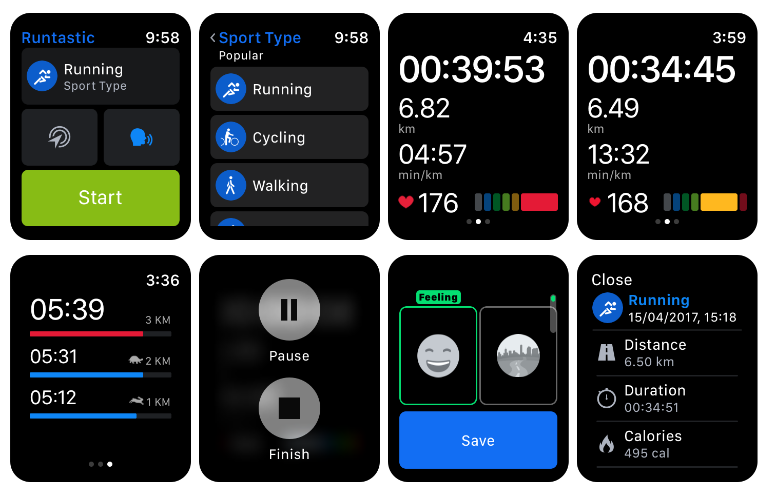
Photo: Graham Bower/Cult of MAC
Runtastic flags after a great start
The Runtastic Apple Watch app is a big disappointment. One of the first apps to support watchOS 2, it allowed you to go for a run without taking your iPhone with you. That feature apparently vanished. Last year, Runtastic promised it would add support for Apple Watch Series 2’s built-in GPS in 2017, but so far there is no sign of it.
It feels like Runtastic squandered its early lead. I find that surprising, considering that Runtastic’s lord and master, Adidas, scrapped its own MiCoach offering and made Runtastic the cornerstone of the brand’s new digital strategy.
Runtastic’s user interface looks a little confusing. The start screen features two baffling icons, which I think only the app’s designer could love. (With a little digging around in the Runtastic iPhone app, I eventually worked out that the icons activate a “Voice Coach” and something called “Live Tracking,” which lets you share your progress on social media). It seems an odd choice to clutter the interface by presenting such minor settings so prominently.
My problems with the Runtastic app design extend beyond mysterious icons. The text is very small and faint — it’s tricky to read while you are out running. Overall, the app design feels dated. For instance, it uses force-tap to pause a workout, when most apps these days follow Apple’s lead and use a swipe to the left to reveal the pause button.
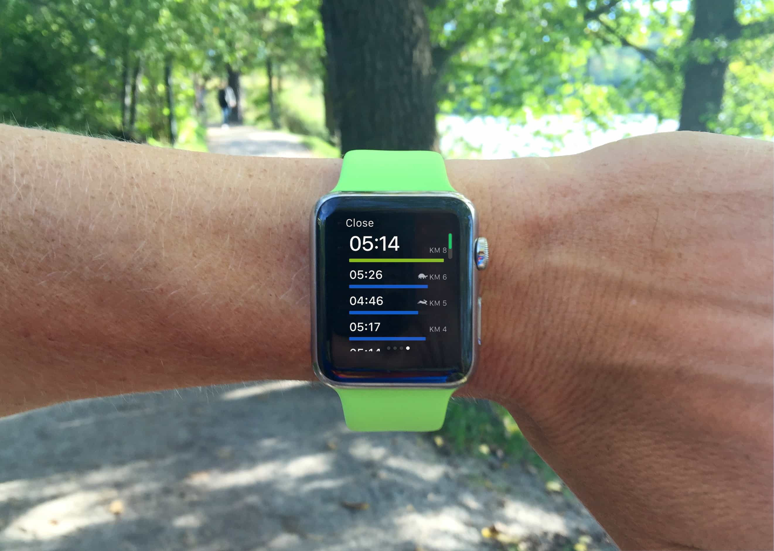
Photo: Graham Bower/Cult of Mac
Runtastic interface: The good and the bad
The user interface is not all bad though. Like Runkeeper, swiping to the right reveals your split times, while colored bars at the bottom of the display provide a great indication of what heart rate zone you are training at. And music controls built right into the app come in handy, because watchOS forgets to return the current app to the foreground if you ever leave it during an active workout.
Runtastic was the least stable of the apps I tested. Sometimes it simply would not launch. And even when it did, it sometimes refused to start a workout. It also repeatedly logged me out, although Runtastic claims it fixed this glitch with its latest update.
This running app shows potential, but it needs a major overhaul to catch up with the competition (and add Series 2 support).
Price: Free
Download: Runtastic Running, Jogging and Walking Tracker

Look out for Runner’s Week Day 5 tomorrow, when I’ll be reviewing MapMyRun.
![Runtastic running app squanders an early lead [Runner’s Week: Day 4] Runtastic running app uses color to show the intensity of your workout.](https://www.cultofmac.com/wp-content/uploads/2017/06/runnersweek-runtastic.jpg)
