
Today I want to show you how you can quickly and easily make a great looking flyer with Apple's Pages application. We'll walk through the complete process, from document setup to text formatting and image placement. Even if you're a complete novice, you should be able to follow along just fine.
Screencast
How to Create a Guitar Lesson Flyer in Pages
Meet Apple Pages
Any other day I would be in Adobe InDesign if I need to write a paper, but I realize not everyone has InDesign; and for typing up a quick paper it might be over kill for most. Having played around with Pages, I think it's safe to say it has all the functionality and capability that your every day Mac user will ever need. And as always, Apple even manages to make word processing fun and intuitive.
Pages comes with a ton of great templates that you can use for almost any kind of paper or flyer you can imagine. However, if you want to get a little deeper, Pages offers up the control to be able to do a quick design yourself from scratch.
Project Resources
- Grunge Edge 3
- Seyhun Serkan Çakmak (Guitar)
- Singer Daniel Vera 3 (Thanks to Ivan L. Vicencio for this photograph)
Step 1. Set Up Your Document
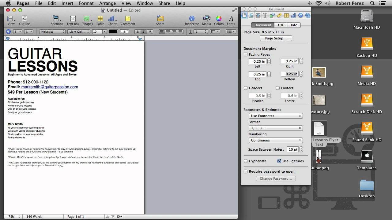
When you start with a blank template, there is a lot of white space around the edges of the page. This is referred to as the margin of the page. The default margin settings are fine for a typical typed document, but when designing a flyer or anything else that is more than just text on a page, you want to use more of the printable area.
There are two settings you can adjust to give yourself more working room. Open up the Inspector by going to View > Show inspector or using the keyboard shortcut Option+Command+I.
Pages by default includes a header and footer, but you may not notice them unless you put your cursor over them.


Use The Inspector Panel To Make Changes To The Page Layout Such As The Margins and Headder/Footer
These by themselves are taking up about an inch of space combined. Turn those off by clicking on the Document Inspector icon in then Inspector window and unchecking Header and Footer.
Secondly, you can adjust the document margins. By default they are set to .5 inches. Set them to .25 inches for now, we'll eventually edit these.
Now that we have more room to work, go ahead and paste or type up your document text.
Step 2. Format the Text:
If someone is walking by and sees your flyer, they should have visual cues as to what is the most important piece of information, what's the second most important, and so on. These visual cues are a very simple definition of what is referred to as text formatting.
The purpose of formatting your text is to guide the viewer to the information you want them to read...
The purpose of formatting your text is to guide the viewer to the information you want them to read, in the order you want them to read it in, and also to help the viewer navigate the content.
If I've done a good job of formatting the article you're currently reading, you should hopefully be able to scroll through from top to bottom and quickly get a feel for what is covered:
- An overview of Pages
- Setting up a blank document
- Formatting text
- Adding images
- Conclusion
If a person only remembers one or two things about your flyer, by formatting the text you can make sure it's the important parts, like what you are advertising and your contact information.
You can see in the pictures below that I've given a visual hierarchy using size and weight. The visual hierarchy of the information from most to least important is as follows:
- Title
- Contact information
- Services and credentials
- Customer quotes


Un-formatted Text Does Not Have Any Hierarchy, And Thus Does Not Guide The Viewer To The Important Pieces Of Information


Formatted Text Shows The Viewer Very Quickly What Is The Most Important Information, The Second Most Important, And So On
In practice, unless the text itself is the only focal point, such as a typed document, you don't want to have long lines of text. Long text lines aren't as readable as shorter lines, and given that the audience of this design is probably going to have limited time walking by or standing and reading, you want it to be as readable as possible.
You can adjust a paragraph's individual margin by placing your cursor in the paragraph, then clicking and dragging the triangle stop. You can also adjust multiple paragraphs the same way by selecting them and dragging.
Step 3. Add the Images
Adding images to your flyer will both make it more visually interesting and help to fill this negative space created by moving the text. To add an image, you simply click and drag it into the document.
Pages supports images with transparency such as .png files, and the text will automatically flow around it. If you can't find any images with transparency or don't have a means to create it yourself, Pages does have a masking feature you can use to make the image.


Pages Offers Many Ways To Incorporate Images Into Your Layout
- Masked image.
- Image sent to the background to allow text to overlay.
- Image that is in front, causing text to flow around it.
If this is more than you want to do however, you can simply send the image to the background, which allows the text to flow over it. Do this by going to Arrange > send objects to background.
Let's scale the image up and do the tried and true half profile view for the guitar. You scale an image by simply clicking the corner anchor point and dragging out.
To rotate you can hold the option key until you get the curved double arrow and click and drag. When adding texture or any other image behind text, make sure that there is enough contrast between the text and any background images you add, so people can still easily read it.
Conclusion:
In a few minutes you can create a nice looking flyer inside of pages that doesn't scream "Hey! I used Pages and that guitar template to make this!". And if you look thorough the templates Apple supplies you can see that you really can get pretty creative with making flyers.
I hope if you were maybe considering dropping the twenty bucks for Pages on Mac, I've shown that with just a bit of know how, you really can get a lot of use out of this wonderful program.


