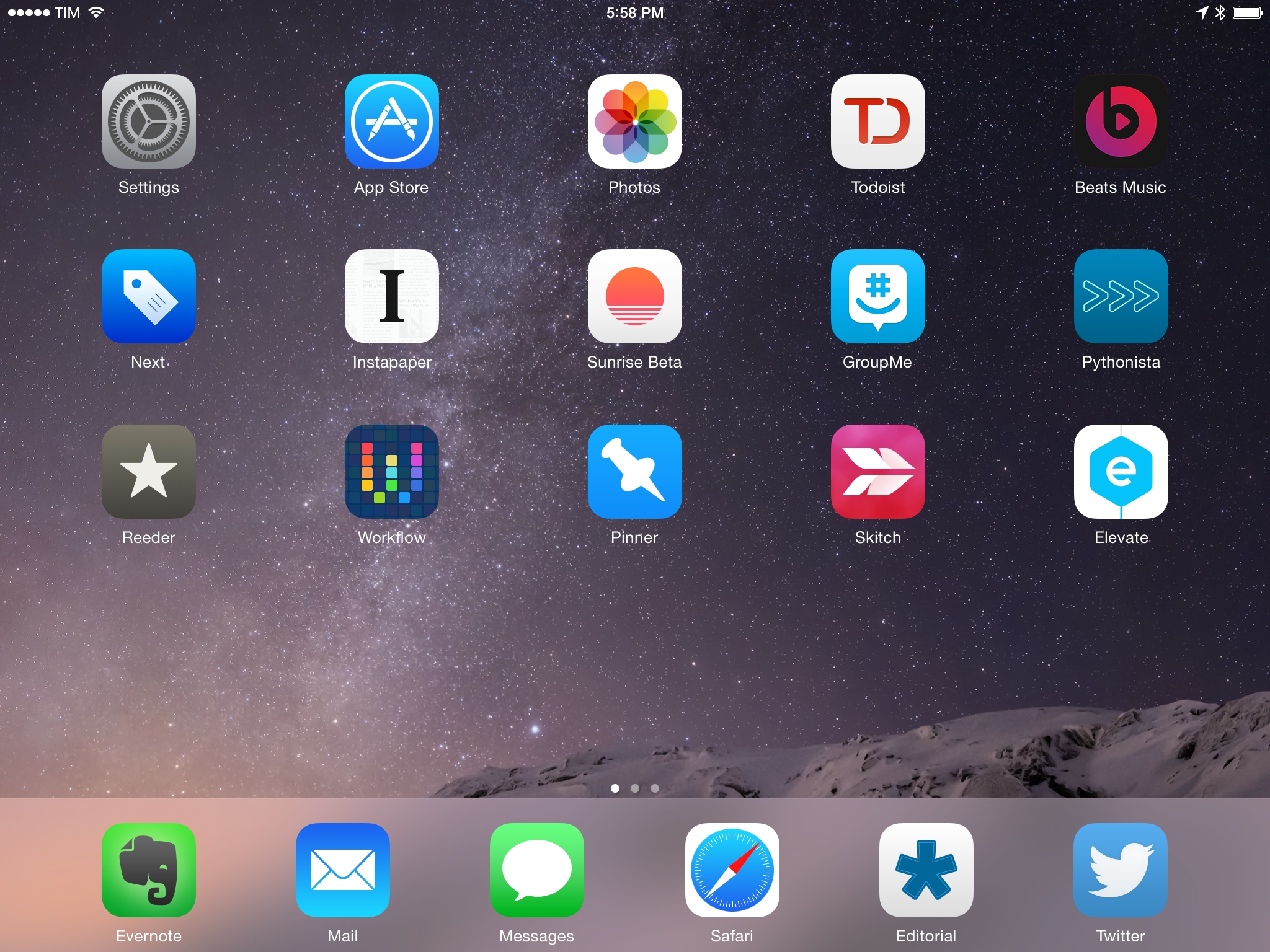
When I reviewed iOS 7 last year, I took a different approach and tried to consider Apple’s redesigned OS from the perspective of someone who uses iPhones and iPads for work and personal tasks on a daily basis. I noted that a new structure enabled developers to make more powerful apps, and I concluded hoping that Apple would “consider revamping interoperability and communication between apps in the future”.
With today’s release of iOS 8, Apple isn’t merely improving upon iOS 7 with minor app updates and feature additions. They’re also not backtracking on the design language launched last year, which has been refined and optimized with subtle tweaks, but not fundamentally changed since its debut in June 2013.
Apple is reinventing iOS. The way apps communicate with each other and exchange functionality through extensions. How status awareness is being brought to iPhones, iPads, and Macs with Handoff and Continuity. Swift and TestFlight, giving developers new tools to build and test their apps. Custom keyboards and interactive notifications.
There are hundreds of new features in iOS 8 and the ecosystem surrounding it that signal a far-reaching reimagination of what iOS apps should be capable of, the extent of user customization on an iPhone and iPad, or the amount of usage data that app developers can collect to craft better software.
Seven years into iOS, a new beginning is afoot for Apple’s mobile OS, and, months from now, there will still be plenty to discuss. But, today, I want to elaborate on my experience with iOS 8 in a story that can be summed up with:
iOS 8 has completely changed how I work on my iPhone and iPad.
The Future’s Legacy
A year after iOS 7, I would say that it hasn’t been a perfectly smooth transition, but, at least for me, it’s hard to look back at what iOS used to be and miss it.
Following the launch of iOS 7, it became clear that Apple hadn’t had much time to optimize the OS for a bug-free experience that also needed to perform reasonably well on older hardware. For someone who relies on the iPad for work purposes, the first few months of iOS 7 were rough: in spite of Apple’s initial bug fix updates, I kept getting Home screen crashes, random reboots, hard resets, BSoDs, and, generally speaking, a bevy of graphical glitches that were new to iOS – traditionally, a highly polished and stable platform.
iOS 7’s technical problems weren’t exclusive to Apple’s own apps and features: as a result of lingering bugs in the final OS and the developer SDK, third-party apps exhibited a variety of text-related issues, inconsistent animations, and crashes. I know of several developers who needed to work around Apple’s bugs to avoid crashes and glitches…which eventually led to other bugs after Apple began releasing iOS 7 updates.
The launch of iOS 7 seemed to confirm that Apple wasn’t the kind of company that could handle a complete redesign while adding major framework and feature additions and hope to release a stable OS. My experience with the iPad as my primary computer was, from a technical perspective, worse than iOS 6. Until Apple released iOS 7.1, I had to cope with more bugs and crashes than I ever expected.
From a big picture perspective, however, I think that iOS 7 was necessary. Breaking with old design trends and longstanding UI conventions allowed Apple to modernize iOS and kickstart a process that would see the company and third-party developers rediscover the personalities of their software. Whether it’s Apple experimenting with different designs for music players or Evernote continuing to tweak its app to find the right balance of updated interface and functionalities, the undeniable truth is that we’ve ended up with fantastic pieces of iOS 7 software such as Elevate, Skitch, Overcast, and thousands of other apps that I doubt would have been possible hadn’t Apple drawn a line in the sand with iOS 7.
iOS 7 changed the conversation from software that had to look somewhat realistic to apps that work well with a focus on content, clarity, and color. The redesign wasn’t the end goal – it was the motivation to start fresh and make better apps.
iOS 7 was a bitter medicine – and I believe that the ecosystem is stronger because of it.
At the peak of criticism last year, many thought that iOS 7’s redesign was a fashionable excuse – a facade – to cover the fact that Apple was running out of ideas. Instead, I now see many of Apple’s decisions with iOS 7 as functional and directly related to this year’s deep changes in iOS 8. Just to name a few: improved background refresh and a more consistent visual style will allow App Extensions to be more versatile and consistent than they would have been without iOS 7; the Today view – useful but limited – can now become an area for interactive widgets; Near Me, tested for over a year, will be integrated in a much more useful Explore section on the App Store.
On the eve of WWDC 2014, I was looking through our archive of app reviews on MacStories and I realized how much had changed from a visual perspective over the years and how little things had improved from a functionality standpoint. Despite Apple’s (strenuous, but ultimately rewarding) efforts to modernize iOS, antiquated paradigms had remained at its core: with no unified system to let apps collaborate on a common task or exchange documents across multiple apps without creating duplicates, iOS 7 was still fundamentally rooted in old limitations that had no reason to exist in 2014.
With iOS 8, Apple is making good on their promise of entering the post-PC era with features that are unexpected and that will take time to digest, but that are still uniquely iOS.
Extensible
Over the years, I developed a series of habits and built workflows to get work done on my iPad with the same degree of functionality of my Mac. That wasn’t an experiment to prove a point: it was a necessary consequence of not being able to sit at my desk every day. I needed the portability of the iPad, so I reinvented the way I worked with it.
The limitations of iOS soon became clear to me, and I had to set up complex workarounds and scripts to overcome them. Without an open OS capable of exchanging files across apps through a filesystem, I had to rely on specialized utilities that would often generate their own copies of files and waste precious storage space on my device.
The Open In menu was my savior and enemy: I could use it to send a document to any app, but that would create additional copies of the same document in silos unable to communicate with each other. When I needed to annotate a screenshot and use it in a blog post, I’d end up with three copies of same file. If I wanted to proofread an article in a dedicated grammar-checking app, it would result in two versions of the file and lots of manual copying and pasting between apps.
And that’s just for files and documents. I’ve come up with all sorts of custom commands and hacks to achieve some basic inter-app communication, which resulted in a lot of hours spent fixing problems with Apple’s sandboxing and figuring out the easiest solution for a problem that wouldn’t exist on a Mac.
On OS X, the power of Alfred, Keyboard Maestro, Dropbox, and the Finder is just one click away. On iOS? I tried hundreds of apps that could help me in my everyday work life, and none of them knew about each other. If I wanted to save time and effort in working from my iPad, I needed to find openings in Apple’s closed ecosystem and turn them into automated workflows to mimic my OS X setup.
That’s what I did, and I loved every single minute spent hacking and testing what could be possible with “underpowered” iOS apps. I built scripts to automate image editing and combine that with Dropbox uploads. I connected apps with x-callback-url to let them collaborate on a single task with one tap. I set up shortcuts in Launch Center Pro and chained actions in Drafts. I let Editorial take care of everything else.
I’m about to throw most of this stuff away with iOS 8.
Thanks to Apple’s work on extensibility and new technologies available to third-party developers, apps are finally able to talk to each other, working in unison to offer their services when and where they make sense. With iOS 8 extensions, apps can become features available in other apps. And while that won’t mean the end of some of my automation workflows, dozens of workarounds I set up for basic inter-app communication won’t be neeeded anymore.
As a recap of the Extensibility primer that I wrote in June, there are different types of extensions that apps can include in iOS 8:
- Today: widgets for the Today view of Notification Center
- Share: post content to web services or share content with others
- Actions: app extensions to view or manipulate inside another app
- Photo Editing: edit a photo or video in Apple’s Photos app with extensions from a third-party app
- Storage Providers: an interface between files inside an app and other apps on a user’s device
- Custom Keyboards: system-wide alternative keyboards
Extensions aren’t sold as separate apps on the App Store – they are bundled into regular apps and they need to be activated in specific parts of the OS called “extension points”. Extensions are installed, but not enabled, when you download an app from the Store, and they are deactivated and removed when you delete an app. Instead of rehashing the explanation that I published after WWDC, I want to focus on the practical changes that extensions have brought to my daily iOS usage.
Extensions are such a big change for iOS productivity, I still tend to forget about them: it’ll take time to realize that iOS can now complete tasks that used to be exclusive to Macs.
For people who want to work on the iPad, iOS 8 extensions make sense only when considered in the context of third-party apps and what developers will create for the new OS. This made it harder to test and reflect upon iOS’ changes this summer: last year, you could use an iPhone running iOS 7 and get a sense of the design differences between Apple apps and third-party software; this year, new third-party apps are required to understand the true potential of extensibility.1
iOS 8 is, first and foremost, all about third-party apps and the possibilities they create for users and developers. For the past three months, I’ve been testing dozens of updated apps – from either big companies and smaller indie shops – and installed extensions in an effort to understand what iOS 8 would bring. In the process, iOS 8 apps reinvented the way I work from my iPhone and iPad.
Widgets
When Apple introduced the Today view in Notification Center last year, I lauded the glanceable and contextual information that it offered through small blocks of content that could preview my upcoming calendar appointments, current traffic, and local weather conditions. I relied heavily on Reminders back then, and I welcomed the ability to mark tasks as completed directly from Notification Center without having to open an app. I noted that breaking notifications in two distinct layers was confusing, but, overall, I was positively impressed with the Today view and I imagined it’d have an interesting future.
In iOS 8, Apple has simplified Notification Center and turned the Today area into an extension point that apps can use for glanceable and interactive widgets. When Craig Federighi unveiled widgets as part of the extensibility announcements at WWDC, I thought that they would turn out to be a modern take on the old OS X Dashboard – somewhat handy, but too detached from the main experience to make an impact. I was wrong.
iOS 8 widgets are extensions that can preview content and have lightweight interactions with their host app. This seemingly obvious statement is the raison d’être of widgets: unlike Dashboard widgets on OS X, iOS 8 widgets are deeply integrated with the app they belong to; therefore, using them has far less friction than switching back and forth between apps and the Dashboard on OS X.
Apple’s built-in examples aren’t that great: like last year, there’s a widget to see your current calendar events and weather forecasts, a list of tasks, and a summary of your schedule. Apple’s widgets are extremely basic in that they preview content and allow you to tap them to jump to their respective apps. They fit well with the Today view’s underlying premise – these are widgets for stuff you need to do or see today. They’re useful, but they don’t show the full potential of the new Today view.
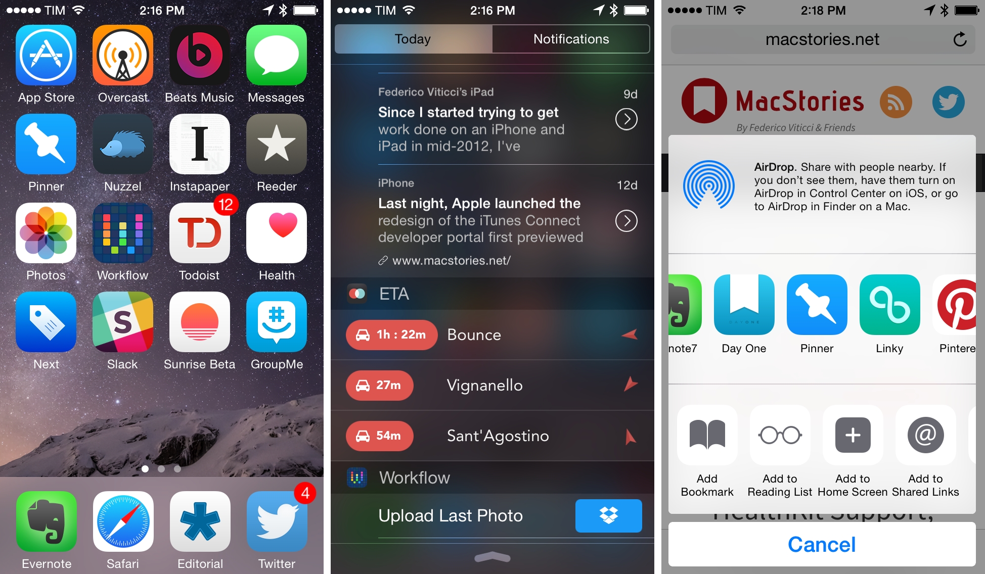
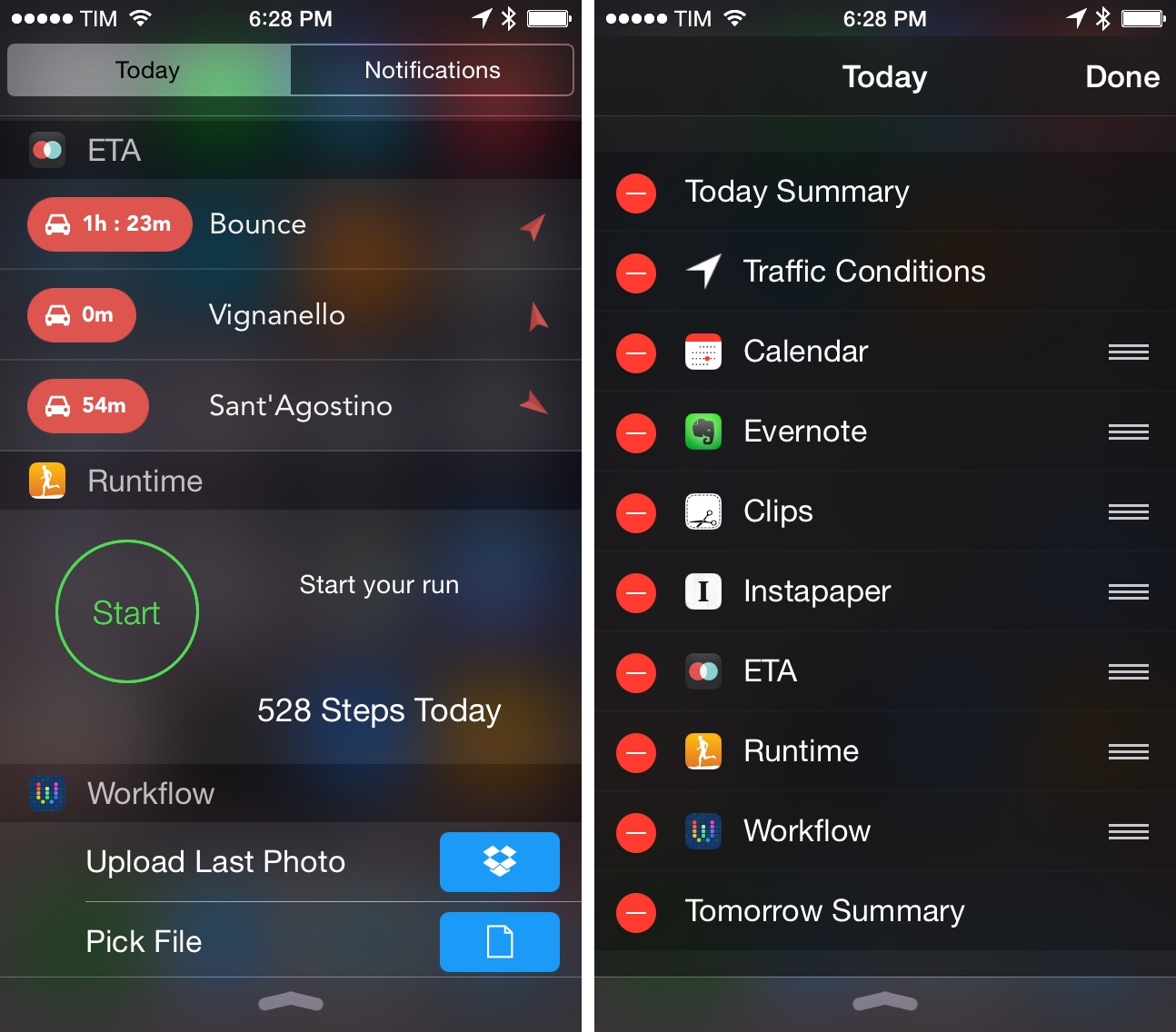
Third-party widgets (like other extensions) are bundled with apps from the App Store and they need to be manually activated by tapping Edit in Notification Center and adding them to the Today area. Widgets can be deactivated without uninstalling the host app, but they will be permanently deleted if the host app is removed from your device. If you downloaded apps that offer widgets you haven’t enabled yet, Notification Center will tell you with a message at the bottom of the screen.
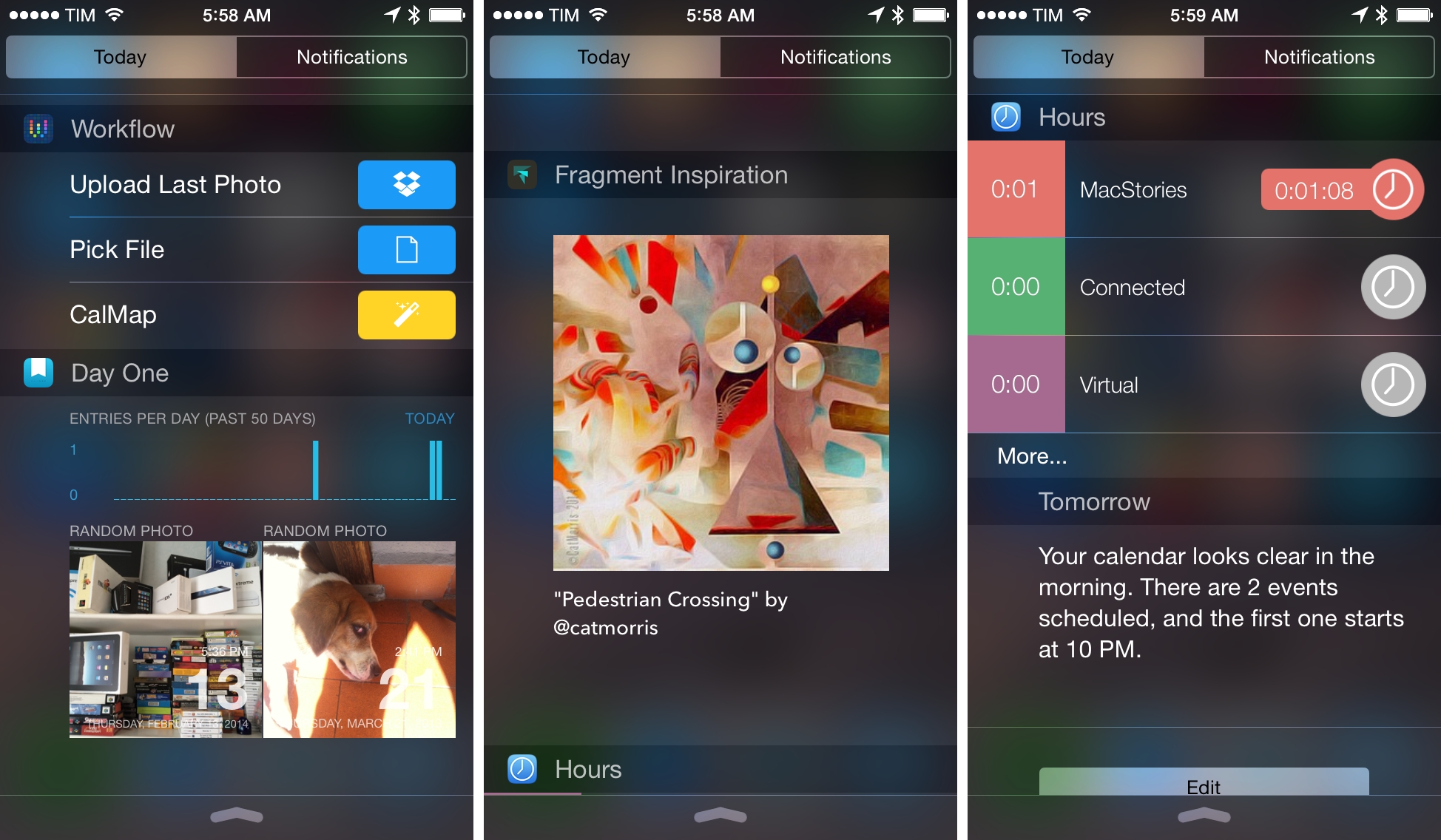
Since June, I’ve seen developers making widgets for all kinds of apps and not necessarily for content that is relevant “today” or that is based on time-related components. Apple advised on creating lightweight widgets with minimal UIs and interactions, and that hasn’t stopped developers from coming up with ideas that are far more useful than a weather preview.
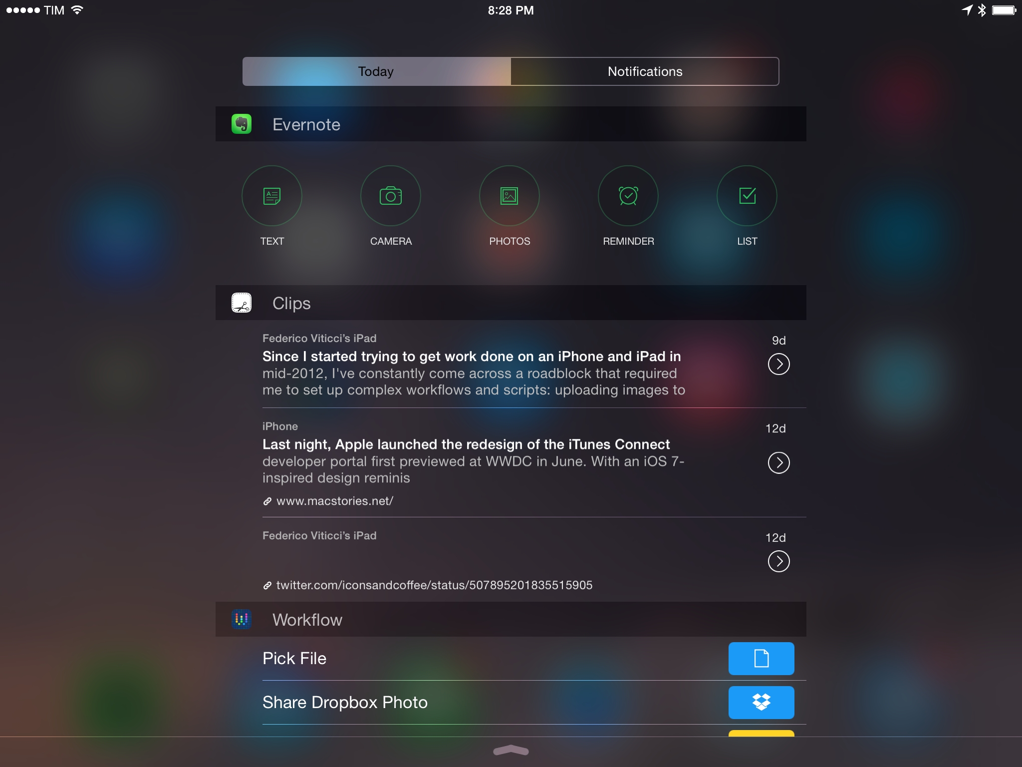
The Evernote widget has buttons to quickly create a new text note, a note from the camera, or save a photo from the device’s library. These buttons don’t bring up a keyboard in the Today view – it’s impossible for apps to invoke text input in Notification Center – but they let me jump directly into Evernote and the section associated with the button I tapped. The “text” button opens the app in typing mode; the camera button opens the app and launches its camera feature; the photos button opens Evernote with a photo picker.
I’ve been using this widget several times a day: it saves me time I would spend launching the app and navigating its interface to create new notes, and it’s a much more native and integrated system than hacks like URL schemes because it’s always just a swipe away.
In fact, I suspect that the whole “app section launcher” idea will take off as one of the most popular uses for Today widgets. A productivity app I was testing offered a grid of actions that, once configured in the app, could be launched from a widget that displayed custom icons for each action. A read-later app is adding a widget with a preview of articles saved on the current day; tapping an article title’s in the Today view opens the app directly into that article. A fitness app to track steps and runs called Runtime is coming out with a widget to view the amount of steps taken on the current day (as returned by the iPhone’s M7 chip) and a button to start a new run directly from Notification Center.
The concept of action launchers that was popularized by Launch Center Pro will feel right at home in the Today view for iOS 8, and I believe it’ll be a better fit thanks to Notification Center’s system-wide presence. But it’s the interactivity allowed in the Today view that turned widgets into must-have extensions for my daily workflow.
A few weeks ago, I began testing Clips, an upcoming clipboard manager by the creators of Dispatch to save and access snippets of text previously copied on an iPhone or iPad (it’s launching soon).
Clipboard management has always been one of the biggest advantages of using OS X over iOS for “real work” – on the Mac, you can use apps such as Alfred or ClipMenu to constantly monitor everything you copy, archive it, and paste it at any time, even if you copied a string of text two days ago. On iOS, developers were never able to create desktop-like clipboard managers to monitor what you copy and paste 24/7: iOS just doesn’t give developers access to that data. So if you wanted to use a clipboard manager, you’d have to cope with the limitations of utilities like EverClip, an app that could monitor your clipboard activity for 10 minutes at a time and that would then be killed in the background by the OS. The high friction required to use these apps was the reason I never truly got into them.
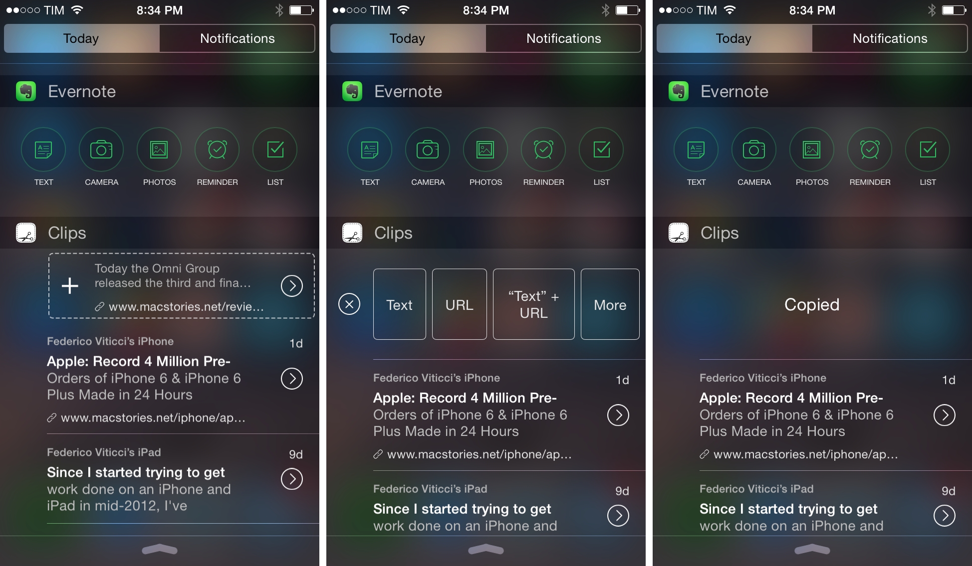
iOS 8 is not going to allow apps to constantly monitor the clipboard in the background, and there isn’t going to be a mobile version of ClipMenu or LaunchBar’s clipboard menu on the App Store today. The developers of this new clipboard manager, though, came up with the idea of using a widget as a quick entry input option for manual clipboard archiving: after you’ve copied something, slide down Notification Center and hit the app’s “+” button in the widget. What you copied will be saved as clipped text into the app without actually opening the app, and it will be previewed inside the widget for future copying with one tap.
I’m using this widget every day and it has allowed me to do research for MacStories and Relay without wishing I had a Mac. It’s not as full-featured as ClipMenu or Alfred, but the ease of access of the widget makes the act of saving your clipboard effortless because Notification Center is always there. I’ll accept the trade-off of having to archive my clipboard manually if it means I can do it visually and quickly with a widget that I can always bring up with a swipe in any app I’m using.
In my tests, I noticed some technical issues with widgets that I believe are related to third-party apps and bugs left in iOS 8.
If you install several widgets on your device, you may notice a brief loading time for content that needs to be visualized when you swipe down to open Notification Center. This problem was more noticeable in the previous betas of iOS 8 and refresh speed has gotten considerably better on the public release, but it can still occurr. I ran my tests with about a dozen third-party widgets on an iPhone 5s and a second-gen iPad mini.
The second (and particularly minor) annoyance is that the iPad can’t load widgets from iPhone apps installed in compatibility mode. While I don’t generally like to keep iPhone apps on my iPad, I wanted to use a widget that’s available in an iPhone-only app and discovered that, despite emulation, the iPad couldn’t use it.
Like other types of extensions, there will be an explosion of widgets on the App Store. If the apps I’m trying are of any indication, most developers will want to offer some kind of shortcut in the Today view, but at that point you’ll have to wonder how much you’ll benefit from a widget that you need to locate like an app on a crowded Home screen.
I’ve tried to be selective with the widgets I want to keep on my devices. There’s no point in scrolling a page full of widgets, even if curiosity will push you to install many of them. That’s normal, but I’ve discovered that I prefer (and ultimately benefit from) keeping only a few widgets around.
Widgets validate the idea of app launchers and action shortcuts. In spite of the “Today” name, the best widgets that I tested weren’t about the next 24 hours or today’s forecast – they were interactive menus and app extensions that allowed me to save text, launch specific actions in a couple of seconds, and navigate less around my Home screen. In my daily workflow, widgets enabled me to complete tasks that were already possible (such as moving bits of text from Safari to a Pages document) more easily and quickly, giving me extra time to do something else on my iPad.
The “Today” name is, at this point, non-descriptive of what widgets are bringing to Notification Center. I wouldn’t be surprised to see two tabs – “Widgets” and “Notifications” – in an Action Center/Dashboard rebranding next year.
Take Action
It’s in the action and share extensions, however, that iOS is finding its maturity as a platform and a new beginning for a rich ecosystem of apps. Action and share extensions have changed the way I get work done on iOS and they mark an important new chapter for third-party apps.
First, some history. iPhone OS was built from the technological roots of OS X, but it never gained the Services menu that, for decades, had allowed developers to abstract features from their apps and make them available as shortcuts in other apps. Mockups and concept videos didn’t take long to appear, but Apple never caved to the pressure of power users who wanted an easy way to let apps communicate and exchange functionality.
The umbrella term that “inter-app communication” became over the years stood for a fairly primitive need: apps should be able to collaborate on text, files, and other types of data without requiring too much user interaction. Why would you need to manually copy and paste a Safari webpage that you want to turn into a todo? Wouldn’t it make sense for apps to offer their services to other apps and make users happier, more productive, and more satisfied with their software purchases?
It did make sense, but without an Apple-sanctioned solution developers had to come up with their own fragmented, flaky, often unreliable technologies to enable some kind of communication between iOS apps.
A few examples come to mind:
- The TextExpander SDK, which developers needed to manually add to their apps. Notably, Smile relied on hacks that Apple eventually noticed and asked to shut down.
- URL schemes and x-callback-url. Primarily aimed at text, this widely popular workaround allowed apps to exchange data and automatically open other apps.
- The GoodReader SDK, built for document management and effectively MIA.
- JavaScript bookmarklets, officially supported by Safari but limited, difficult to configure on iOS, and generally user-hostile.
- Python scripting with Editorial and Pythonista, developed by Ole Zorn and compatible with various iOS frameworks.
- Launch Center Pro and Drafts, which both started out as simple utilities and evolved into full-featured apps capable of making other apps communicate.
With the exception of GoodReader, I relied on all these tools to get more done on iOS in less time and to a higher degree of what the platform could normally provide. It was all I could use, but I knew – as I often argued here at MacStories – that none of them was a solution.
There are two ways to look at iOS’ old limitations. There were so-called power users like me, Alex, Eric, and hundreds of others who liked to tweak their devices and were willing to invest hours in creating workflows that could save them a few minutes each day. And then there are the millions of people who simply don’t care. The people who buy iPads and want to write a college essay or prepare academic research on it don’t want or need URL schemes.
Between empowering the masses and pleasing a vocal circle, Apple will always choose the former. A cornucopia of app functionality was being wasted before extensions. Action and share extensions demonstrate how Apple has been thinking about these problems to create a system that’s far more powerful than old hacks and workarounds, secure by design, and user-friendly in a way that, like widgets, makes sense.
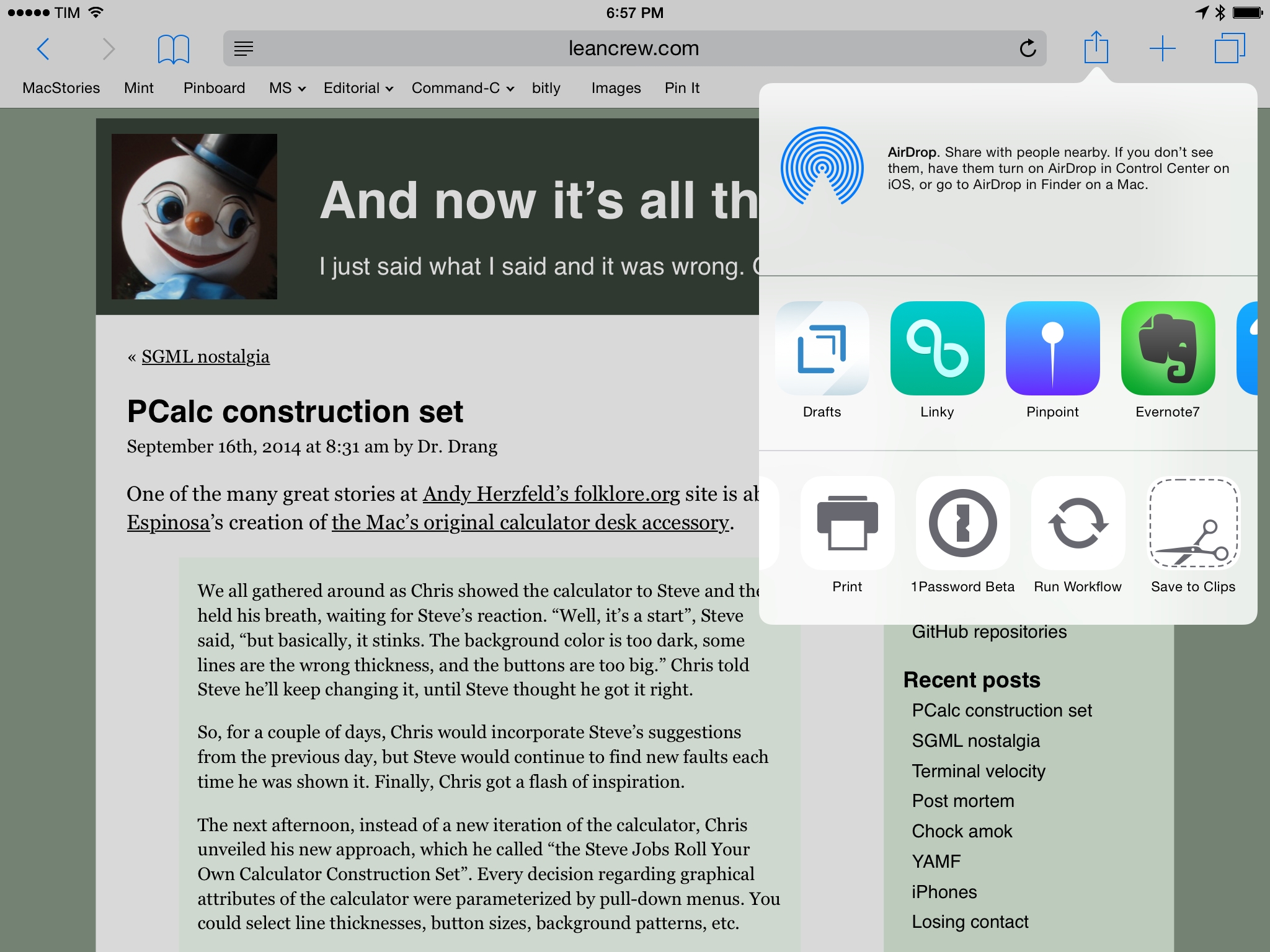
Action and share extensions are installed alongside their respective apps and can only be launched from the system share sheet. To make this clear: on iOS 8.0, you will never be able to launch an action or share extension without tapping on its icon in the share sheet.
For this first version of iOS 8, Apple chose to confine extensions to specific areas of the OS called extension points: widgets are displayed in the Today view, custom keyboards can be loaded from the system keyboard, and actions can be activated from the share sheet. I don’t want to get in the technicalities of Apple’s system, which likely took years to develop as Apple wanted to build a secure inter-app communication system that wouldn’t put user data at risk while also remaining simple and easy to activate. Creating that kind of secure opening in the sandboxing model must have been a huge effort among Apple engineers, but I want to focus on the user experience.
In the three months I spent with iOS 8 on the iPad and iPhone I use for work every day, action and share extensions have been amazing. They are app features available in other apps with their own custom interfaces and they’re compatible with any app that supports the system share sheet. Action and share extensions expose specific functionalities from the apps you already use and they feel like the next logical step for the Services menu.
Action and share extensions coexist in the share sheet and the differences between them can be blurry. While Apple has been adamant about the fact that share extensions should be intended for social services (see the company’s original share sheets) and actions for everything else, I have been trying share extensions that save the extension’s input locally without ever posting it to an online service. For this reason, I would say that the best way to think about them is this: share extensions are at the top of the share sheet and they’re used to save the extension’s input (a link, some text, etc) somewhere else; action extensions perform a more complex task in the app that’s currently being used.
Like widgets, I believe that action and share extensions are going to be extremely popular among developers of utilities and productivity apps. The important aspect of Apple’s decision to let extensions live inside the share sheet is that this limitation doesn’t create any confusion for users and developers: you’re not going to find different ways to activate extensions because iOS 8 will have to show a share sheet first. You may find a custom sharing icon and a share sheet filtered to show only some extensions, but the activation behavior will always be consistent. While Apple will probably end up giving up some control here in the future, there is a certain consistency and welcome simplicity that was nowhere to be found in the mess of URL schemes and inter-app communication hacks.
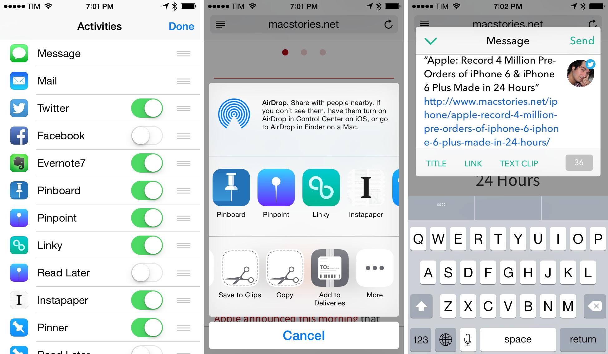
This elegance carries over to what action and share extensions look and work like, too. Like the share sheets introduced back in iOS 5, these extensions display custom sheets or full-screen views on top of the app you’re using. I’ve tried extensions to quickly capture notes (with the upcoming Drafts 4, the current Safari page is saved into a note sheet), Pinboard sharing sheets (every Pinboard client is going to have a share extension), and read-later confirmation sheets.
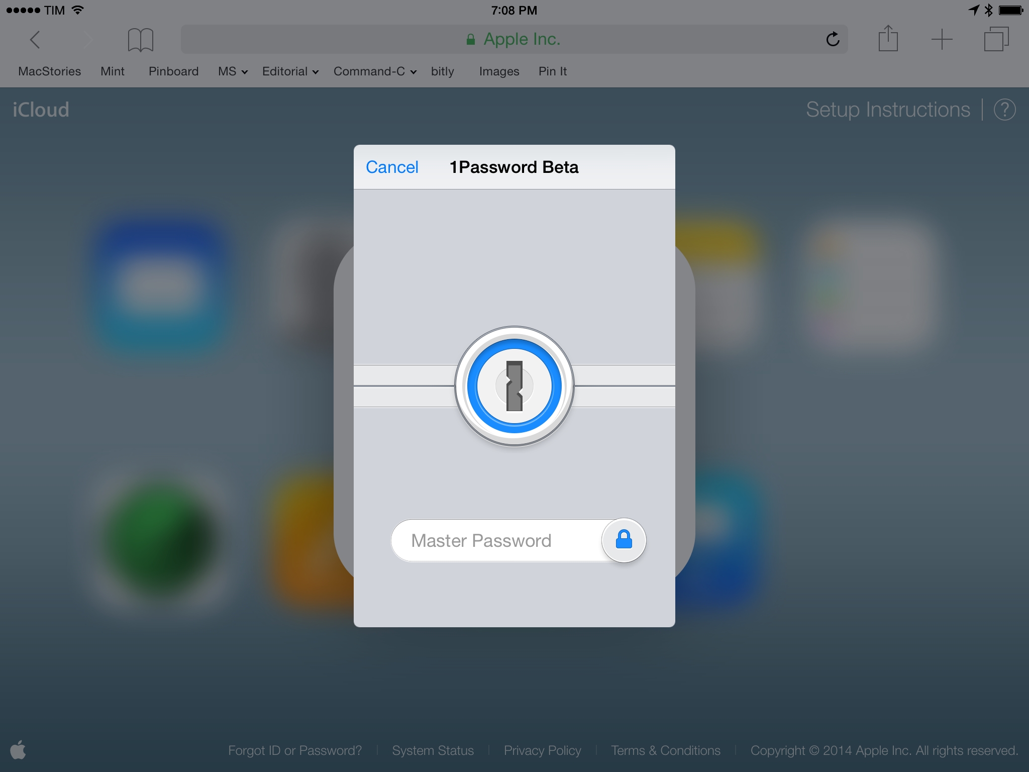
I also tested more advanced extensions, such as Linky, which allowed me to cross-post a link to various social networks. And, of course, there was the 1Password extension, which makes 1Password ubiquitous.
Extensions don’t split the screen in two and they don’t chain multiple apps together – they let an app provide a subset of its features to any other app. You will see the extension carry the interface and branding of the app it comes from but it will be presented as a sheet out of its typical environment, keeping your context.
Apps become features.
In practical scenarios, action and share extensions have changed my iPad workflow and I know there’s much more coming, starting today. Several tasks that I used to launch with automated workflows, URL schemes, or bookmarklets have been replaced by visual, integrated, and more powerful extensions.
- An upcoming note-taking gives me an extension to capture whatever I’m looking at – whether it’s a webpage in Safari or a paragraph of text. I can select what I want, save it in the app without opening it, and I’m done.
- Linky lets me cross-post to multiple networks at once. Its extension can automatically fill in a webpage’s title and link if opened from Safari, or it can insert the input text by other apps into its share sheet. It even understands whether I want to share selected text or not.
- I used to switch back and forth between 1Password and iOS apps several times a day. No more. With the 1Password extension, my logins are always available in a 1Password mini-vault that I can unlock with Touch ID from any app.
- Bookmarks saved on Pinboard? No more bookmarklets and URL schemes. On iOS 8, your favorite Pinboard app will likely offer a share sheet that has a full-blown interface and that supports tag autocompletion, privacy settings, and more.
And there’s more. I could mention the visual note-taking app that accepts anything you throw at its extension, whether it’s a PDF, an image, or text. Or the app that lets you build personalized commands and run them on-demand from its extension inside other apps. Or what Readdle is launching with iOS 8.
The beauty of Apple’s system is also that, in theory, apps are capable of determining which kind of input should be passed to an extension, enabling or disabling extensions accordingly. In Safari, for example, action and share extensions can get the current webpage title, URL, or selected text; in a read-later app, an extension will likely get the same values, but for an article you’re reading; in a document management app, an extension may work with the file you’re viewing, its file name, or other pieces of data related to it.
The system was intended to scale elegantly and quietly in the background, but, in the early days of iOS 8, there will be confusion in regard to which extensions can be used where and, unfortunately, bugs.
On several occasions, I launched share extensions that couldn’t work with the input shared by the app I was using; part of this, I imagine, was related to bugs and design problems of the apps I was testing, but clearly developers have been facing problems with Apple’s SDK. I assume that developers will need more time and better tools to understand how their share extensions work with thousands of other apps on the App Store, so don’t be surprised if an extension is failing or misinterpreting an app’s input right now.
I’m disappointed to see a lack of extension support in Apple’s own apps, and particurlarly in Mail. It just makes sense, in my opinion, to be able to turn messages into tasks or archived documents, but Apple hasn’t integrated extensions with Mail yet.
What I realized in using extensions is how necessary last year’s redesign of iOS was. Imagine if Apple didn’t ship a new design with iOS 7: today, we’d have sheets of stitched leather or shiny metal on top of apps that look like agendas or little robots. The cohesiveness and subdued style that iOS 7 brought with its precise structure and hierarchy allows extensions to integrate nicely with apps, feeling like extra actions rather than eerily realistic objects.
The impact of action and share extensions on my workflow has been massive even with only a few apps and bugs left in iOS 8. I use my iPad more because I spend less time switching between apps, copying text around, or moving files between different containers. I’m more efficient thanks to extensions because the quality of the software I use every day has increased considerably. I can’t imagine what we’ll start seeing today with action and share extensions on the App Store.
Safari
After Editorial, Safari is the app I use the most on my iPhone and iPad. Last year, I decided to switch to Safari as my primary browser (I used to be committed to Chrome’s cause) and I’ve never regretted leaving Google’s platform. I found Safari for iOS 7 to be noticeably faster, cleaner, and more integrated with the system than Chrome, and I liked the improvements that went into tab management and iCloud sync.
I’m even more impressed by this year’s updates to Safari as they tighten the browser’s relationship with other iOS apps through iCloud Keychain, make the iPad version truly desktop-class, and allow third-party apps to use the same (faster) rendering engine.
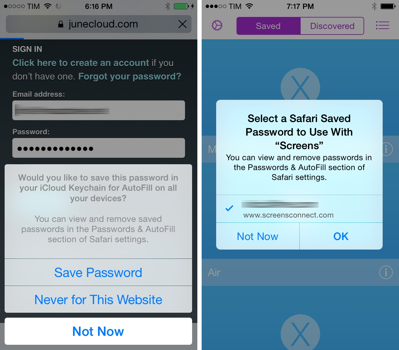
iCloud Keychain has been one of the most pleasant surprises of the past year. While I’m a heavy user of 1Password and I continue to use it for all my logins, credit card informationm, secure notes, and other private data, I’ve enjoyed the ability to automatically fill logins in Safari with iCloud and have those changes sync across devices with no management required. iCloud Keychain has a long way to go to replace a full-featured app like 1Password (you can’t even search for logins in iCloud Keychain), but its integration with Safari is top notch.
In iOS 8, third-party apps that work with a web service that you’ve already logged in with Safari can request to access your credentials stored in iCloud Keychain, automatically filling their login fields for you. The new version of Screens (out today on the App Store) supports this new feature: if you have a screensconnect.com account saved in iCloud Keychain, the app can ask to use a “Safari saved password” so you won’t have to type it. It’s a minor addition (Screens also supports the new 1Password extension), but it really makes a difference thanks to Safari’s deep integration with the rest of the OS.2
The new Safari for iPad is, by far, the best version of iOS’ Safari yet. The main interface hasn’t changed substantially: there’s still a bookmarks bar, a tab bar, and Safari Reader is accessible by tapping on an icon in the address bar.
Gestures and tabs have been redesigned and rewritten to allow for a much faster and smoother interaction that is an absolute pleasure to use on the iPad’s larger screen.
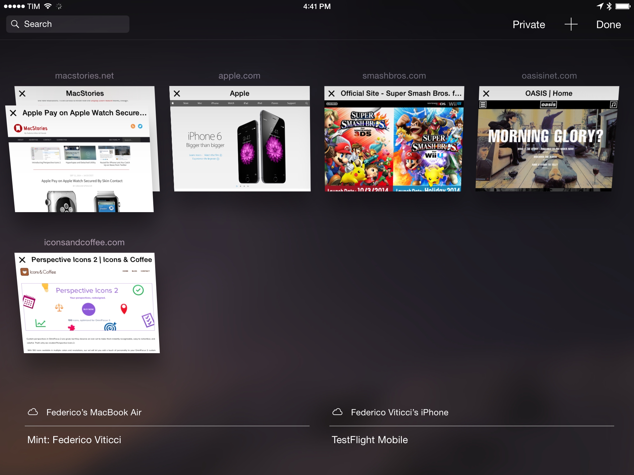
At any point during navigation, you can pinch-to-close with two fingers and the current webpage will zoom out and shrink to reveal a new birds-eye view of all your open tabs. This new tab view, inspired by Safari on the upcoming OS X Yosemite, takes advantage of the iPad’s screen with visual previews for tabs that offer more information and context than a tab bar.
In this view, the tap targets of the pages’ titles are large enough that you can tap to open them and pinch-to-zoom to get closer to a stack of pages and get a bigger preview. You can tap & hold to reorder pages, swipe them to the left to close them, and press the “+” button to see recently closed tabs. The experience is extremely tactile and, combined with a beautiful and elegant design, some of Apple’s best work on iOS.
I appreciate a lot of small tweaks and changes that may appear irrelevant taken individually, but that add up over time and make Safari for iOS 8 friendlier and faster to operate.
- When you switch to private browsing, Safari no longer asks you to close or keep all your tabs. It just keeps them all and switches to private mode.
- You can close iCloud Tabs open on other devices. Swipe to delete a tab, and it’ll close on the device it belongs to. I like that I no longer launch Safari for iPhone to twenty open tabs every day.
- Tap the address bar, swipe down, and you get options to add the current URL to your favorites or request the desktop version of the website you’re viewing. The latter is a great addition because it means I don’t have to see unusable mobile themes anymore, but I wish there was a preference to always request the desktop version for specific websites.
I’d like to have a special mention for Shared Links. When Apple added this feature to Safari last year, I thought it was a cool way to read links from Twitter timeline; it’s a simple filter for links on Twitter, built into Safari, and I use it quite a bit when I don’t have time for tweets and i just want some links. I’ve discovered many interesting articles thanks to Shared Links – I almost wish that Apple made it a separate News app.
This year, Apple added RSS support to Shared Links for iOS 8, which is an interesting turn of events as people regularly like to announce the end of RSS and Apple removed support for RSS feeds two years ago in Safari for Mountain Lion.
Unifying Shared Links with tweets and RSS feeds sounds strange, but it works. It’s nice to be able to see a list of links from your subscriptions in the browser, which you can tap to open in the current tab immediately. Shared Links will likely never become my preferred destination for news, but I’m glad it’s there.
I wish that Apple improved the way downloads are managed in Safari, but it looks like we may have to wait until next year for that. There is still no download manager in Safari, a surprising omission given the addition of iCloud Drive’s filesystem layer in iOS 8: Apple could have given Safari its own file container and let the browser save downloads in there and sync them with iCloud. Instead, tapping on a file that Safari can’t render still shows no progress for the download, but when the file is finally previewed you get the old menu that offers you to open the file in another app. At least you can run extensions on “downloaded” files.
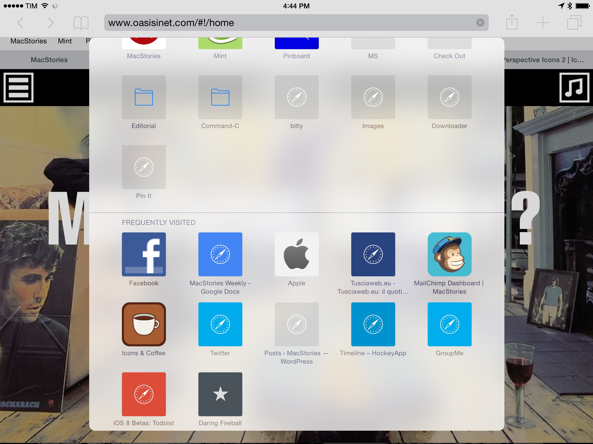
The addition of frequently visited websites is a nice one. Available in the Favorites menu by tapping the address bar, Frequently Visited shows large icons for websites you often go to – it’s like Top Sites, but it takes up less space.
One of my other favorite features of Safari is related to its engine, which is now available to third-party apps. In the old days of iOS and until last year, it used to be that Apple had a faster Safari rendering engine called Nitro that, due to security concerns, was exclusive to Safari. Third-party apps that had web views (such as Twitter clients and news readers) couldn’t use the same JavaScript engine and were thus slower to render webpages. You may have noticed that Safari got faster over the years, but third-party apps remained slow. That’s changing with iOS 8.
Thanks to a new developer API called WKWebView, any iOS 8 app can now use the same rendering engine of Safari. This sounds trivial – just use the same technology of the system browser – but it’s actually quite a technical achievement on Apple’s part. The difference between apps that use the old web views and iOS 8 apps that use the new APIs is noticeable, and it makes me open less tabs in Safari because I can read webpages in apps with the same speed and performance. I like this democratization of web views as it puts an end to third-party apps being second-class citizens when it comes to web performance.
I continue to be impressed by Safari’s speed, elegant interface, and fluid scrolling and zooming. In iOS 8, Apple brought changes to tab management that I found particularly noteworthy and useful on the iPad; these changes, combined with iCloud Keychain and higher performance, have made my browsing faster and more efficient.
Notifications
With iOS 8, Apple overhauled Notification Center and the way notifications are managed by letting you:
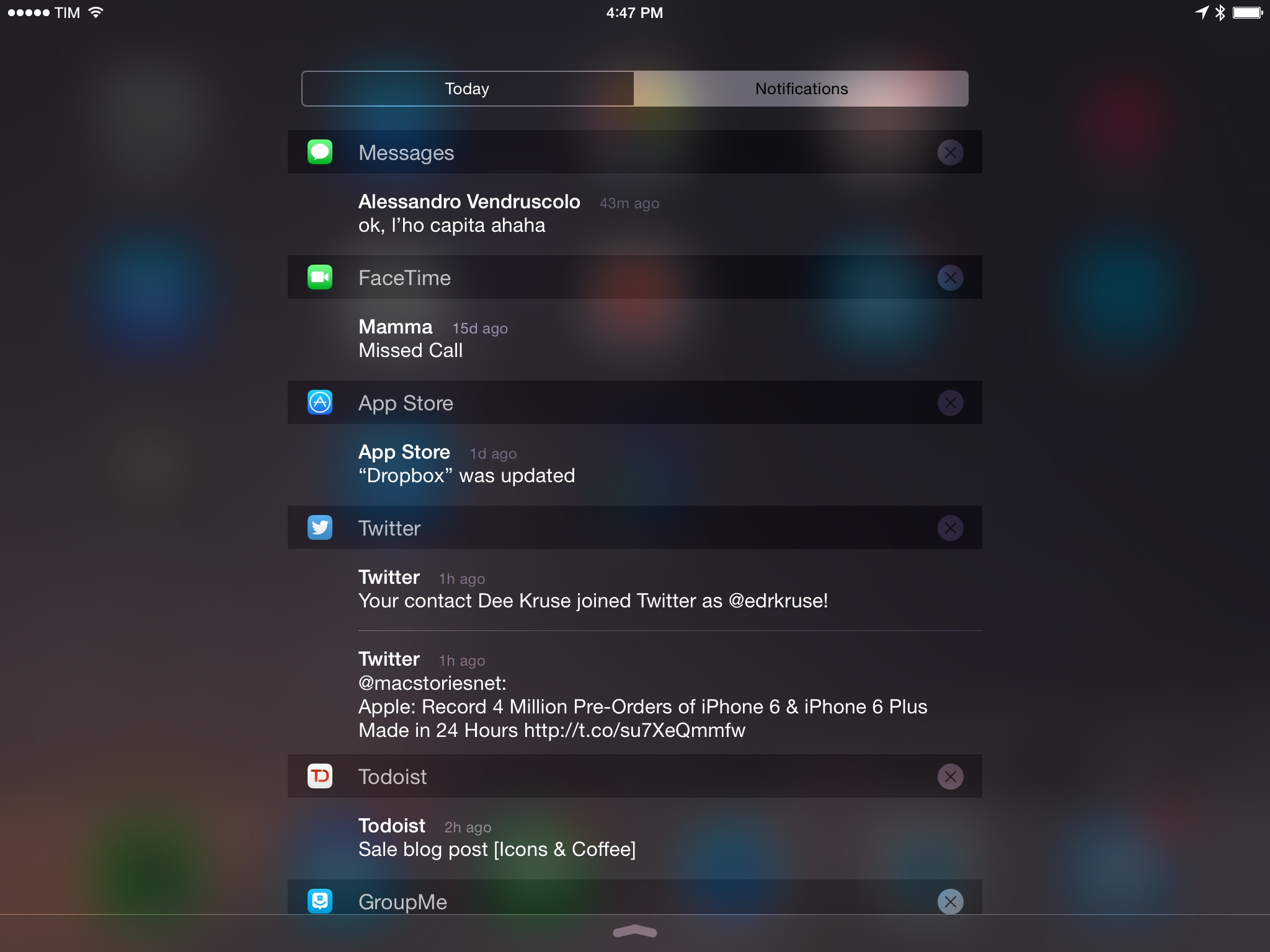
- Dismiss individual notifications in Notification Center;
- Quickly reply to iMessages without opening the app;
- Take action on notifications with buttons embedded inside the notification banner.
These are solid changes, and they share the common theme of making you save time when handling the incoming stream of notifications, which can be daunting these days. I’ve only been able to test interactive notifications with a handful of third-party apps, but what I saw was enough to confirm that these improvements were long overdue on iOS.
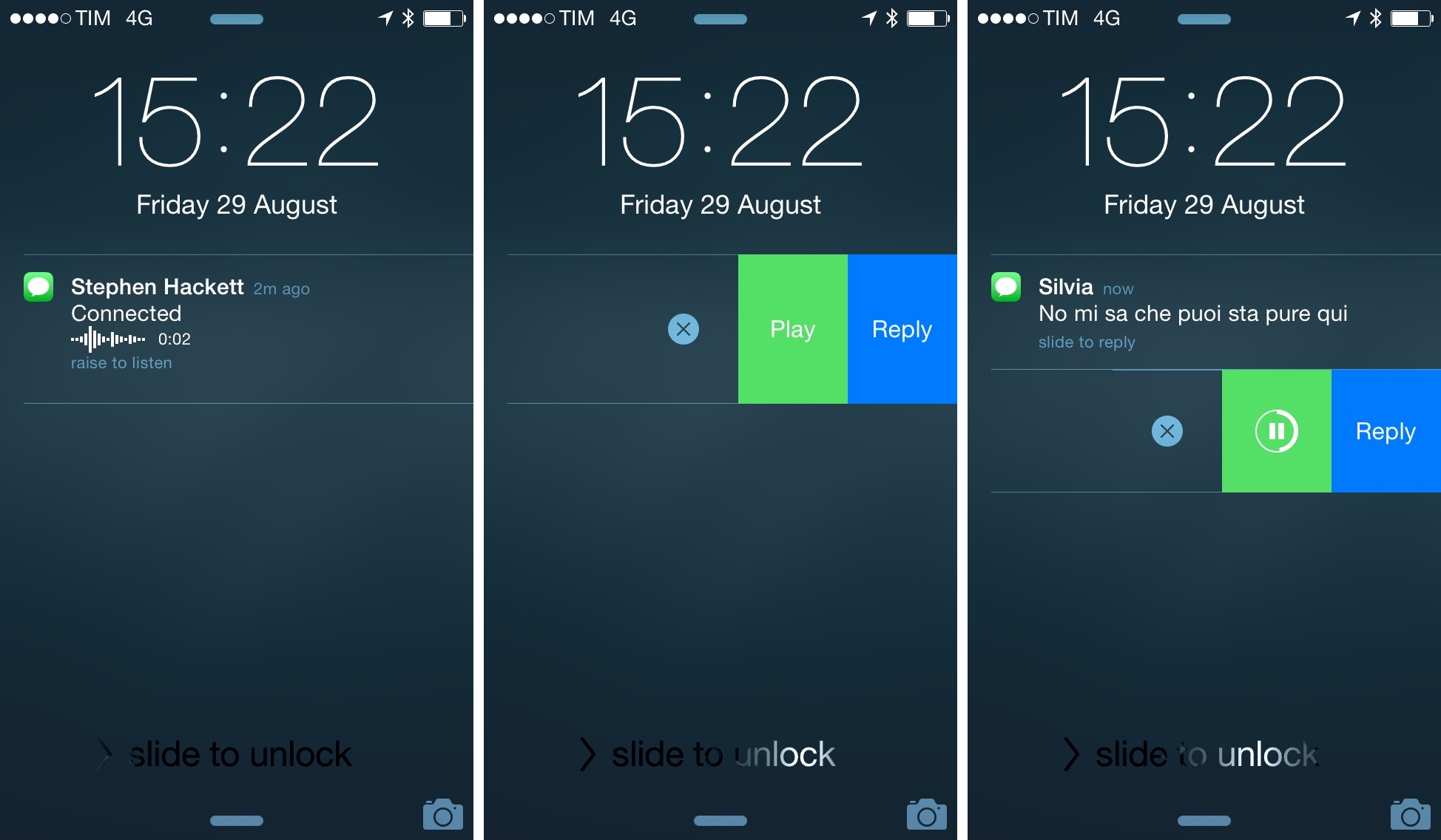
Notifications can be swiped to the left in Notification Center to show a delete button and, if available, custom buttons to act on a notification without opening the app that sent it. In email messages, for example, you can swipe to show Mark as Read and Delete, which will perform the respective action directly from Notification Center without launching Mail.3
Notifications are also interactive when they come in through banners. Swipe down, and you’ll get action buttons if the developers added them to the app. I haven’t used interactive notifications from banners much: I don’t usually want to act on email right away, and I couldn’t test many third-party apps that supported them.
I’ve used the quick reply feature for messages a lot, and I cherish the time it’s saving me on a daily basis. Quick replies are one of those features that just make sense: of course you should be able to respond to messages on the fly without having to switch apps. Android had this for years, and I’m glad that Apple began to open up with inline replies with iOS 8, even though they’re limited to the Messages app for now (you won’t be able to quickly reply to a Twitter DM or Slack message).
Quick replies allow me to be polite and send a short reply immediately without losing the context of what I’m doing. Prior to iOS 8, I often ignored notifications and upset people because I forgot to open the Messages app and respond to them; now, the distraction is still there, but the decreased friction incentivates me to reply and deal with it immediately because it’s easier.
My only gripe is that the quick reply banner doesn’t update if a new message comes in while you’re typing; thankfully, you can tap the banner and you’ll be taken to the Messages app with your text already filled in.
I can’t wait for quick replies to become available to third-party apps.
Quick Comments on Mail
Mail is always one of the first apps I set up with a fresh install of iOS, and I was curious to check out Apple’s additions in iOS 8. Mail has largely stayed the same, with the exception of new gestures to act on messages or dismiss them to take a quick look at your inbox.
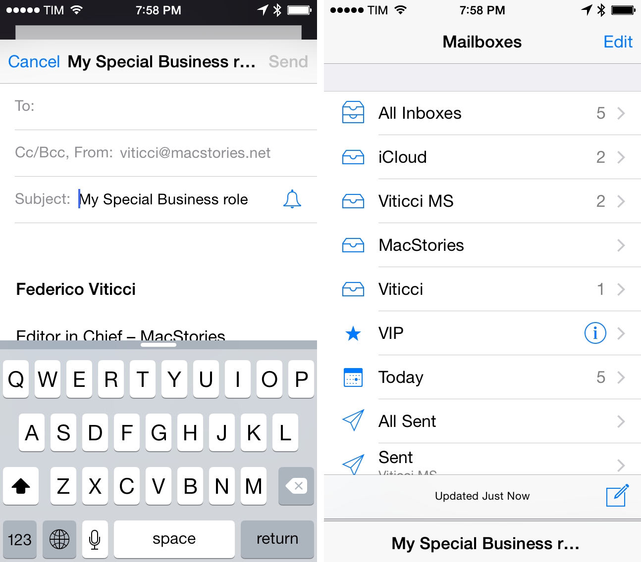
The swipe-to-close gesture was demoed at WWDC and it works on both the iPhone and iPad. When you’re writing an email, swipe down from the title bar to “dock” your message so you can go back to your inbox and see other messages that you may need to reference before continuing to write. This gesture works beautifully and I’ve been using it a lot to see other messages or double-checking information without having to save a message as draft.
There are also new gestures to quickly archive, flag, or delete messages, which are clearly inspired by the short/long-swipe mechanism popularized by Mailbox. These gestures can be configured in the Settings and they make processing email faster, but unfortunately they’re only partially available to third-party developers.
What I don’t understand is the lack of extensions and document picker in Mail. Apple has built a new secure system to integrate with apps and bring better document management to iOS, but both are completely missing from Mail. It would only make sense, in my opinion, to be able to turn emails into todos using a share extension or to print to PDF with an action directly in Mail without installing a third-party client.
Similarly, Apple has long featured a button to insert a photo or video in a message in the copy & paste menu, but they haven’t done the same for the iCloud Drive document picker. I want to believe that both of these features were cut due to time constraints and that they will be available in the future.
Last, I would like to see an email button in the new Recents/Favorites menu of the multitasking view. I’ve been using those shortcuts quite a bit, but they’re limited to starting calls or messages.
QuickType and Custom Keyboards
As someone who writes on the iPad every day, I was looking forward to improvements in the keyboard area. With iOS 8, Apple decided to add a new predictive engine to the system keyboard called QuickType, and then give developers the tools to create custom keyboards that can (almost) replace the default keyboard.
As far as Apple’s keyboard goes, QuickType hasn’t had a meaningful impact on my typing habits yet. Available as an extra row on top of the regular keyboard, QuickType displays three buttons for words you likely want to type; Apple says that QuickType is able to understand the context of the current conversation in Mail and Messages and that it should adapt to your writing style.
I have mixed feelings about QuickType. Occasionally, suggestions provided by QuickType are accurate and match what I want to write – it’s usually expressions like “cool, see you later” or “Talk tomorrow?” that I want to send as short replies. On the other hand, QuickType is often too formal or generic to be used in real conversations with my friends, who would easily realize I’m sending impersonal canned messages.
QuickType lacks personality in many of its predictions, which explains why I’ve been using it more as a fancy autocorrection tool than a predictive engine. I believe QuickType has a bright future ahead of it though, especially because of the deep system integration that Apple can build without being creepy about it. QuickType already works with multiple languages, and I look forward to seeing how it’ll grow.
What surprised me and continues to intrigue me is the amount of innovation I’m seeing in custom keyboards.
Perhaps it’s the fact that iOS users couldn’t enjoy the versatility of custom keyboards before, but besides keyboards that are only bringing themes and other questionable interfaces to the standard iOS keyboard, I’ve seen developers come up with fantastic ideas to enhance the typing and data input experience on an iPhone and iPad.
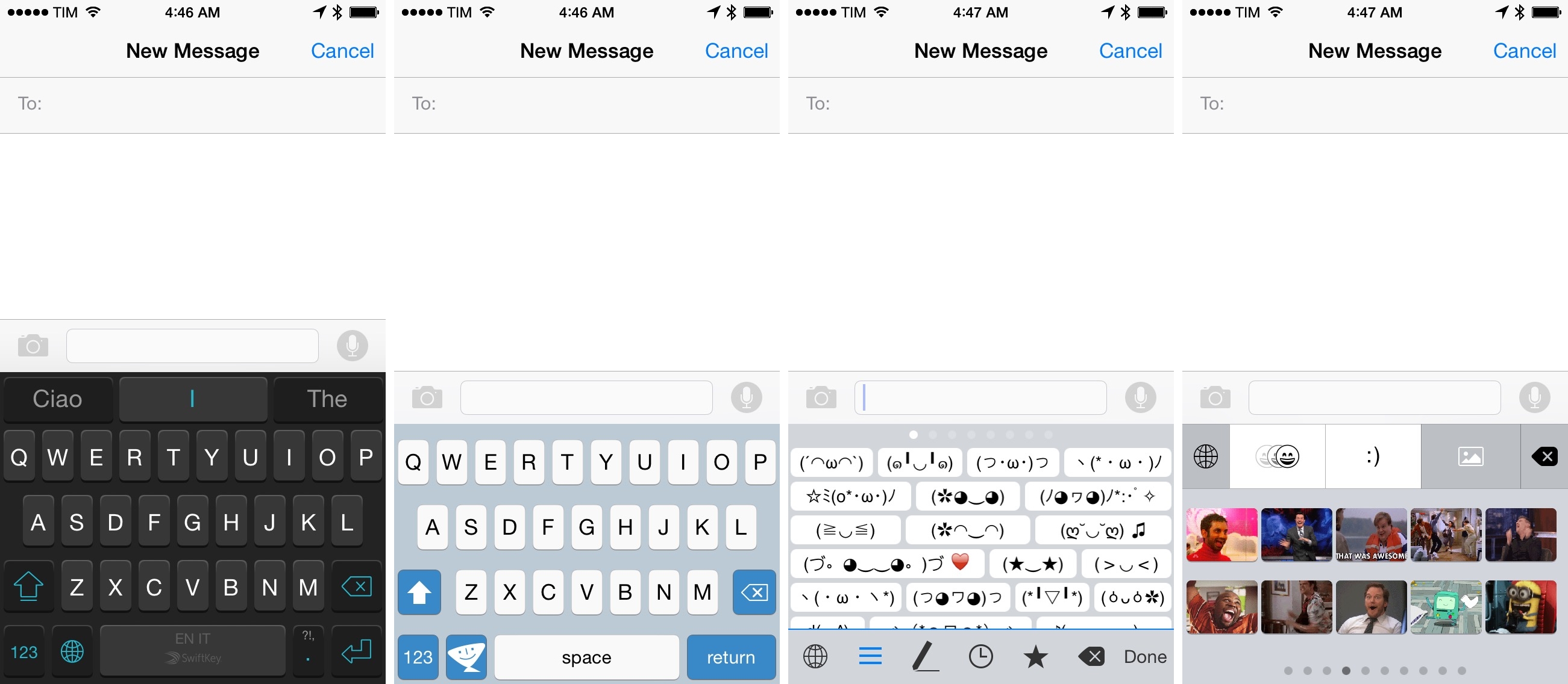
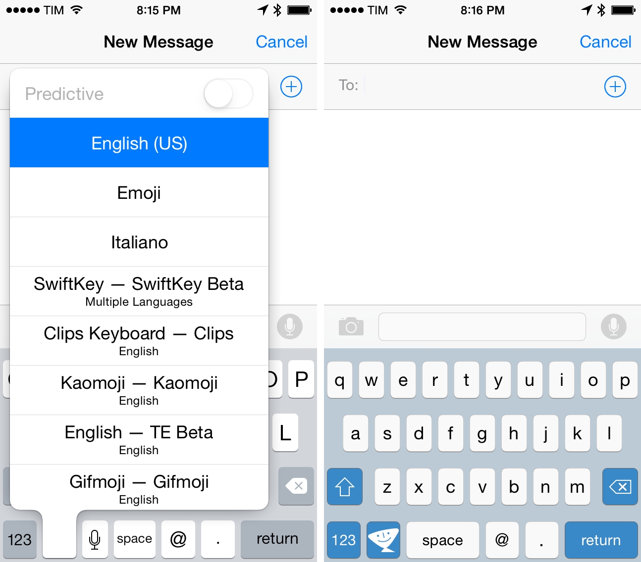
SwiftKey delivers accurate and personalized predictions based on your writing style (the keyboard can plug into your Twitter and Facebook accounts to learn how you write) with a swipe input method on the iPhone. The TextExpander keyboard expands your existing snippets as you type. There are going to be hundreds of custom keyboards on the App Store starting today and, like extensions, Apple opening up this area of iOS to third-party developers means we’ll see an explosion of new ideas – some of them useless and ugly, others elegant and powerful.
Generally speaking, I’ve been testing a few custom keyboards for iOS 8 and I still have to find a balance between the keyboard I’ve always used and new experiences offered by developers. Keyboards that provide a specific feature such as clipboard management or emoji insertion were easier to fit in my workflow because I know I use them when I need them. They are utilities, available in a new area of the OS. Single-purpose custom keyboards that deal with data and text in new ways will be huge on iOS 8.
Full-featured alternative keyboards are seeing a steeper adoption curve in my personal experience because I keep thinking that maybe I’m just fine with Apple’s keyboard. I assume that it’s a matter of time – for better or worse, I’ve been using the default keyboard for seven years now – and I’m curious to see if a keyboard will slowly gain an edge over Apple’s default solution over the coming months.
One of the big reasons behind my doubts for general-purpose custom keyboards are the limitations that Apple put around them, and I suspect that a lot of users will go through this phase.
Custom keyboards can’t:
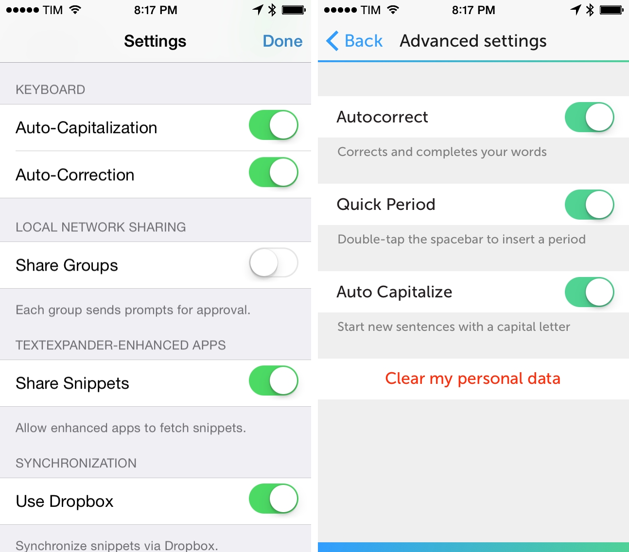
- Access the system settings of Auto-Capitalization, Enable Caps Lock, and dictionary reset feature
- Type into secure text input objects (password fields)
- Type into phone pad objects (phone dialer UIs)
- Select text
- Access the device microphone
Furthermore, app developers can choose to reject custom keyboards in their apps; and, while keyboards must display the keyboard switcher (globe) icon to return to the system keyboard, they can’t show a quick switch menu on tap & hold, which considerably slows down the process of moving across keyboards.
All these limitations can be overcome by setting preferences in each custom keyboard and accepting the fact that iOS will often default to the system keyboard due to privacy concerns. And that is fine: I appreciate the secure model that Apple built to protect customer data as much possible and I like that Internet access needs to be granted manually to custom keyboards.
But from a user’s perspective, this lack of deep system integration, little trade-offs, and increased friction add up over time when trying to use a general-purpose custom keyboard as your only keyboard. At least in my experience, I’ve found it easier to switch to simpler custom keyboards when I needed them rather than keyboards meant to be used all the time.
There are some great ideas coming out of developers of custom keyboards for iOS 8 and it’ll be interesting to see this market shape itself in the next year.
Until then, any developer who fixes Apple’s Shift key design is welcome.
Battery Usage
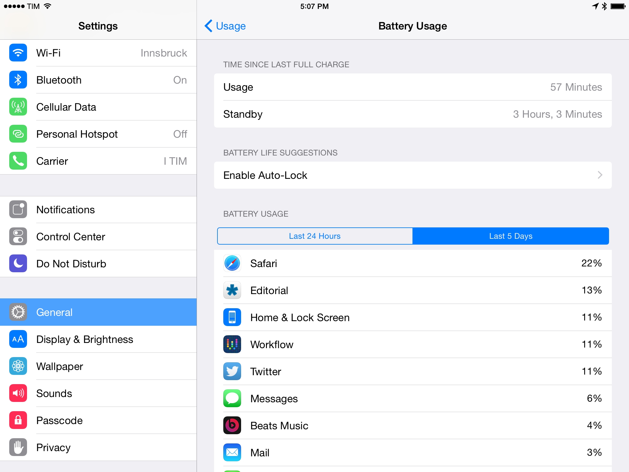
iOS 8 includes detailed battery usage statistics by app (also known as “battery shaming”) meant to expose apps that consume a lot of energy. These stats are available in Settings > General > Usage > Battery Usage and they can be viewed for the last 24 hours or x number of days (usually 3, 5, or 7 days).
It’s a simple addition taken from Mavericks, but it made an important difference in my everyday usage of the iPhone and iPad. I’ve already deleted a bunch of apps that were consuming too much battery in the background and that I didn’t know about, which has made my devices’ battery last longer. I can see which apps or system features are using my battery and how (Beats Music, for instance, says “Audio”) and there are handy suggestions to increase battery life such as enabling auto-lock or decreasing screen brightness.
This is a welcome addition, especially for people who spend a lot of hours on an iOS device each day. I’m hoping that next year we’ll get even more detailed stats with graphs and battery usage by app version.
A Note on iCloud Drive and Spotlight Suggestions
I’ve only briefly used Spotlight Suggestions and iCloud Drive on my devices and, while I believe they have potentially huge implications for search and file management, I’m not ready to have a complete opinion on them yet.
iCloud Drive is, in theory, a good idea: Apple realized that users like to organize their documents in folders after all, so they came up with a unified location that combines the old iCloud (files are inside their respective apps) with a traditional filesystem. In iCloud Drive, you’ll see folders with app icons on them, but you can also move files around, create new folders, and drop files anywhere you want.
iCloud Drive is shared across apps, meaning that any app can access files from other apps and save them without creating a duplicate copy. iCloud Drive is meant to replace the old Open In system and it shows Apple giving up on some of its vision for the sake of user convenience and simplicity, but it’s too early for me to tell whether it’ll have an impact on how I work on iOS.
The reason is twofold: I don’t use document-based iCloud apps and I was more interested to try document provider extensions, also new in iOS 8. In the past three months, none of the Dropbox-enabled apps I use switched to iCloud Drive and I’ve only been able to try one document provider (Transmit). I could elaborate on the principles behind these features, but I very much prefer to wait for a practical comment (plus, I already wrote about this topic in June).
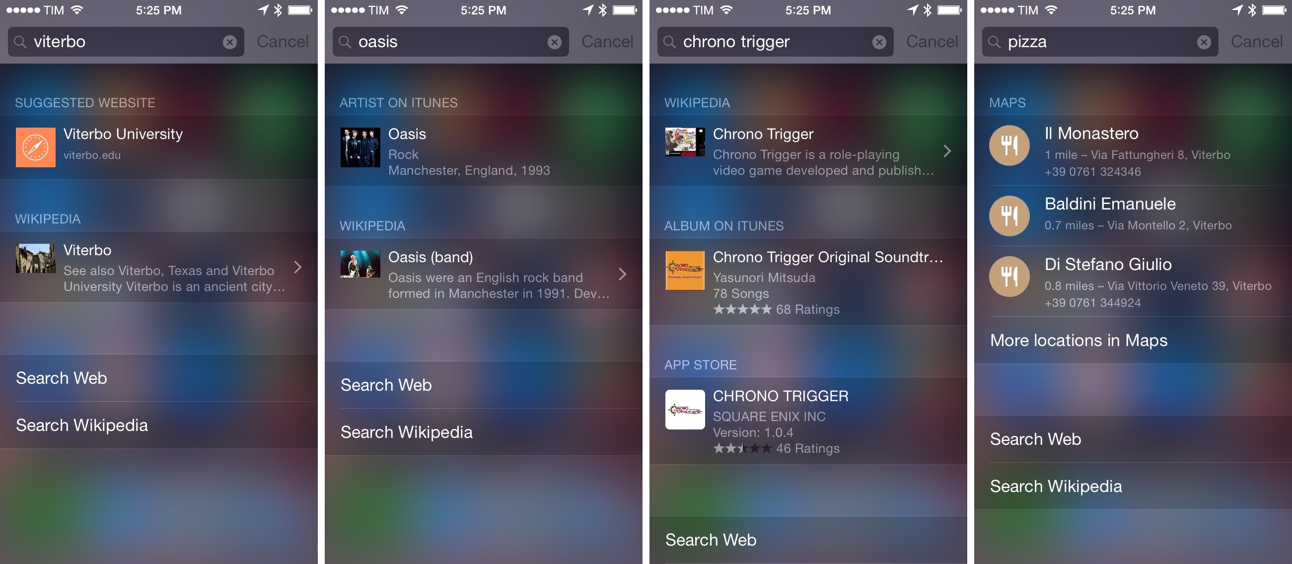
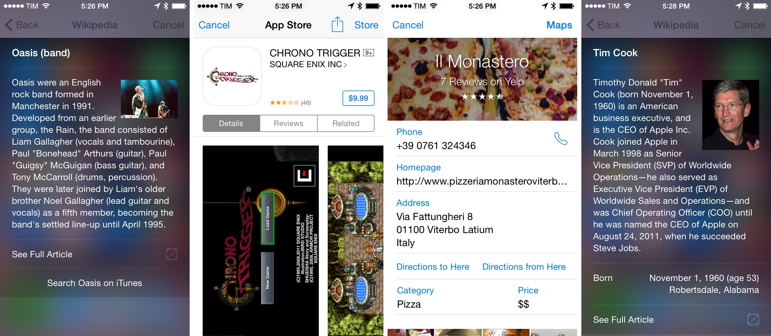
The issue with Spotlight Suggestions is different: I only managed to activate them a couple of weeks ago as they weren’t available in Italy during the iOS 8 beta. Spotlight Suggestions are a great idea: they put web content such as Wikipedia pages, iTunes and App Store results, Maps locations, and more directly into Spotlight without having to jump through Google or use the search field in an app. Apple wants to push Spotlight as the universal way to search and land on relevant results rather than an application launcher or search utility for your local data.
This is, potentially, a big problem for Google. In my two weeks of testing Spotlight Suggestions, I’ve already avoided Google a few times and arrived directly on Wikipedia or suggested websites thanks to Spotlight Suggestions (they are available in both Spotlight and Safari). Suggestions show a small snippet of text and a photo before you tap the result and they take you directly to the relevant page without seeing ads or small links to choose from. Not only is it faster, it’s a better user experience.
Apple is, however, facing years of habits and expectations when it comes to search. People associate search with Google and they’re used to open google.com even just to launch websites. Spotlight Suggestions display one or two top results based on what Apple think it’s appropriate, and they don’t obviously come with all the features of Google Search (namely faster suggestions and Google Images). For simple search queries, though, I think that Spotlight Suggestions are fine, and they’re growing on me.
It’s also interesting to think about Spotlight as a search engine for iOS apps. Spotlight Suggestions can look for results embedded in specific apps (iTunes Store, Mail, etc) and launch them without forcing you to open the app first. I would love to see Spotlight become a search feature that gets results from any app on my devices and that can be opened from anywhere, not just the Home screen.
Continuity
Continuity is Apple’s initiative to let iOS devices and Macs seamlessly exchange data and activities either automatically or manually with Handoff, and I’ve come to rely on some of its features quite a bit.
It seems obvious now that iPhones and iPads should relay messages and calls to each other and let you reply or respond on whichever device you prefer, and it’s already difficult for me to remember that this is a new functionality of iOS 8.
I love being able to pick a phone call and read SMS on my iPad without going in another room to find my iPhone. I’m often working with my iPad around the house, and I get the occasional phone call that I need to take but I don’t want to get up. Same with SMS – I have a couple of Android friends who still send regular messages and, of course, two-factor authentication systems rely on standard SMS.
Before iOS 7, I would get a confirmation code on my iPhone and I’d have to quickly find it and type the code manually into a login field of an app. With Continuity, I get the SMS relayed to my iPad so I can just copy and paste it.
My parents still like to call me with regular old phone calls (as does my doctor), and thanks to Continuity the phone part of the iPhone is turning into “just an antenna”. I rarely used my iPhone as a phone before, but now that I can receive and start phone calls on my iPad – which I’m always using for work all day – I’ve noticed that the Phone app is barely launched anymore.
Unfortunately, Apple decided to delay the SMS Relay feature until October, likely to fix remaining bugs in anticipation of OS X Yosemite. During the iOS 8 beta, SMS Relay worked very well on my iPhone 5s and iPad mini, and I’m surprised that Apple decided not to ship it for iOS 8 devices today.
I was impressed by Handoff when Apple announced the feature at WWDC and I still think that it’s a powerful concept executed elegantly, but, for practical purpose, Handoff hasn’t clicked for me yet.
Handoff lets you continue an activity on another device without losing your progress or data. For instance, you can start writing an email on your iPhone and decide to finish it on the iPad; by handing off that message, you’ll pick up the draft right where you left off – text and everything. You can do the same with webpages, iWork documents, notes, and third-party apps can implement Handoff as well, letting you seamlessly continue tasks across devices.
On iOS 8, Handoff is activated by swiping up an icon in the bottom left corner of the Home screen. That icon indicates the app you’re sending to another device, but it doesn’t hint at what you were doing inside that app; once swiped up, the app will simply resume and load your previous content and context as accurately as possible. Safari will open the webpage you were reading on another device, but it won’t resume your scroll position or text selection.
I tested Handoff with Apple’s apps and a couple of third-party apps that used the feature to switch between devices. Handoff makes for a good demo: activities are “beamed” instantly between my devices (you don’t need to be on the same local WiFi network) and apps can suggest fallback options if handed-off content can’t be opened in the same app. A Pinboard client that supported Handoff, for instance, could open a webpage I was reading in the app on my iPhone into the same app on the iPad; if I didn’t have the same app installed on the other device, Handoff could open the webpage in Safari instead.
My problem is that, besides technical tests, I never actively sought out Handoff when I was working on my iPad or iPhone. Usually, if I begin writing an email message on my iPhone it’s because I know I can finish it there; iCloud features like iCloud Photo Library and iCloud Tabs remove the need to get another device to find photos or webpages, and because both my iPhone and iPad are always with me, Handoff is mostly unnecessary.
I suppose that the Continuity picture will be complete and better judged once Yosemite is out. I love the automatic and passive propagation of my phone and FaceTime calls across devices; Handoff is neat, but I didn’t find a good use for it on my iOS devices. I’ll check back in October.
New Horizons
The reinvention of iOS starts from the fundamentals of user experience: how apps communicate with each other, how text is entered on the screen through a digital keyboard, or how documents are managed and stored in the cloud. iOS 8 shows an Apple that’s been listening and identifying the weaknesses of its mobile OS, paying attention to what users and developers wanted from their apps.
iOS used to be, for many, a limited platform where work couldn’t get done and apps couldn’t collaborate or exchange information. With iOS 8, the conversation has been changed to what can be done next. With a more versatile OS capable of being extensible but secure, Apple is creating a huge opportunity for every party involved: an opportunity for users to discover how iOS can help them in their daily lives; an opportunity for developers to explore new app markets and craft powerful software that wasn’t possible before.
In typical Apple fashion, new features introduced with iOS 8 will likely be updated with fixes and more options over the next releases and in iOS 9. Apple hasn’t showed many examples of action extensions and widgets in their apps, and the OS isn’t without its fair share of bugs (but they’re far less disruptive than last year’s).
More extension points will probably be added in the future (Copy & Paste and Control Center extensions in iOS 9 would be great), going beyond the share sheet and allowing developers to attach extensions to custom interfaces. The current implementation of action and share extensions is already an important step towards the elimination of proprietary sharing menus and the adoption of a more consistent, versatile extension system.
There are hundreds of new features in iOS 8 that I haven’t covered in this article because I wanted to focus on my experience with using iOS 8 for work every day. The apps that I’ve been trying over the past three months have profoundly changed the way I can work from my iPad all day: I could run MacStories on an iPad before, but iOS 8 has allowed me to stop finding workarounds to make the iPad do something it wasn’t built for.
And I’ve only tried a few apps for iOS 8. Starting today, we’re going to see new categories of apps on the App Store, built by developers who can work with brand new technologies for document management, inter-app communication, keyboard input, notification management, glanceable information, and more. If I was able to reconsider every aspect of my iOS workflow in three months with just a few iOS 8 apps, I can’t imagine the amount of innovation we’ll see over the next year.
iOS 8 is an incredibly democratic OS. Apple realized that a single company couldn’t provide all the tools for modern consumer needs, and they’ve decided to put the ball in the developers’ court. More than ever (and bugs aside), it feels like developers are building the iOS platform alongside Apple rather than competing with them. Three months into using iOS 8 every day, I sometimes forget that all these new features are now available to iOS users: many existing apps are having new beginnings, and adjusting expectations to new functionalities will take time.
The scope of iOS 8’s changes will truly make sense as developers keep building brand new experiences over the coming months. iOS has begun to open up, and there’s no stopping at this point.
iOS 8 has changed how I work from my iPhone and iPad. I’ve never been more excited about its future.
- Apple didn’t even provide extensions to test in their own apps during the iOS 8 beta testing period. ↩︎
- Third-party apps can also create new accounts in iCloud Keychain. ↩︎
- Tapping Delete on the Lock screen’s Notification Center will also ask for a passcode or Touch ID, which confused me initially (I thought it was a bug). It’s a good move. I tested a third-party email app with support for the same actionable notifications, and the buttons worked as expected. ↩︎


