With Inbox, Google dares to be different
The bold, new interface to Gmail likely will confuse and alienate a lot of people. But somebody needs to give us a better way to handle email overload.


- Shankland covered the tech industry for more than 25 years and was a science writer for five years before that. He has deep expertise in microprocessors, digital photography, computer hardware and software, internet standards, web technology, and more.
It's a good thing Google's new Inbox email interface isn't mandatory, because it's going to take awhile for the world to get used to it.
Google clearly believes Inbox is the future of its Gmail service. But it's quite a departure from the email we've grown used to over the last couple of decades. Gone is the single list of incoming messages. Gone is the list of folders on the left side of your PC's screen. Gone is the trash can icon.
What replaces these standard features? An act of faith. When you use Inbox, you're trusting Google's algorithms to show you what you want and what you need. Instead of presenting you with a chronologically arranged list of everything, squeezing as much as possible onto a screen and leaving it up to you to decide what to handle and what to defer, Inbox sorts what you've got and presents what it deems important.
Done well, that's not a bad thing. With the daily email volume growing beyond manageable levels, bringing some order to the chaos is a good idea. Even if you want full manual control over your inbox, it's inevitable you'll miss something when there are hundreds or thousands of messages arriving daily. At some point, we'll have to rely on computers to sift the wheat from the chaff.
Google is probably the best-positioned company to try to deliver this radical an overhaul. The company controls both the back-end Gmail service and the front-end apps most people use to reach it. It has the Google Now technology to blend in what's relevant to a particular individual. Oh, yeah, and let's not forget that it's got years of experience delivering on its mission to organize the world's information and make it useful.
Welcome to Inbox
Google Inbox is available as an app for the Web, Apple's iOS and Google's own Android operating system. For now, using Inbox is an invitation-only option; Gmail users can request access by sending an email to inbox@google.com.
For the curious, I recommend skipping Google's shallow promotional video and going straight to the Inbox introduction instead. It's still too fast to function as a tutorial, but it at least it's actually designed to show how to use Inbox. (The curious might also want to read CNET Review's hands-on take on Inbox here. )
Among the Inbox features, which I've been trying for a few hours now:
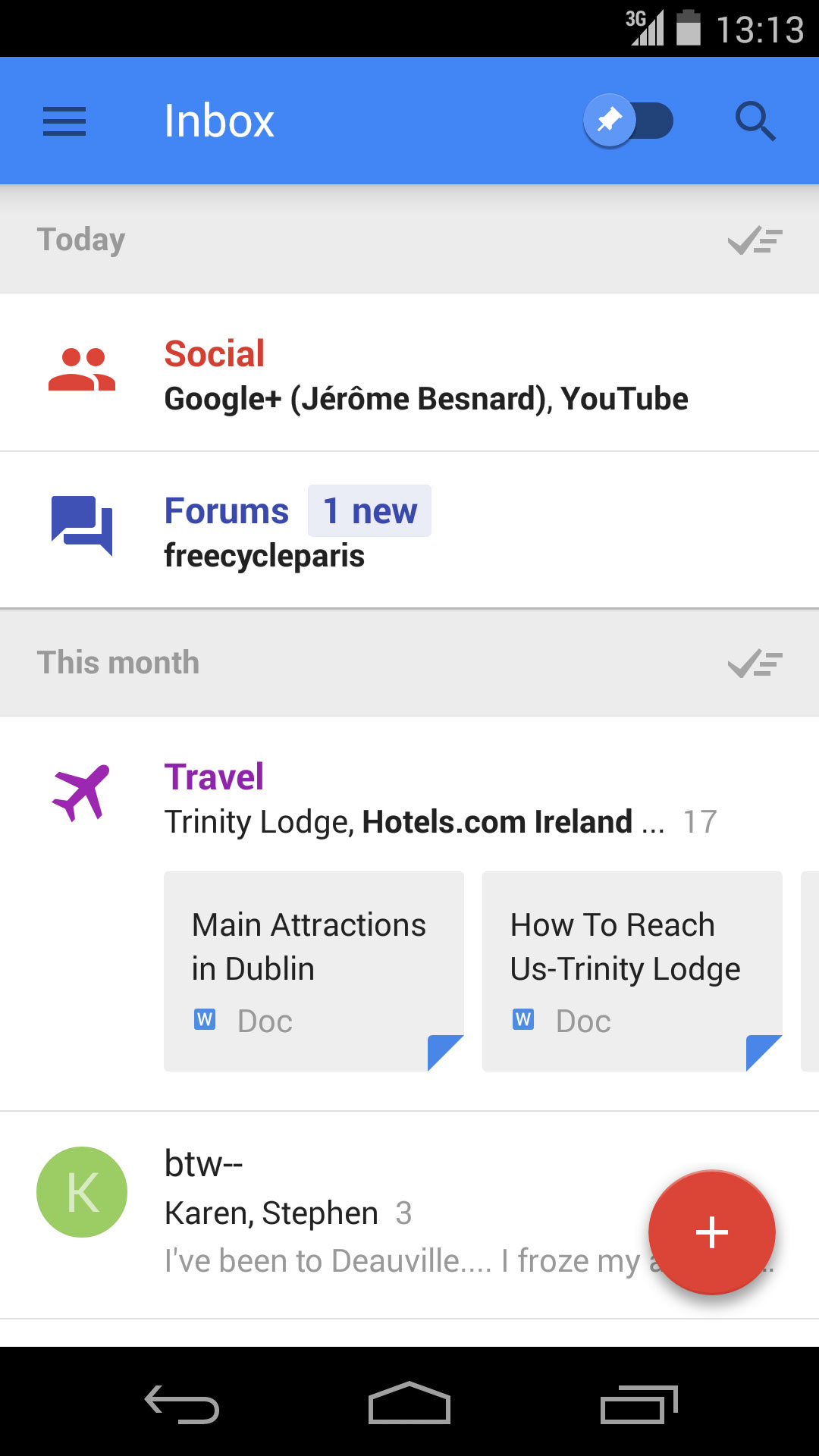
- It automatically groups emails into categories called bundles, creating several of its own and letting you add your own.
- It lets you easily declare yourself done with individual messages or entire bundles.
- It gives messages a snooze button if you want to deal with them later and a pin button to keep important message front and center.
- It offers a big round button on the lower right of the screen for quick access to a choice of likely actions.
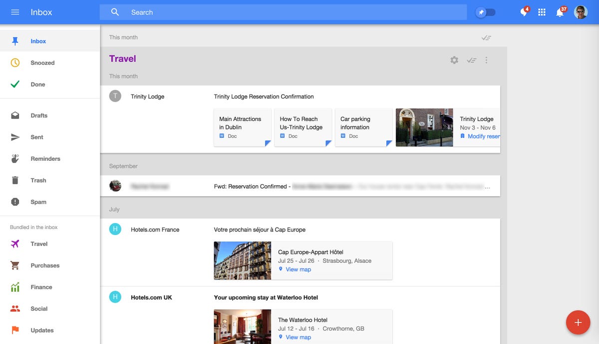
- It spotlights extracts of individual messages and augments them with online information such as airline flight status.
But when you first encounter Inbox, your gut reaction is likely to be confusion.
Even though it has familiar features from Gmail and other email services, everything looks different, and it's hard to distinguish what's truly new from what just got a new name or a new look.
Traditional email inboxes, including Gmail's, present a long list of messages, usually with the newest at the top. With Inbox, you have to get used to the idea of fewer messages, showing more information.
On a PC with a big screen, that's not too jarring a difference, especially if you weren't using Gmail's "compact" layout option. But on a smartphone, it's not uncommon to see just two or three messages and a bundle and some of its contents.
Expanding messages
When you click or tap on an individual email message, Inbox expands it within the interface rather than taking you to a new screen. The same expansion happens when you click or tap a conversation -- Gmail's nested collection of the back-and-forth messages grouped under their common subject line. And yes, it happens with bundles, too. One of the big adjustments you'll have to make with Inbox is distinguishing messages from bundles. And if Google further unifies messaging by blending in the text messaging and voice communications from its Hangouts service, there will be more adjustments to come.
One existing Gmail feature, the archive, has been repackaged. In Gmail, the archive button sweeps messages out of the way but lets you retrieve them later via search. In Inbox, that becomes the "done" checkbox.
Similarly, bundles are easier to grasp once you realize they're just an expanded version of Gmail's existing tabbed interface, which splits emails into categories such as primary, social and promotions. With bundles, there are some new default categories: travel, finance and purchases.
Trashing the trash can
One change a lot of people will dislike is the missing trash can. That harkens back to the earliest days of Gmail, which debuted publicly on April 1, 2004 with the ethos that you should archive your messages instead of delete them. Google tried again with the Gmail Android app, which for a short time in 2013 excised the delete button. You can still delete messages, but it's two taps on a phone and two clicks on a PC.
Inbox comes with a button that offers a scary degree of power: the "done" checkbox. Google wants you to see your inbox as a to-do list, and evidently it wants to give you that dopamine hit you get when you check all those checkboxes so your inbox is all tidied up. But be careful: marking an entire bundle "done" can mean you won't see messages unless you go looking for them. The cautious among us will perhaps prefer Inbox's slick snooze feature, similar to that used in the Dropbox Mailbox app. Swiping a message toward the left in the Inbox mobile apps makes it go away for a few hours, a day, a week, or a specified time. (Swiping a message to the right marks it "done.")
My advice for Inbox users is to start with the Web interface to get a feel for it on a bigger screen, where it will look a bit more like your old inbox, then pick up the mobile app after that.
Curiously, the thing that got me to adjust to Inbox fastest was muscle memory. That's because Gmail's keyboard shortcuts -- J and K to cruise up and down your inbox, O to open, X to select, E to archive, # to delete -- all work in Inbox, too.
Google clearly has put a lot of thought into Inbox. Its design is fast and clean -- a standout example of Google's new material design philosophy. Inbox works remarkably similarly across mobile devices and PCs.
It's jarringly different from what you're used to. But as long as Inbox remains optional, that's OK. Somebody needs to shake up email, and Google is the one most likely to succeed.