Obligatory Apple sales post
July 28, 2016 at 8:43 PM by Dr. Drang
Apple’s 2016-Q3 numbers came out a couple of days ago, and there was the usual orgy of chart making and hot takes. MacStories and Six Colors are in a tight competition for the hottest takes and the most orgiastic charts. Because it’s two days after the fact, my takes are lukewarm at best, but nobody’s charts are as compact or as handsomely branded as mine.
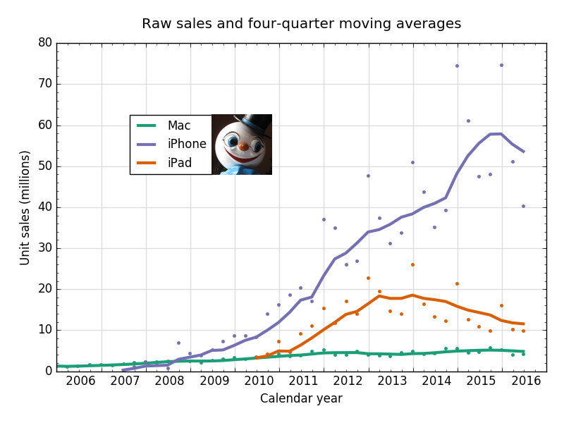
The dots are the raw quarterly data and the lines are the now de rigueur trailing four-quarter moving averages. The abscissa is the regular calendar, not Apple’s off-by-three-months fiscal calendar: Q2 ends (and is plotted) on the last Saturday in March, Q3 ends on the last Saturday in June, Q4 is on the last Saturday in September, and Q1 ends on the last Saturday in December of the previous year. I plot it this way because I think the real calendar is easier to understand—and I like to be annoying.
Let’s start with the Mac, where the lackluster sales are a perfect reflection of the effort Apple’s been putting into it recently. Among notebooks, only the weird and underpowered Retina Macbook has gotten any love recently. In the desktop world, the iMac had a leap in quality when it went Retina, but that was almost two years ago, and the less said about the Pro and the Mini the better.
As for the iPad, its unit sales are still decreasing, but its revenue is increasing thanks to the more expensive iPad Pro. Jason Snell has a nice chart of average selling price that shows a distinct jump up for the iPad line this past quarter. The ASP is 18% up year-over-year, which is how a 9% decline in unit sales becomes a 7% increase in revenue.
(I’m compelled to say that I was disappointed to read this tweet from Federico Viticci and this post from John Gruber. Both touted the revenue increase without mentioning the continued unit sales decrease. I know they both linked to the full story, but the election year has made me weary of obvious half-truths.)
Unlike with the Mac, Apple has truly improved the iPad hardware over the past few iterations. It must be terribly frustrating for that hard work to have such small returns. But if you squint, you can see that sales are maybe/possibly/conceivably starting to level off from their two-year decline. When people talk about sales “leveling off” it’s usually a bad sign, but not in this case.
Finally, the iPhone. Down substantially from Q3 of 2015 (8.5% in units, 7.7% in revenue), but as I said back in January, 2015 was a tremendous year for iPhone sales because of the pent-up demand for a larger phone. A better comparison (and Jason made this same point) is to look at the trend from the years before and skip over the iPhone 6.
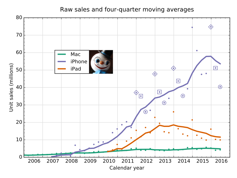
Here’s the same chart, but with the raw figures for Q1, Q2, and Q3 highlighted with diamonds, squares, and circles, respectively. I don’t go back further than the iPhone 4S because that’s when the current fall release schedule began.
Looking only at the highlighted sales, we see that 2016 looks like a reasonable continuation of the years before the iPhone 6. Q1 (diamond) is higher than we might expect, Q2 and Q3 are perhaps a bit lower, but nothing is significantly out of whack. You’d get the same impression if you extended the moving average line from the trend before the kink at the end of 2014.
Is this a Panglossian view? Maybe. But simply looking at year-over-year data is too pessimistic. We’ll have plenty of opportunity to declare Apple dead if the iPhone 7 tanks.
Update 07/29/2016 5:35 AM
The colors in the plot were originally the green, blue, and red from Matplotlib’s standard palette. I had intended to change the script that makes the chart to use a palette that’s more friendly to color blind readers, but I forgot. Now it’s fixed, and any further iterations of the chart will use the new colors.
The section of the script that plots the raw data and moving averages now looks like this:
python:
ax.plot(macDates, macMA, '-', color='#1b9e77', linewidth=3, label='Mac')
ax.plot(macDates, macRaw, '.', color='#1b9e77')
ax.plot(phoneDates, phoneMA, '-', color='#7570b3', linewidth=3, label='iPhone')
ax.plot(phoneDates, phoneRaw, '.', color='#7570b3')
ax.plot(padDates, padMA, '-', color='#d95f02', linewidth=3, label='iPad')
ax.plot(padDates, padRaw, '.', color='#d95f02')
The new colors came from Cynthia Brewer’s online color picker.


