Microsoft changed how the Xbox One Home button works, and I'm not sure I like it
One button press becomes three. Also, I'm old and resistant to change.


- Author of the award-winning, NY Times-reviewed nonfiction book The Tetris Effect; Longtime consumer technology expert for CBS Mornings
The great thing about modern game consoles is that they do a lot more than just play games. Besides gaming, I actually use my Xbox One much more frequently as a streaming media machine, jumping between Netflix, Amazon Video, Vudu, YouTube and all the apps for my favorite cable channels, from Syfy to Comedy Central to HBO.
A simple tap of the center home button on the Xbox One controller will take me right back to the main menu, also called the home screen, which allows for fast and easy swapping between video apps. Or at least it used to.

Pressing the center button on the Xbox One controller now brings up a Guide sidebar, rather than the traditional home screen.
I powered up my Xbox One this past week only to find a required system software update waiting for me. After downloading and installing it, the system warned that the functionality of the home button on the controller was changing before suggesting I watch a short how-to video that explained how it was going to work from now on. Experience tells me that if they have to offer a video tutorial, chances are it's not going to be an entirely intuitive concept.
Now, instead of tapping the home button to go, you know, home, it instead brings up a new version of something Microsoft calls the Guide, a one-stop shop for all kinds of apps, features and menus. Yes, it covers a lot of the same ground as the traditional home screen, but it also crams a lot more information into a small sidebar that covers about one-third of the screen.
From the new Guide, getting back to the home requires you to press the A button on the controller, which highlights a button labeled "Home," then pressing the A button again to confirm. That means we've gone from pressing the Home button on the controller to pressing the Home button on the controller, then pressing A and then pressing A again. Easy, right?
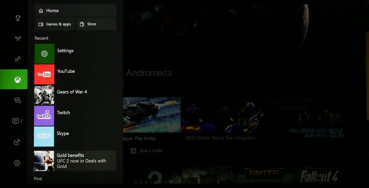
This is the sidebar view you get when hitting the Home button on the controller.
You can find most of the same things through the Guide, but it can involve tapping over from the left column of the sidebar to the middle one before scrolling down to find the new, smaller icons for frequently accessed apps. Also lost in the translation is a very cool Xbox feature which showed a live preview of the main active app on the home screen. The processing overhead required for this is one of the reasons Microsoft says the new system may feel zippier than the old one.
I'm not alone in my wariness. I checked Reddit's Xbox One board and found other detractors.
"Is it just me, or was it so much nicer being able to press the Xbox button once to go home, and twice to open the guide? I hate how you have an extra 2 button presses (Yes, I understand it isn't a ton of work) to get home now." --EmbraceCha0s
"What could be faster than turning a one button operation into a three button operation?!?!" --thegreatestajax
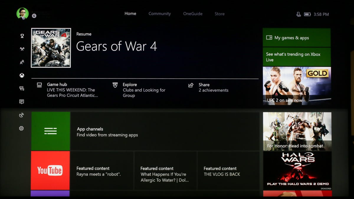
Three button presses later, here we are back at the traditional home screen.
To be fair, the new system has its supporters as well.
"Here's the thing. You no longer have a reason to go "home." So the inconvenience of the extra button pushes are irrelevant. The point of the update is to make "home" accessible anywhere via the sidebar. You can access everything from there. It is "home" now essentially." --BrinkofEternity
"I will say that it did take a little to get used to the new UI, but I prefer it now." --pizzatarian
When I asked Microsoft if I was alone in feeling a bit put out by the Home button switchup, the company told me:
"We redesigned the Guide and Home based on feedback from the community to continue to drive more overall performance. We took the most popular multitasking experiences gamers were using and built them directly into the Guide on a new start page. The redesign enables gamers to quickly get to the content they care about most, including My Games and Apps, Home, the Store and recently launched and pinned applications."
There may be a lot of reasons the new menu system is better or faster for some use cases. For me, usually switching between streaming video apps on the fly, it feels less intuitive and requires extra inputs.
But I'm also open to the possibility that I'm just old and resistant to change.