DigitalPage: A unique note-taking app with great expandability

DigitalPage
Note-taking becomes a habit. Once the user is hooked on one note-taking app, it's hard to be swayed to another due to familairity, long investment, and an expanse of catalogued data. Due to a saturated market led by the dominance of Evernote, any rival must offer intuitive and innovative ways to organize accumulating data, while at the same time being easy to navigate.
DigitalPage's namesake app gets a lot of the must-haves right. But its key differentiating point is its literal "map" of pages called "Page Map", which allows you to visualize your pages, offering a new way to navigate and catalogue. Touting itself as an "integrated memo", it offers multiple fresh utilities that could get a long-term Evernote user on-board.
Free-format page with wealth of options
Users can immediately begin writing their "page", otherwise known as a "note", once logged in by pressing the "write" bar on the homepage, or by clicking the pen-shaped icon.
Once on the individual page, it's basically free-formatting. You can start or end your page as a simple note, and can scribble down up to 3,000 characters.
At the bottom of the page there is the edit bar with a plus-shaped icon on the left, which allows you to pick out your photo album, record your voice, and attach them to the page. The right icon at the tool bar offers to-do, schedule, location (linked to Google Maps), calendar, contact, alarm, and tag. Each has its own native color -- for example location is in red -- and you can choose one to attach as hyperlinked text.
DigitalPage's simplified the tool bar well enough, grouping photo and audio on the left and the rest on the right. The native colors given to each hyperlink allows for easy distinction. DigitalPage definitely offers enough options and combinations for the user to add their own character. Each page is like a blank whiteboard or scrapbook ready to be filled in.
DigitalPage Homepage.
Suggested
Suggested is the flagship feature that DigitalPage is touting. Once a couple of pages are saved, the app begins to suggest pages that you might want to look at again. The "suggested" bar is right below the "write" bar, so it's one of the first thing users see when starting DigitalPage.
Users see a "brief" of what the suggested page is about, as well as a native color. The point of this feature is to cut through the navigation process altogether, showing what the user wants before they look for it. The app even has its own suggestion algorithm based on the current time, location, and context.
To appreciate the "suggested" feature takes time. After a month of use, I've accumulated a little over 100 pages, and obviously I couldn't remember all of them. As an automatic reminder, it was very useful. If I'd booked a schedule beforehand, on the day itself DigitalPage suggested that page. Other times it suggested old pages that had slipped my mind; even without opening the page, I found the briefs beneficial. The feature basically serves as cordial heads-up.
Scroll, click & continue writing
The smartphone was meant to be scrolled, clicked, and occasionally swiped, and DigitalPage's homepage and overall UI catches this spirit well for the most part.
Below the top menu bar and write bar, recently created or edited pages are laid in a list, much like most news apps, and you can simply scroll to find. At the right of each list there is the link icon that shows how many others this particular page is "linked" to (but more on that later).
You can slide a page on the list to the left by swiping; at the right there is the trash icon to delete the pages. All deleted pages are collected in the trash bin and are recoverable. So far, all pretty familiar and easy enough for users to do without even thinking.
The bottom menu bar comes with five icons: "Back to homepage", "search", "write" (a slightly larger, very noticeable pen-shaped icon), "calendar", and "about". It's a set-up that lets users get into the brass tax: writing, checking your schedule, and editing.
Link & Page Map: A new way of cataloging
Here's where it gets interesting. The Link feature is a unique way of allowing users to catalogue their pages by drawing up what it calls a Page Map: a molecule interaction map, with the molecules as your pages.
DigitalPage's Page Map
It takes time to build up to this as you need a few pages saved. At the top right corner of every saved page, there is a link icon. After you are done with a page, click the button to load the Page Map screen. You'll see the page you have just written as a squircle at the center of a white background. Press on the squircle. You can then press the chain shaped icon to load up search and a list of pages you have recently edited. Press on one you think is thematically "linked" to the page. The white screen reloads, and a new squircle then appears attached, or linked, to the first squircle.
You can keep manually adding new squircles around the original page, until you have a huge molecule map with countless molecules. Once you're inside a page to edit, the linked pages are shown at the bottom in a film-type bar that you can swipe left and right to view and edit.
This sounds complicated in text, but the visual experience is a lot simpler. Basically, the link bar allows for instant jumping from page to page, while the Page Map is a visualization of all the linked pages for ease of use.
I think DigitalPage is onto something here. Having a Page Map in the shape of molecule interaction map is unique and makes the experience fully optimized for smartphones. Although the PC version offers the feature too, the UI is really there with smartphones in mind. It takes advantage how infinitely you can zoom in and out of a page in the palm of your hand. It's different from Evernote's notebook, done in a scrapbook format. DigitalPage, like its name, embraces "digital" rather than looking back at analogue.
The drawback is the squircles are pixelated, depending on how much you zoom in and out, making it often visually clunky. Hopefully this is something they can fine-tune in later updates.
Tag, Search then Link
Tag and search is obligatory for any note-taking app, and DigitalPage offers just that. You can attach a tag to any page with a keyword, and can search all the pages with that particular keyword tag at the search menu, which is readily available at the bottom of the homepage.
But if you are hooked on drawing your own Page Map, you can still utilize tag and search during "mapping" to find the page you want.
Suggest Link
DigitalPage also suggests links on the Page Map as more and more pages are saved. Multiple "recommended" squircles in purple will be shown around the already existing squircles. Simply press on one of the recommendations and it will attach to your Page Map.
DigitalPage says it correlates these suggestions based on all the content, location, and tags that you have saved based on machine learning, so the more you save, the more accurate the suggestion gets.
After a month using the app, I found the suggestions to be helpful in certain cases and very exact in others. The most important point for a feature like this is to be not intrusive. It must not feel like the app is trying to tell you what to do; if it does, it's like an annoying pop-up. Luckily, a lot of the time, the suggestions were spot on, and successfully reduced navigation or organization time.
View in Calendar
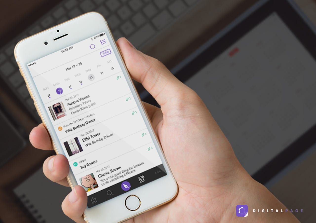
By clicking the fourth-from-left icon on the bottom menu bar, you're taken to the "all page" list, which is organized based on chronology in a calendar. Click on a date and under the bar will be a list of all the pages you created and edited at a particular date.
The UI is very simple, and users can use the pre-loaded weekly bar to find recent edits or load the monthly bar to go back further through your personal memory lane. Do away with the calendar by clicking the list icon on the top-right corner, and a page list loads with the most recent at the top.
It's nothing special, but the calendar feature is another good option that caters for the note-taker who prefers to find pages based on time rather than theme.
Worth a try?
DigitalPage is not yet perfect. I hope the next update focuses on fine-tuning the Page Map even more, so that it becomes stylistically flawless and smoother to navigate. I felt a lot of the back and forth could be made simpler; there must be a way to make integration of the tag option with search and link simpler. I hope DigitalPage finds the right balance between consumer choice and ease of use for future versions, as well as better pixels in the Page Map.
But overall, DigitalPage makes for a satisfactory experience. New features such as Page Map manage to enhance the utility and enjoyment of the app without being gimmicky. The final result is generally easy note-taking, and just enough more for the experience to be fun.