Apple is a company that once prided itself on refusing to compromise the iPhone’s design and user experience. Most notably, Apple was years late to the phablet market because it wanted to find the ideal design for an iPhone with a larger display (and it must have, since it has reused the same design for three consecutive years). If recent rumors pan out, however, Apple’s upcoming new iPhone 8 makes one of the worst design compromises we’ve ever seen. Let’s take a few moments to talk it through.
Here’s a render of an upcoming new Android phone by a company called Essential that’s getting some buzz among hardcore Android fans:

It’s difficult to find the words to express how terrible the phone’s display design is. “Bezel-less” is the trend du jour in 2017, and it’s glorious when it’s done right. When it’s done wrong, you end up with something like this new Essential phone, with a hideous notch cut out of the top of the display. Do you really want a huge chunk taken out of the top of your UI? Lordy does that look awful…
Apple would never do anything so ridiculous, right? Right?
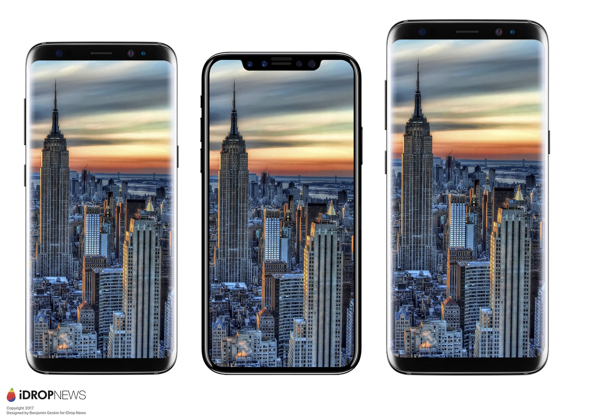
The iPhone 8 has long been rumored to feature a new design that dramatically shrinks the bezels surrounding its screen. The current crop of iPhones have much more wasted space surrounding their displays than top Android phones have had over the past couple of years, so the change will be a welcome one… if it’s done well.
According to the most recent crop of rumors, Apple’s next-generation iPhone will look something like this render, which is sandwiched between the Galaxy S8 and Galaxy S8+:

Ugh.
The idea of Apple removing the home button and embedding the Touch ID scanner into the phone’s display is fantastic. The idea that Apple would maul the top of the iPhone 8’s display just to get the corners as close as possible to being bezel-free is not.
In terms of usability, a design like this would only make sense if the top portions of the screen were off-limits to the majority of the phone’s UI, reserved only for status bar items like signal strength and battery life. Then the background up there would always be black, and you wouldn’t be left with photos and other graphics that have a big chunk cut out of them. Of course, this would only work if Apple decides not to make the iPhone 8 in light colors, since the bezels on the face of the handset would need to be black.
If the render above does indeed resemble Apple’s final iPhone 8 design, and Apple doesn’t reserve that extra display space only for status bar items, it would be yet another example of a compromise to the user experience that feels very un-Apple. Would the Apple of the late 2000s have made an iPhone with a huge ugly notch cut out of the display? Would the Apple of the late 2000s have rushed out a redesigned MacBook Pro without the latest-generation processors, or released a wireless mouse that can’t be used while it’s charging?
But hey, at least Apple will be able to brag about its nearly bezel-less iPhone 8 when it unveils the new phone in September, right?


