
iOS 11 App Icon Refresh Hints at Apple’s Future Advancements
 Credit: iDB
Toggle Dark Mode
Apple’s upcoming iOS 11 software update will usher in perhaps the most major overhaul since the release of iOS 7 back in 2013. At the core of iOS 11 will be the all-new, dramatically redesigned Control Center, as well as a myriad of app switching and advanced multi-tasking capabilities optimized for iPad. We’ll also get a bounty of the usual UI tweaks and performance enhancements throughout the operating system, however according to Apple’s latest iOS 11 developer beta 6 release, there will also be a few subtler changes onboard — specifically, in relation to the design of some iOS 11 system app icons.
New App Store & Maps Icons
First up, we have the redesigned App Store icon, which for iOS 11 has done away with the pencil, ruler, paintbrush design of old, and has interestingly shifted to what appears to resemble popsicle sticks configured in the same ‘A’ shape as before.
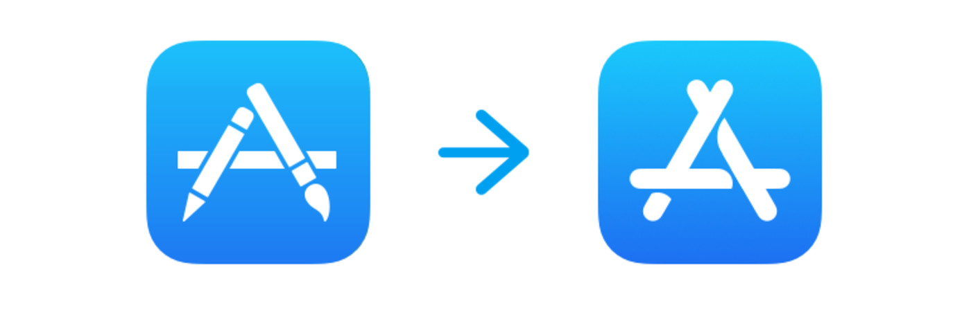
The changes were first brought to light by iCulture, and while it may seem somewhat nonsensical for Apple to do away with the more meticulously designed pencil/ruler/paintbrush, it should be noted, according to NextWeb, that the new icon has apparently been designed to “look better at higher resolutions,” which may or may not hint that Apple’s iPhone will be bumping up the pixels this year. (Hint: We already know the iPhone 8 will.)
Next up, we have Apple’s Maps icon for iOS 11, which has been redesigned to reflect the company’s all-new Apple Park headquarters in Cupertino. As you can see in the image below, the traditional intersection of Infinite Loop and the Interstate Highway 280 in Northern California has been replaced with a subtler design of the same freeway with the partial outline of a circular structure in the upper right-hand corner.
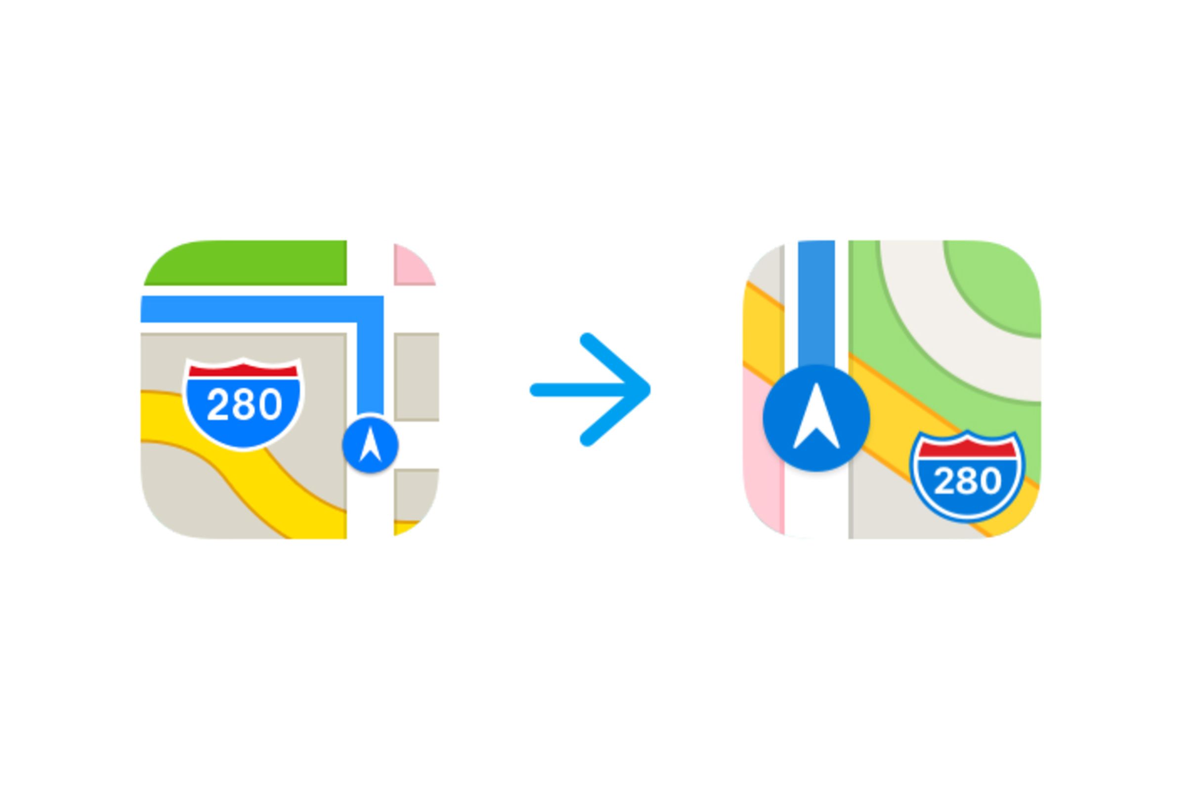
It’s not 100% guaranteed that this circular structure is intended to reflect Apple Park, however given the timing of iOS 11’s release in relation to both the design and grand-opening of Apple Park, it’s likely that Apple’s iOS team decided to make the switch to commemorate the opening of Cupertino’s 2.8 million square-foot “spaceship.”
Other Subtle Icon Changes
There are, of course, other app icons that have been redesigned ever-so-subtly in iOS 11, too. Although Maps and the App Store arguably lead the way in terms of their reconfiguration, Apple also made a few minor changes to app icons including Clock, making the numbers a bit thicker than they are in iOS 10, as well as to Safari, which introduces a change so subtle, you probably won’t even notice the difference! But it’s there, nevertheless, according to the wonderful world of Twitter.
Wow, Apple really moved the needle with the new Safari icon pic.twitter.com/ntCxGzkWfr
— Jordan Kay (@_Jordan) July 25, 2017


