Like all Apple products, macOS is an accessible platform. Blind and low vision users can navigate their Mac using VoiceOver, while someone who has physical motor delays can use Switch Control to edit videos in Final Cut. And under the Accessibility pane in System Preferences, there is a multitude of other features one can use, ranging from Zoom to Invert Colors to closed-captioning and more. Whatever your need, the breadth and depth of Apple’s accessibility software spans many domains. This is why Apple is lauded as the industry leader in accessibility: the tools run deep and they’re well-designed.
Still, accessibility on macOS doesn’t quite reach feature parity with iOS. Amidst rumors that Apple is working on a cross-platform set of APIs to bridge the company’s two primary operating systems, now is an opportune time to consider what each platform does and what they offer one another.
In the context of accessibility, the way Apple brings consistency between iOS and macOS is by sharing features and technologies among the two. As such, there are some iOS-first features macOS sorely needs, while the Mac offers things iOS would benefit from as well. Such enhancements would not only improve the user experience across devices, but also would make iOS and Mac software richer, fuller products overall. And most importantly, more accessible.
Large Dynamic Type
Dynamic Type was introduced to iOS in 2013 with the release of iOS 7. Five years on, it’s hard to believe the feature has yet to make the jump to the Mac. Of all the things macOS needs, Dynamic Type should be near – if not at – the top of everyone’s list. It’s certainly at the top of mine.
While Zoom is an excellent tool for enlarging text, adding Dynamic Type would make it even better. The purpose of Dynamic Type is simple: it’s a set-it-and-forget-it slider that, when enabled, allows text size to be consistent system-wide. (Apple told me at WWDC last year it did a “ton” of work in iOS 11 to make text render better at the largest settings.) As on iOS, Apple could make a public API for Dynamic Type so developers could integrate it into their apps. Crucial, though, is the way in which Dynamic Type could augment the Mac’s UI in general. For elements such as the Finder and System Preferences, Dynamic Type would surely give those menus a visual boost, as the labels and iconography today are still fairly small, at least for me. Even something like the menu bar would be enhanced by Dynamic Type.
The lack of Dynamic Type in High Sierra today is even more glaring when you consider macOS runs on the 12-inch MacBook and the 27-inch iMac. These sit at polar opposites of the screen size spectrum, but one thing they have in common, in terms of accessibility, is that text and the like are relatively tiny. If you use either (or both) of these devices, chances are good you’ll increase the text size to see comfortably. This is particularly true on 27-inch displays because the sheer physical size of the screen means on-screen content is more spread out. Adjusting the screen’s resolution helps, but it’d be better if it could be used in tandem with Dynamic Type.
Larger Cursor Support on iOS
When I use the Mac, one way I make it more visually accessible is I have the mouse pointer set to the largest size. I prefer using a Magic Mouse with my Touch Bar MacBook Pro, and the bigger pointer makes it easy for me to find the cursor and click things. Likewise, I prefer dark mode in Ulysses on the Mac and iOS because the higher contrast makes it easier to find the insertion point when I’m writing or editing.
Apple should take the larger mouse pointer slider from macOS and bring it to iOS – particularly for text-editing, I’d like an option to enlarge the cursor. The current mechanic for moving the insertion point is fairly inaccessible, and it’s due to its small size. I find it frustratingly difficult to use. (Bonus suggestion: Another setting for enlarging the magnification loupe, akin to how you set the Mac dock’s magnification level.)
Give the Touch Bar a Taptic Engine
One of my hopes for this year’s WWDC is to see Apple announce improvements to the Touch Bar. I’m in the minority of people who like the Touch Bar; I believe it is genuinely useful for accessibility. The Touch Bar’s Zoom feature is one of the best pieces of software Apple has ever shipped. Hopefully 2018 brings more Touch Bar goodness.
One thing I believe the Touch Bar would benefit from immensely is haptic feedback. While it’s great at making commonly-used controls more readily accessible, the touch controls would be even better if they included haptics. I don’t know how technically feasible this is due to the incredibly small space the Touch Bar occupies, but it would be terrific if I felt a buzz or pulse every time I tapped a button or scrubbed through the screen brightness slider. The double dose of sensory integration would make the Touch Bar experience a richer one.
Dark Mode Everywhere
macOS currently has a dark mode feature, but it only affects the menu bar. It’s great and I use it; the higher contrast, especially when selecting menu items, makes using the menu bar a better experience. My only wish would be for Apple to extend the feature further into the OS: apply it to windows, the Finder, and other interface elements. And make it a public API for developers.
Likewise, iOS has a few apps (Clock, Stocks, the Apple Watch app) where it uses a “dark mode” interface. It’d be equally great if, again, Apple extended this dark mode to the entire system. It would help boost contrast, but it also would make it so that app developers wouldn’t need to roll their own dark modes. Make it an API and developers could let users switch to Apple’s dark mode whenever they wanted, for reasons of contrast, fatigued eyes, or whatnot. iOS is close to reaching its twelfth version; a dark mode is a long overdue addition.
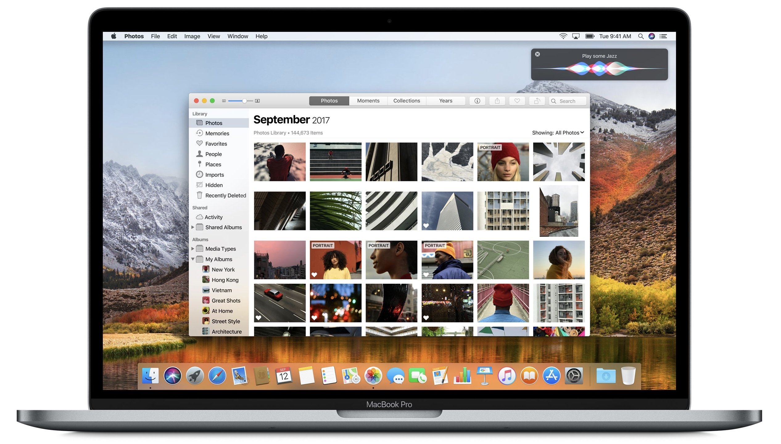
Make Mac Siri and Notifications Literally Front and Center
This is an admittedly esoteric request, but it bugs me often so I’ll mention it here. When you invoke Siri on iOS, the UI takes up the entire screen, and when notifications come in, they’re centered on-screen; by contrast, the Mac’s counterpart Siri and notification features have been relegated to the right side of the screen. At least in my experience – because my right eye is my weaker eye, visually speaking – this makes it awfully hard to focus my vision on Siri and notifications. Again, esoteric, but I actually would prefer Apple take an iOS approach to Siri and notifications on the Mac and center them on screen. At the very least, it would make reading notifications or infrequent Siri queries easier because the text would be right in front of me instead of off to the side.
As Apple’s platforms continue to mature, particularly iOS in this case, there are ripe opportunities to consider how they can be refined in the aggregate. The feature suggestions I list here are effectively design-oriented ones that are geared more towards usability than aesthetics. The addition of these would boost the accessible design of both the Mac and iOS, which ultimately makes the user experience better for everyone.