This article is more than 1 year old
Oracle launches its very own 'net threat map
Pew! Pew! The whole world is connected, and the Internet is super-dangerous
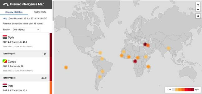
Eighteen months after acquiring Internet infrastructure outfit Dyn, Oracle has unveiled some of the smarts it bought in the form of an "Internet Intelligence Map".
Explaining the launch, Oracle's Director of Internet Analysis Doug Madory wrote “a self-serve capability for some of the insights we produce is a great way to move towards a healthier and more accountable Internet.”
The Internet Intelligence Map presents two points of view: country statistics, based on BGP route, traceroute responses, and incoming DNS queries to Oracle on a country-by-country basis.
Traffic Shifts is the second presentation, designed for viewers with more familiarity about how BGP works. Based on the hundreds of millions of traceroutes the system runs each day, Oracle correlates the penultimate network traffic traverses on its way to the destination network (AS, which stands for Autonomous System, is the identifier used).
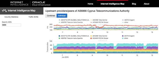
As networks change, traffic can shift from one transit provider to another, and this is what the traffic shift view captures. For example, the image below was captured by The Register at 10AM (Australian Eastern Standard Time) on June 14:
A simplistic interpretation is that the purple area belonging to AS174 (Cogent) had outages on June 9, June 10, and June 12. A better understanding is that on those occasions, Cogent didn't route any traffic to Cyprus Telecommunications (AS6866). Note that June 9 is a special case – OTE Global Solutions, Telecom Italia Sparkle and PCCW Global also briefly stopped sending traffic to AS6866, suggesting that it would be worth investigating what kind of outage would change flows from four transit providers.
Madory explained that the shifts are coloured blue because they're treated as neutral events: “On any given day, there are hundreds of such shifts as ISPs change transit providers or re-engineer their networks. The tool enumerates the top one hundred shifts in the previous 48-hour period and allows our users to explore a macro-level connectivity picture for any given AS.”
To be fair, then, it's much more than the notorious “pew-pew” maps popularised by the long-gone Norse Corp.
It may even – we'd need to take your advice on this, dear readers – stand as a competitor, at last, to the world-famous Threatbutt (to whom we are indebted for the subhead to this article). ®


