For space grey MacBook Pro with Touch Bar, Mojave Dark Mode is the new Aqua
 Daniel Eran Dilger
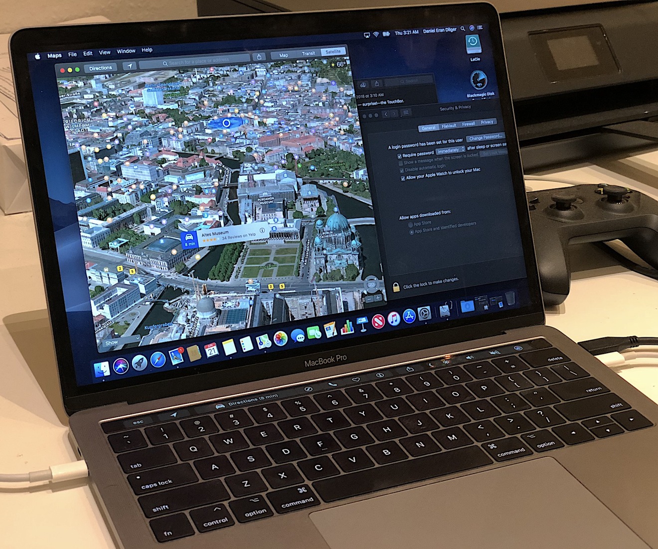
While Apple's new MacOS Mojave is designed to support a long tail of older Macs (dating back as far as 2010) it's particularly a treat when used on new machines. In particular, its new Dark Mode is ideal on a space grey MacBook Pro with Touch Bar.
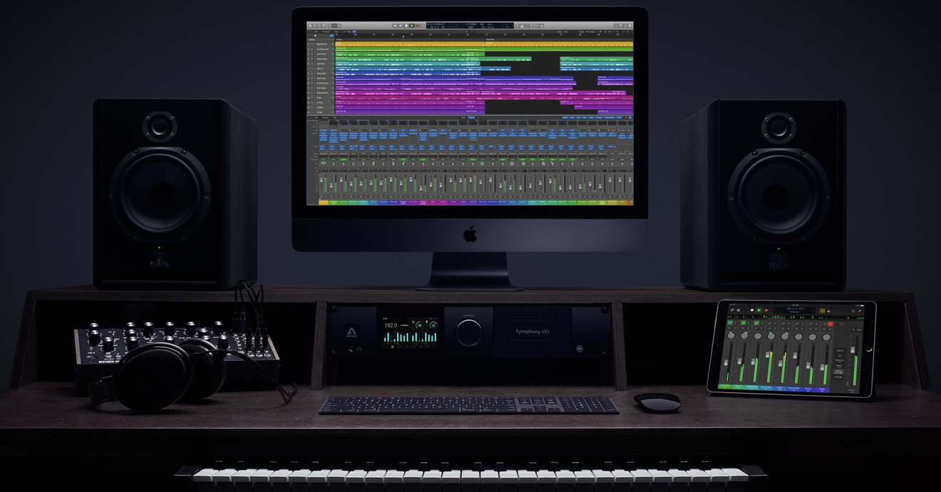
Apple's MacBook Pro, iMac Pro and razor thin Retina Display MacBooks all suggest that these luxury class Macs were built in anticipation of the Mojave release, with its new Dark Mode user interface that echoes Space Grey metal and the black display bezel the same way that the early 2000's Aqua UI of the first editions of Mac OS X reflected the translucent plastics of the Macs of that era.
The new Dark Mode in Mojave is the natural progression of Apple's work over the last few years that introduced developers to dark UI concepts— and the work that would be required to get their apps ready for a system-wide Dark Mode in the future. It might sound simple, but the work needed to make existing apps consistently look great in Dark Mode was a complex process that involved years of efforts. Third party developers are still working on it. Even Apple's own iWork team is still working on it.
The first modern suggestion of an alternative system wide Mac UI that I recall was presented at WWDC 2015— among guidelines for developers on how to make sure their apps followed best practices in design. Since macOS Yosemite (2014), Apple has been offering the option to display a "dark menu bar and dock," baby steps toward Dark Mode.
Even earlier, Apple had been experimenting with ways to highlight and focus attention using a minimal, dark UI. Back in the late 90s, Apple experimented with Brushed Metal as a way to distinguish QuickTime, then after acquiring Final Cut Pro, kept its dark grey interface as a way to focus attention on video content. Logic Pro, acquired in 2002, also featured a dark UI, which Apple retained and used across other Pro Apps.
In 2005, Apple's new "Front Row" UI for Macs focused attention on playing movies, music, photos and podcasts. The concept of dark framing progressed with full screen iLife apps and then system wide support for third party Full Screen Apps in 2011's macOS Lion, where a single app not only took over the desktop, but typically used a minimal, dark UI to focus attention on what the user was doing— as Apple's own apps (including iPhoto) had previously explored.
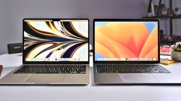
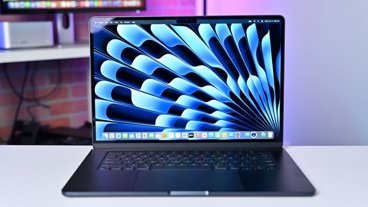
Dark Mode on Mojave blends the display into your MacBook Pro's backlit keyboard and— surprise!— the Touch Bar.
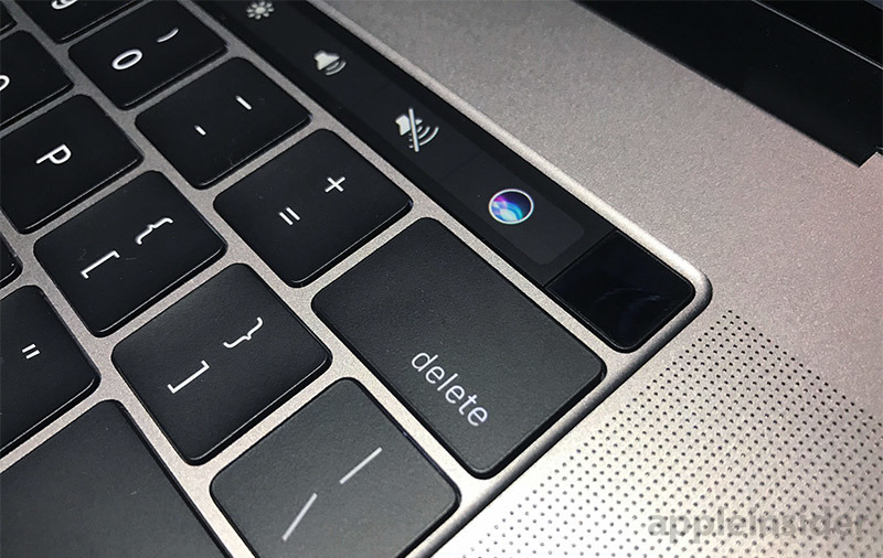
Touch Bar is already Dark Mode
If you have a MacBook Pro with Touch Bar, this release is for you. It looks like the screen melts into the keyboard with the kind of precision that Steve Jobs would unleash upon the world, developed out in the open as if in slow motion— but none of us anticipated it until it dropped. It's like we thought it was a finger bowl but it was really Palmolive and we were soaking in it, as Madge had to point out.
Actually, it wasn't wholly unanticipated that with OLED coming, Apple would make a dark UI a cool new fashionable look— a vast swing from the original bright, light OS X interface with its hyperrealistic icons and glossy translucent effects.
Back in the early 2000s, Jobs was showing off the power of OpenGL and GPUs to do unprecedented Quartz Compositor effects with translucency and texture mapping for Aqua— it effectively turned the desktop into a video game, a solid five years ahead of Microsoft being able to copy it.
Right now Apple is focused not just on the engine doing the drawing, but on the display— working to fully exploit the super efficient, hyper contrast, ultra vivid nature of OLED technology (and microLED after it). Macs are still shipping with LCD screens, but OLED is coming and Dark Mode will be ready for it.
The best way to show off the OLED future today is with a dark UI. As Microsoft fans like to point out, that company tried doing this long ago with its early generation OLED-based Zune with a mostly-black screen. It was so dark Microsoft launched the product in a candle lit room, hoping journalists wouldn't notice that the screen wasn't actually very bright (they didn't).
Apple Watch similarly launched with a dark UI because it has both a small battery and an OLED screen that needed to be bright. Touch Bar (which is also implemented using an OLED panel) is itself super Dark Mode already.
When you use Mojave Dark Mode, it makes the Touch Bar really pop as an extension of both the keyboard and the display. It's not an accident that all of these technologies emerged together at Apple this year.
How do you take your Cocoa?
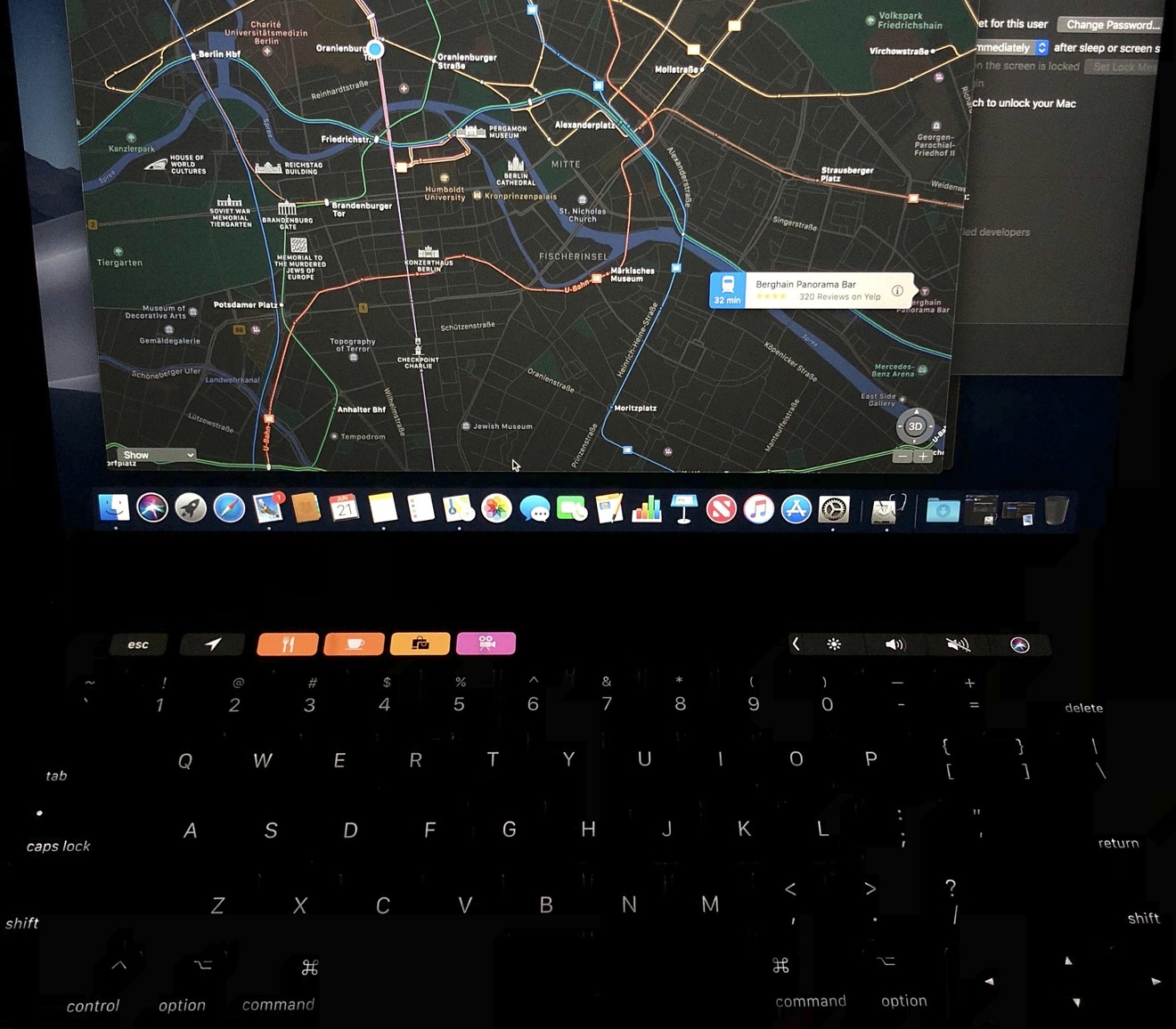
You might not like Dark Mode. It can be great for working in low light, and has a cool, futuristic feel to it. But the alternative "Light Mode" feels right (or at least more familiar) when I'm working. When you're working in Light Mode, Touch Bar feels like it becomes detached as part of the keyboard.
Light Mode is a "good morning," drink coffee, edit a presentation, get shit done sort of thing. Dark Mode is a kick back watch an online movie, smoke a bowl, edit photos, type up some good ideas kind of experience. It's smart to offer both, and that's what Apple is doing.
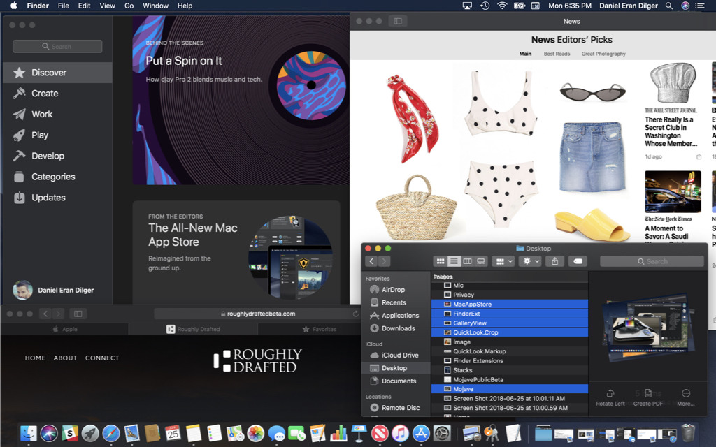
Compare the desktop examples below to see how Light and Dark Modes emphasize different elements. (Also visible below: the new favicons in Safari tabs, and when you select multiple documents in the Finder, they pile up in a spiraling stack).

The new Dark Mode is not a forced transition in the model of Microsoft's 2007 Windows Vista "Aero UI," or the even worse "Metro UI" it shipped on Windows Phone in 2010 and then foisted upon many unappreciative Windows 8 users in 2012. The new Dark Mode of Mojave is a choice. That's also distinct from Apple's own forced transition of the "Clarity, Deference and Depth" UI released in iOS 7 (which users scrambled to download).
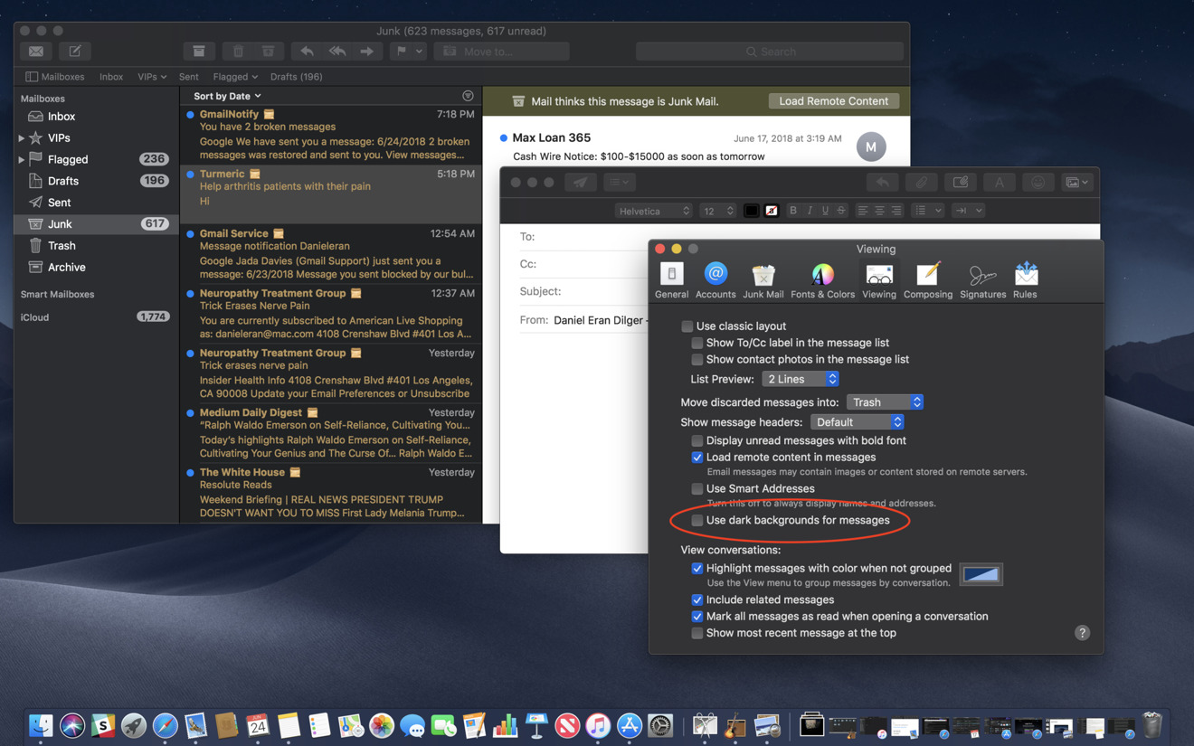
Some apps let you strike a middle ground. For example, Apple's Mail (above) and Notes both have an option to give their working documents a light background while the rest of the system remains in Dark Mode. This combination really makes your active window stand out as a focus of attention while everything else fades into the background. It's currently my favorite way to work.
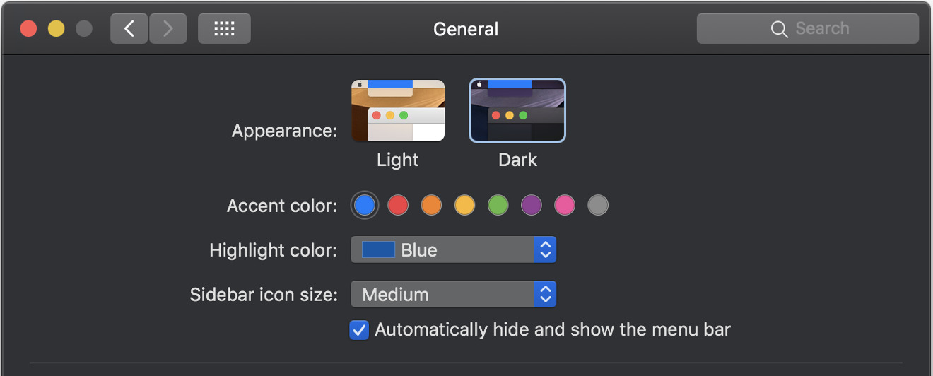
But of course, you can change the UI Mode anytime with the click of a box. It takes less than a second to redraw the screen in your new choice. You can also select a Highlight Color (used in text selection or menu bars) and one of eight Accent Colors (used in UI elements like Checkboxes and Radio Buttons, similar the "Blue or Graphite" Appearance option in High Sierra).
The 30 bit Dark Mode
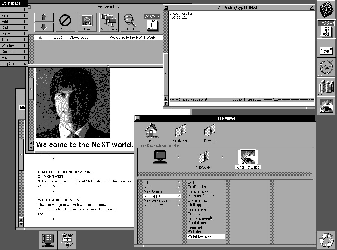
Mojave's Dark Mode appears a bit reminiscent of NeXT's advanced desktop operating system that Jobs built in the late 80s after leaving Apple, and what he brought back to the company when he returned in 1997— effectively turning Apple around and saving it from collapse.
The original NeXT desktop was naturally dark because it used just four shades of grey (2 bit color) to maximize its graphics computing power, skipping support for chrominance entirely to radically push the state of the art ahead in sharp megapixel resolution rather than color depth.
The original Mac did something similar with its 1 bit color: it could only produce black and white pixels, using patterns to approximate shades of grey. But focusing its resources on high quality display technology rather than color allowed it to deliver accurate, sharp square pixels in an era where most PCs were drawing text using blurry rectangles with 16 ugly colors.
Color depth is no longer a scarce resource. Starting with last year's 15 inch MacBook Pro, Apple now has modern production Macs with support for 30 bit color— more than 1 billion colors (10 bits per RGB channel). Any yet rather than making the desktop an egregious rainbow of unrestraint, Apple is releasing Mojave with a subdued, Dark Mode that makes very subtle, meaningful use of color.
That's also what the company did when it debuted Touch Bar, which is designed to primarily stay black and white unless color adds some useful function or information. Light UI is similarly tame in its use of color. This all has the effect of focusing attention on your own documents, particularly when editing vibrant photos or HDR video.
Beyond its integration into Dark Mode, the new Mojave gives the Touch Bar some additional attention. You can create custom Automator actions and install them into the Touch Bar's Control Strip for easy access. And when a website sends you a security code via SMS, it will also pop up in the Touch Bar to tap rather than having to type it in, just like the QuickType keyboard in iOS.
Touch Bar is effectively a Mac-sized QuickType panel. And now the Touch Bar's native OLED Dark Mode is spreading across the Mac desktop in Apple's Mojave Public Beta.
 Malcolm Owen
 William Gallagher and Mike Wuerthele
 Christine McKee
 William Gallagher

 Marko Zivkovic