Digital Wellbeing is one of the bigger features with landed with Android 9 Pie—though it seems like Google is keeping it separate and distinct in the Pixel-only public beta. I've spent the last week using it to analyze my use patterns and place restrictions on how I use my phone, and while the tool brings together a lot of options for precise configuration, I've found the data it actually provides is a bit lackluster. But I think there are ways it can be improved.
Let me preface all this discussion with an acknowledgment and disclaimer: Digital Wellbeing is a beta product, and it isn’t finished. I’ll be reserving final judgment for whenever Google says it's done. But I’ve stuck with just one phone—my Pixel 2 XL on Android 9 Pie—for the last week in order to test the new features properly, and in that time I believe I have a good idea of both Digital Wellbeing’s effect on my life, and the features it still needs to function as it can and should.
First, let’s talk about the things it does well.
Digital Wellbeing has made me use my phone less, but not via negative reinforcement, as was the case with my Android Go experiment. Instead, it was more like a gentle nudge to remember: I wanted to use my phone less. That's why I turned its various features on in the first place. I won't repeat myself too much given my earlier hands-on, but the data visualizations it provides are illuminating, and the tools offer incredibly detailed degrees of control from the app level down to per-app notification types. In a way, that's also its biggest problem, though.
There are two significant omissions in Digital Wellbeing as I see it: It needs data export, and it needs more granular data visualizations.
Data export
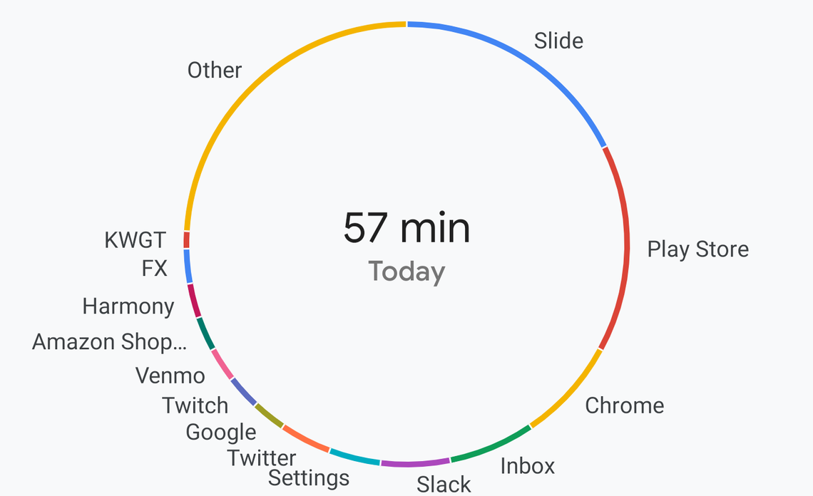
Digital Wellbeing and its Dashboard are able to collate an impressive quantity of data related to our phone use—and, for many of us, that means our lives. The information is presented via a convenient circle graph, but I have no doubt that the data being gathered is much more specific. The Dashboard can show me my screen time for each individual app for a given date, but at some level, it's assuredly also keeping track precisely when I was using them.
I don't consider that a privacy problem, though I'm sure some people might. I use my location history on Google Maps all the time for tracking down dates or things I've forgotten, I've already accepted having that information collected. However, I do think it's a waste for it to be gathering all of this data if I can't use it and see it for myself outside the dashboard.
Big graphs look nice, and they're good for certain things, but a more detailed analysis would be useful.
The circle and bar graphs are easy to parse at a glance, but they're also an incomplete view of the information gathered. If a more precise method of browsing it can't be included in Digital Wellbeing, then being able to export that information—either to other apps or just via something generic like a CSV—would allow for more detailed analysis.
I would love to know my own trends at a level that can better enable me to control them. Is there a specific time of day I'm more likely to slack off and check Reddit or Twitter? Do I tend to read the news at the same times each day? If so, how long at each episode? When I hit work chat on the go, am I more likely to get stuck in for a long while, or do I only check in sporadically? None of these questions can be answered by a single number tied to a day.
Improved access to data brings me to the next feature I'd like to see.
More specific data for the tools provided
Digital Wellbeing doesn't just provide you with information, it also gives you the tools to use it, and the most powerful of those included is notification management. As a means of minimizing interruptions, it's incredibly powerful. For example, Google Maps has an incredible 64 individual configuration options for the types of notifications you can control, but that's also the problem. The statistics the Dashboard shows you don’t divide up to match each of those controls. That means you’re left guessing or keeping track of things on your own when you start toggling notification types—which sort of defeats the purpose, right?
Trimming down notifications is a process of trial and error, or you risk stopping those you want to keep.
The Dashboard is suitable as an overview, but it's not useful for the way Android's notification management is set up. You can see which apps are the worst offenders, and you can control them individually at a high level of detail, but you don’t have the proper information at that same detailed level to do anything really beneficial with these super-precise controls. For example, I can tell you I got 22 individual notifications from Google Maps on Thursday, and I can also control every type of notification the app presents among that insane list of 64 options, but I can’t tell you what categories any of those 22 notifications fell into.
Functionally, this works out to two things: You can blanket disable notifications for apps that bother you, or you can spend a ton of time deducing and keeping track of the individual types of notifications from those apps and then precisely, laboriously, individually block them.
This is a lousy metaphor, but it’s like having to paint a beautiful landscape with only an industrial spray gun and an extra-fine pen, without your glasses. If Google is going to offer notification control at such an incredible granularity, the data presented should be just as finely detailed.
Excluding these two small complaints, it's evident that a lot of thought went into Digital Wellbeing. But expanding the Dashboard to include options for a more detailed analysis of the data collected—as well as a takeout-style export for the stats nerds—would make the detailed configuration options it's loaded with a bit more useful. My only fear is that, in trying to make things even easier, Google may decide to move in the opposite direction and strip down controls to match the data we currently have, which would be terribly unfortunate.