
The original Apple Watch is one of my favorite Apple products of all time. From the day it was introduced in September 2014 until launch day in April 2015, I eagerly awaited its arrival at my door. Week after week, I poured through every image and line of text on the Watch webpage, studying each band design and finish option.
I followed along as Apple showed off the Watch in Paris and Milan, and as celebrities posted photos of their exclusive band colors. Special Apple Watch shops opened, and I was thrilled by the stunning window displays installed across the world. By the time I had my own watch in my hands, I felt like an expert on it.
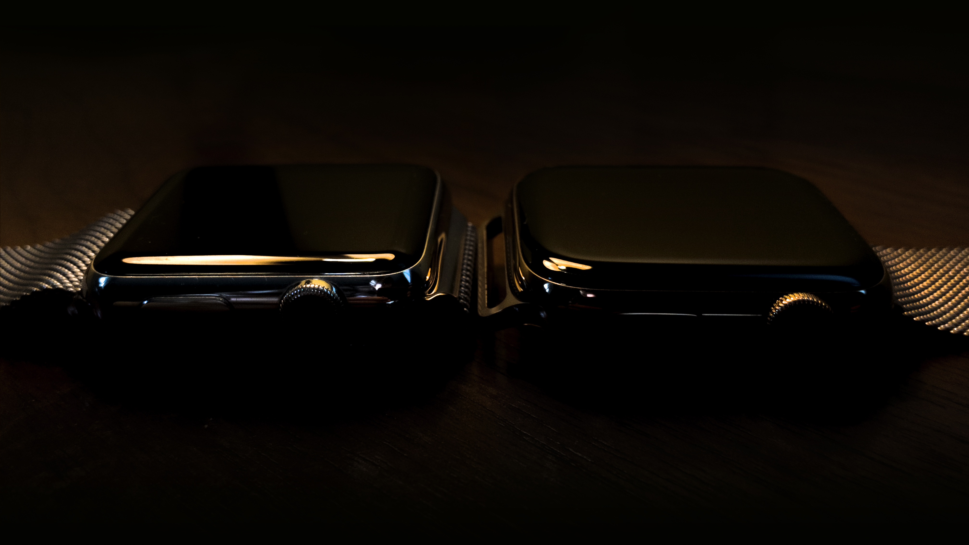
I splurged on the original 42mm stainless steel model with a Milanese Loop. It was a great watch, but the sticker shock never wore off and I was hesitant to replace it until I felt like I had extracted all of the value I could from it. This year I decided it was finally time to make the upgrade, and purchased the 44mm gold stainless steel Series 4 with matching Milanese Loop.
The Digital Crown
In May 2015, I reviewed the Apple Watch as a design object. I was particularly impressed by the Digital Crown, which was then an entirely new way to interact with notifications and apps:
“It’s my favorite part of the design of the device, and I find myself idly spinning it around, even when the watch’s display is off.”
With Series 4, the Digital Crown has taken a significant leap forward and become an even more important component of the Apple Watch story.
At the Apple Watch reveal in September 2014, Tim Cook discussed Apple’s major user interface innovations over the last several decades. The original Macintosh popularized the mouse, the iPod introduced the click wheel for navigation, and multitouch on the iPhone made using a touchscreen feel natural.
The Digital Crown was positioned as the next transformative input device. “With every revolutionary product that Apple has created, a breakthrough in user interface was required… The Apple Watch required the same kind of carefully deliberate consideration,” Cook said.
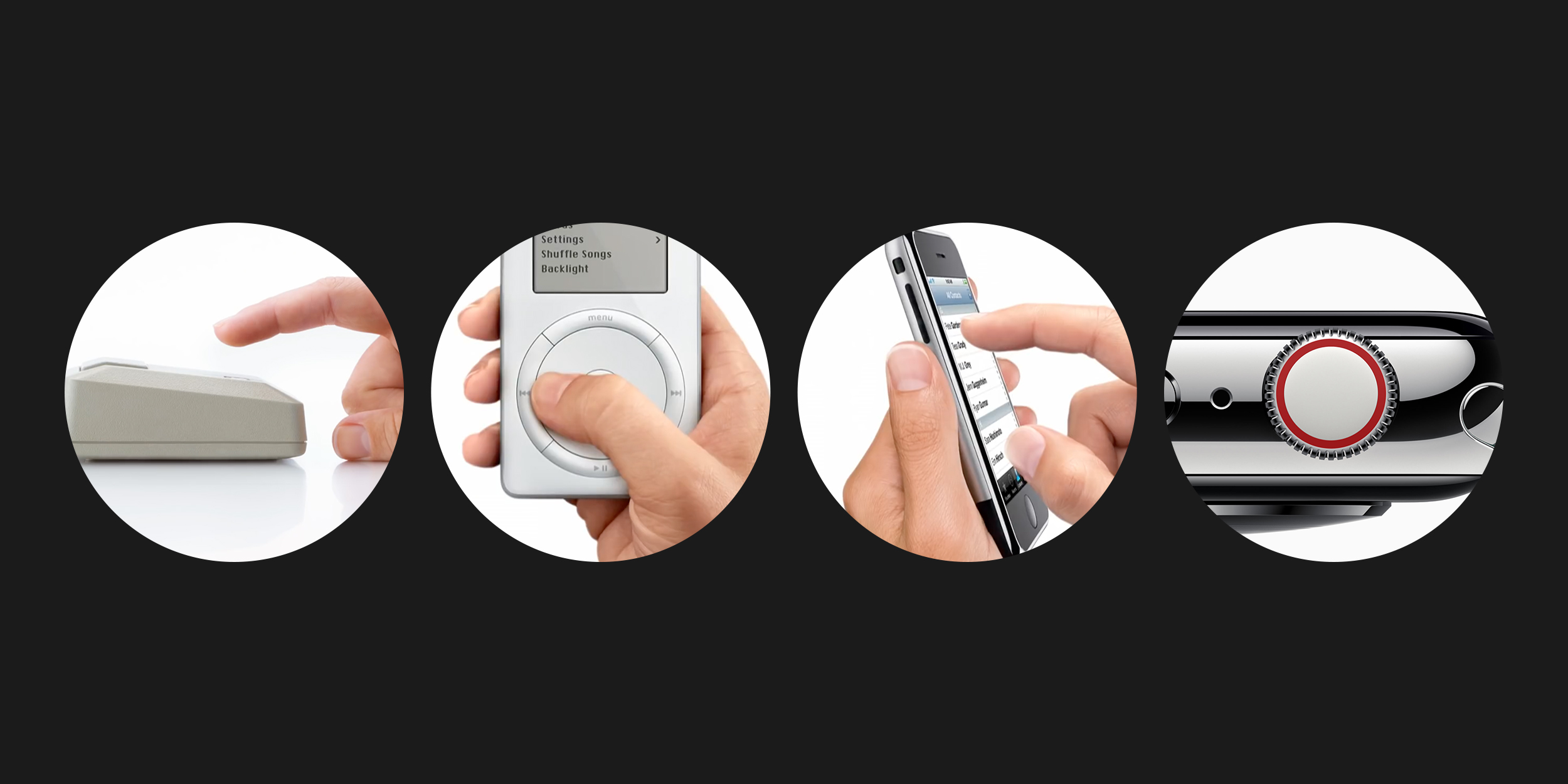
While I loved the first-generation Digital Crown as a physical object, I failed to grasp its gravity in Apple’s long-term strategy for the Watch. After all, it was just a new way to scroll, right? Four years later, Apple’s initial aspirations have proved prescient. The Digital Crown isn’t just an input device, it’s now an interactive tool that provides contextual feedback to guide you through interfaces. Critically, it’s also becoming key to unlocking new health data.
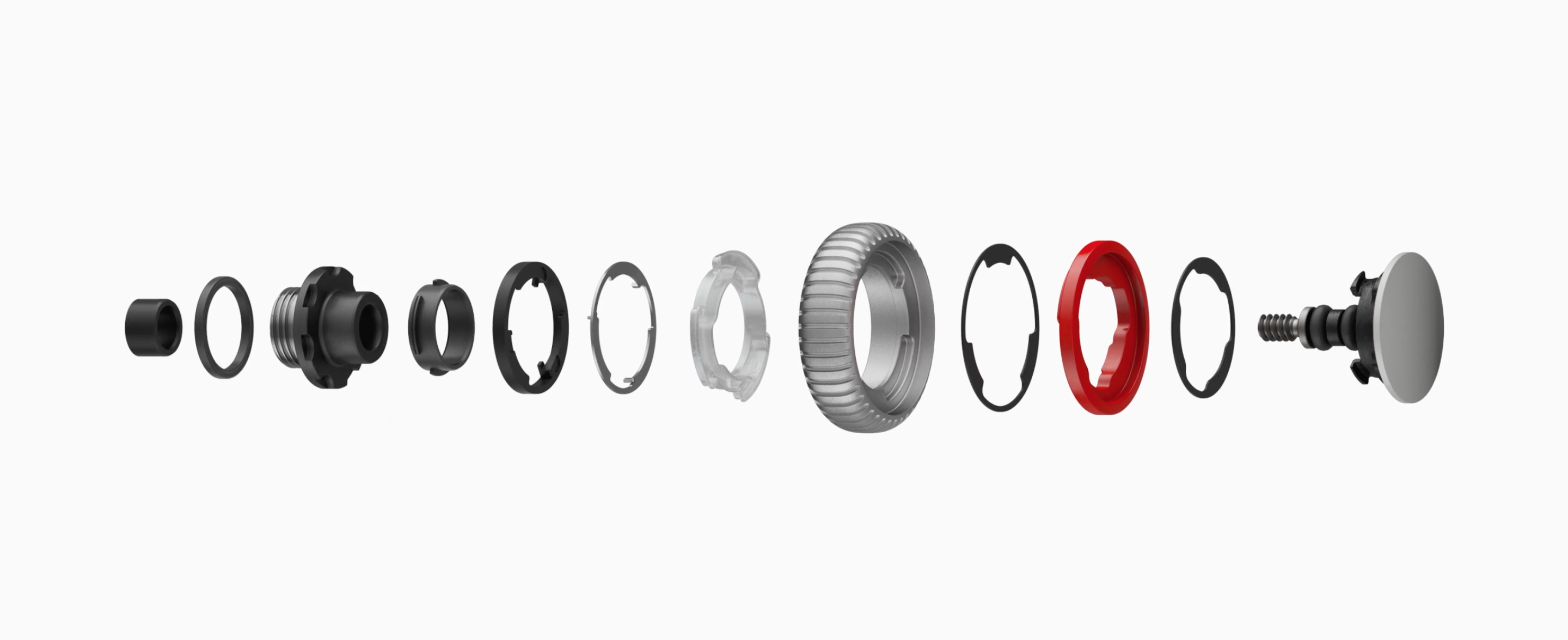
Apple says the crown on Series 4 has been totally re-engineered and now houses 21% more components, including a titanium electrode. From the outside, you might never know. A red ring has replaced the full red dot capping the crown on cellular watches. The engraved tick marks circling the device now extend across the full depth of the dial. The crown is a little thinner, too, but none of these changes betray new functionality.
 Haptics
In my original review, I focused strictly on industrial design and failed to mention watchOS at all. This was a mistake, since the experience of the hardware is so closely tied to the software. With watchOS 5 and Series 4, the integration is deeper than ever before.
It takes just one scroll to feel what’s new. The Digital Crown now offers continuous haptic feedback. On previous Apple Watches, you’d feel a small bump when scrolling to the end of a list. With Series 4, every interaction has been transformed to feel more like a satisfying mechanical dial. Scroll through a list, and tiny haptics and sounds guide you through. Flip through your recent apps, and more substantial taps add weight to each card. The crown isn’t actually rotating differently, but it feels like it is.
This feedback is my favorite part of the Series 4. It makes the crown feel alive, and even makes using the Apple Watch more fun. I want to interact with it. As software updates slowed down my old watch, I gradually stopped using apps and started turning off features to preserve battery life and my own sanity. Navigation became frustrating, and even the simplest tasks felt choppy and stuttering. To me, using the Series 4 is almost like experiencing the Apple Watch for the first time again.
When I pick up my old watch, its Digital Crown now feels broken. The mechanism has stiffened with age, and the lack of feedback is jarring. If you’ve ever pressed the solid state home button on an iPhone while it’s powered off, the sensation is similar. Apple offers an option to turn off the Haptic Crown, but I’d never consider it.
In many cases, haptics add an unparalleled level of precision to navigation. Apple has mapped the tiniest bits of feedback – I’ll call them “ticks” – very tightly around the dial. The result is a sensation of extremely direct manipulation. It’s luxurious. Secondary haptics – I’ll call these “thumps” – are much heavier and used to indicate the end of a list or separations between units of information.
While this feedback can be highly satisfying when implemented correctly, the behavior doesn’t always feel consistently applied across the system. Apple warns about this in its own watchOS Human Interface Guidelines: “Exercise restraint when using haptics. Use haptics to draw attention only to important events. The overuse of haptic feedback can cause confusion and diminish the usefulness of that feedback.”
 (Don’t worry, I closed my rings.)
As my colleague Benjamin Mayo more eloquently described it to me, the disconnect happens when you lose 1:1 tracking between the motion of your finger on the crown and the motion of content onscreen.
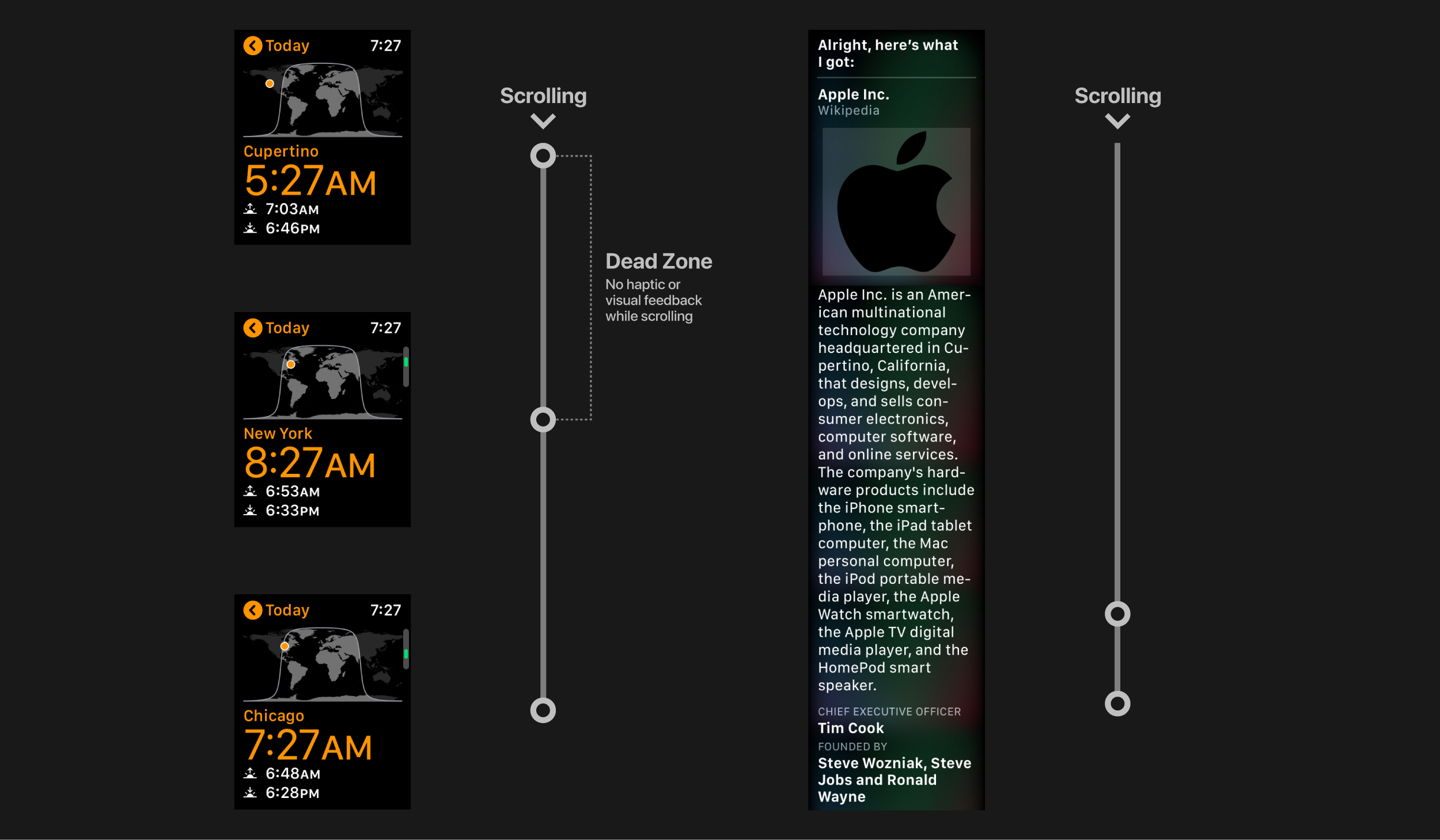
To illustrate this, let’s compare common types of feedback offered during different interactions on the Apple Watch. In notifications and apps like Activity, scrolling the main “body” of the content is accompanied by ticks (the Activity app has changed its behavior in watchOS 5.1 beta.) This is my favorite kind of feedback, and reminds me of using the date and time pickers on an iPhone. A thump indicates the bottom of the view.
Scroll a list of buttons or cards like in the World Clock, and thumps indicate each item as it comes into focus. There is no feedback to tell you when you’ve hit the bottom of the list. While I conceptually understand why and where these different haptics are offered, the inconsistency is jarring in my mind. This feeling hasn’t lessened with time and experience using the watch.
Part of the issue is that some haptics feel incorrectly weighted. When moving through a list of cards or buttons, there is a “dead zone” of input between beginning to scroll and an action happening onscreen. This is especially notable when cycling through cities in the World Clock, where scrolling seems to require excessive effort. You’ll have to give the Digital Crown nearly a full rotation without a supporting animation or haptics to guide you before the next city clicks into place.
A similar problem is found in Siri Wikipedia results, where text is treated like blocks of content. Scrolling the crown through a large section feels unresponsive until suddenly, an entire paragraph clicks in and out of view, making it impossible to read. This isn’t an issue with the speed of the processor, it’s a problem with how haptics are applied.
Apple Human Interface Designer Chan Karunamuni discussed the significance of appropriate feedback in an excellent WWDC talk this year on Designing Fluid Interfaces: “It’s important for an interface to respond satisfyingly to every interaction. The interface is signaling to you that it understood you. It’s so important for the interface to feel alive and connected to you.”
The fluid interface introduced with the iPhone X has spoiled moving between apps on the Apple Watch, too. Pressing the crown no longer feels clever; it feels slow and clumsy. I’d much rather move between apps with a lightweight movement. As I noted in a Twitter thread, determining the right gesture for this interaction would not be an easy task.
Thankfully, Apple can change the behavior of haptic feedback at any time, if it chooses. The Digital Crown hardware itself is fantastic.
Sensors
Haptics and appearance are only part of the Digital Crown’s story with Series 4. Later this year, Apple will ship an ECG app that allows anyone to generate an electrocardiogram by just holding their finger on the electrode built into the crown. While we can’t yet test the feature to see how it performs, the implications of making this kind of health data more accessible could be profound. We’ve already seen countless stories of lives being saved thanks to the Apple Watch’s heart rate alerts, and the ECG app could represent a similar turning point.
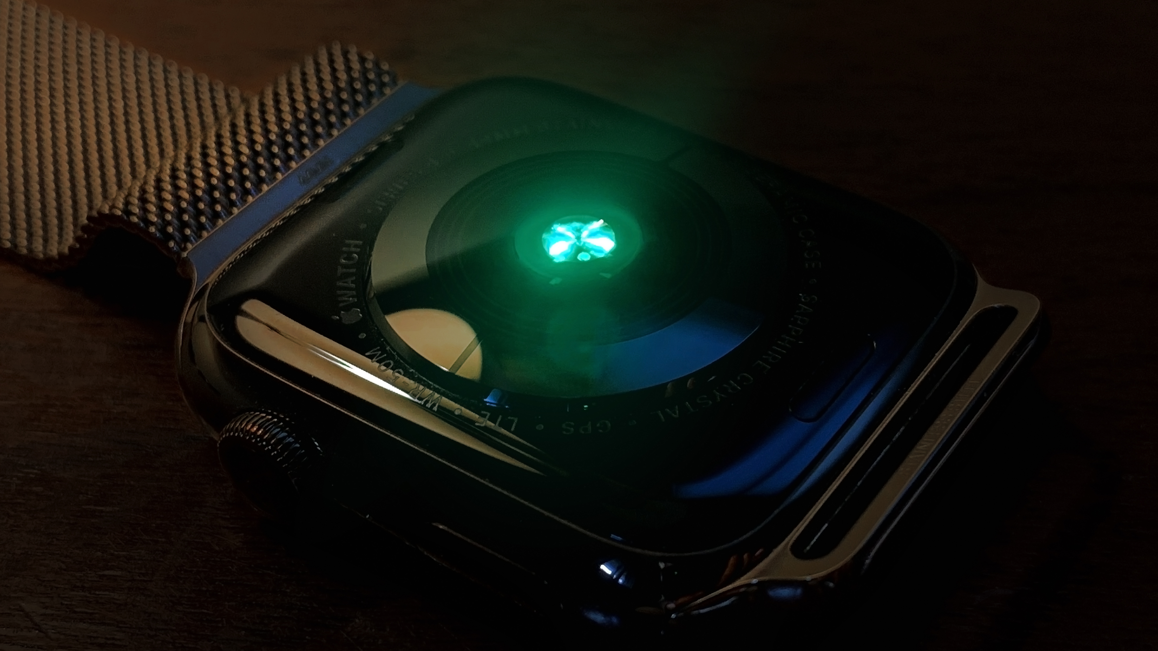
The new Digital Crown works in tandem with an improved Optical Heart Sensor on the back of the Series 4. Earlier Apple Watches used four separate photodiodes and green and infrared LED lights. The new sensor takes the form of a singular point of green light surrounded by concentric circles. While I was always a fan of the design of previous Apple Watches backs, the new sensor manages to feel even more precise and technical with less visual clutter.
Since the Apple Watch Series 4 is thinner than its predecessors (aside from the original model), you’ll probably notice it sits more comfortably on your wrist. Even coming from the first-generation watch, I found this to be true. The difference is almost imperceptible, but the Optical Heart Sensor feels flatter. Combined with its reconfigured photodiodes, less green light spills out from under my wrist when the watch is taking a heart rate measurement.
Display
As the years ticked by, my original watch’s physical design aged more favorably than its internals and software. Even today, it’s a beautiful watch with one exception: the display.
It’s astonishing how an improvement to existing technology can instantly make everything that came before it look ancient. It happened last year with the edge-to-edge display on the iPhone X, and the same is true this year on the Apple Watch. In addition to the rounded corners and larger viewing area, I’m also experiencing for the first time the brighter display technology introduced with the Series 2 in 2016.
More pixels would be meaningless if not put to good use. That’s why I’m glad Apple built the new Infograph Modular face. On my original watch, I chose to use a modified version of the Photo face with a pattern of my own design. I missed the utility of complications, but was never satisfied with how the original Modular face looked. Fixed analog faces feel antithetical to the idea of the limitless display of the Apple Watch.
Infograph Modular combines the modernity of a digital face with the beautiful detailed complications previously reserved for analog faces. Using it makes my wrist feel like a tiny powerful dashboard. It’s fresh, connected, and sophisticated. Switching away from the Photo face alone has hugely increased the value of the Apple Watch in my life.
Milanese Loop
The Milanese Loop is the only Apple Watch band I’ve ever owned. I’ve worn it in tons of scenarios – at home, traveling, in an office environment, for formal events, hiking in the desert, and camping in a tent. I’ve always found it to be perfectly comfortable, and the weight has never bothered me.
When the time came to pick a band for my Series 4, the gold Milanese Loop was the obvious choice. I’ve been waiting for a version in an affordable polished gold finish since the first Apple Watch Edition. If you’re familiar with the Milanese Loop from previous Apple Watches, expect the same experience for Series 4 – with one caveat.
Apple has slightly tweaked the design of the loop to allow the magnetic clasp to be removed from the lug on one side. The original band could not be separated. Some have speculated that this will make the band easier to use with the unreleased AirPower wireless charging mat. You shouldn’t notice much of a change in day-to-day use, but it is something to keep in mind for safety as you handle your watch.
I was slightly disappointed to find that the Milanese Loop will still occasionally buzz when I get a haptic notification. This is simply a byproduct of metal rattling against metal, but I thought that the improved Taptic Engine in the Series 4 Watch might lessen the effect.
The thrill of the original Apple Watch can never be duplicated. The unfamiliarity and mystery of an entirely new product category is a rare experience. After wearing my first-generation model since launch day, I was burned out on Apple Watch. The device was aging and tired.
For me, the Series 4 has been a fresh start. Excitement and anticipation have been supplemented by genuine utility and practicality in my daily routine. Additions like the Haptic Crown and edge-to-edge watch faces continue to make it a joy to use.
For more thoughts on the Apple Watch Series 4, check out Zac Hall’s complete review.
Check out 9to5Mac on YouTube for more Apple news:
FTC: We use income earning auto affiliate links. More.


Comments