iPhone and iPad are held back in the productivity department in part due to Apple’s decision not to adopt a more comprehensive menu system beyond iOS’s weird popovers.
What iOS needs is Mac style menus.
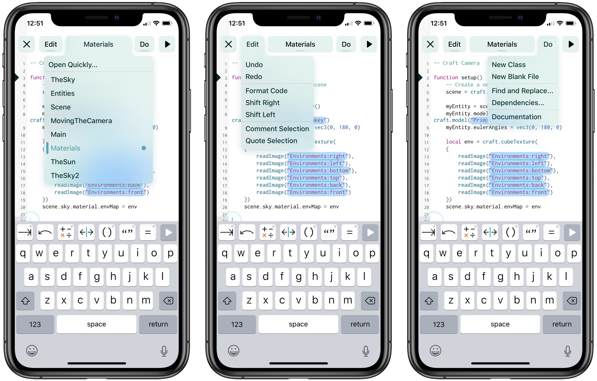
Simeon, co-creator of the iPad coding app called Codea, has created a macOS-like menu system for iOS that looks great and works so good that he’s already implemented it.
He wrote in a blog post:
Codea is our iPad app for creative coding. I’ve been developing a universal version for some time.
It’s hard to take a complicated, eight-year-old iPad coding environment and bring it to iPhone. There’s so many damn features that need to work in so many damn configurations.
Autolayout takes care of many of these issues (thanks, SnapKit). But it doesn’t take care of the most important: design. I’ve been stuck on the design for a universal version of Codea’s code editor for over a year. It might even be two.
One of many Sketch files with iterations of how the code editor should scale
I realised six months ago as I was using my Mac, using the menus, that I need these things—menus—in Codea. I was trying to solve a problem that has been solved for decades.So I set out to make the best menus I could make for iOS.
To illustrate how this all works, here’s the video from their new app, Shade.
Daring Fireball’s John Gruber wrote a succinct observation:
What they’re doing here with Codea isn’t just putting the Mac menu bar on iOS. They’ve designed and built a very iOS-looking take on a menu bar, deeply informed by the aspects of the Mac menu bar that do work on a touch screen. Something like this is desperately needed as a standard interface element on iPad, and I think could work on iPhone too.
As an aside, looking at the nice drop shadows behind Codea’s menus reminds me how much I hate the almost-no-shadow flatness of standard iOS popovers on iPad. Ever since iOS 7 I’ve thought iPad popovers look like a rendering bug or an early prototype. Putting aside a debate regarding the overall flatness of iOS 7–12, iPad popovers just look wrong to me. They should look a lot more like what Codea is doing with their menus.
If you really want to go technical, be sure to check out their follow-up post.
That post isn’t interesting just because Simeon explains the challenges of building such a seemingly simple feature as a desktop-like menu system for iOS but because it also contains a bunch of additional videos showing it all in action.
Here are just a few.
Codea 3.0 and Shade 1.0 will both make use of these menus to some extent.
What do you think, girls and boys? How cool would it be if iOS 13 brought such a menu system to iPhone and iPad?
Be surer to chime in with your thoughts in the comments down below.