

If the rumors are to be believed, the Apple Watch is finally getting an App Store of its very own. We’ve always been able to install apps on our watches, but in watchOS 6, Apple is reportedly building an App Store right on the device, so we can find and install apps even if our phone isn’t around.
On paper, that sounds like a killer feature. App installation is a big annoyance on the Apple Watch, requiring a tethered iPhone and tandem downloads, so an on-device App Store would certainly give the Apple Watch some much-needed independence. But you need look no further than a Wear OS watch to see how the experience could be frustrating. Here are four problems to look out for and how Apple could solve them on the Apple Watch.
Problem: App downloads are too slow
Solution: Require app thinning and app slicing to keep download sizes small
When you download an app using the Play Store app on a Wear OS watch, it takes an average of 20 to 30 seconds over Wi-Fi, and about double that over LTE. Considering most of the apps you download on your watch are something you need right now, that’s way too long.
On Apple Watch, downloads will need to be nearly instantaneous to be of any use, otherwise it’s just as easy to pull out the iPhone and download the old-fashioned way. Apple Watch apps are already super small, and with app thinning and slicing, games and utilities could be ready to use as soon as we tap the button. That way, developers could push an “instant” version of the app that lets you start using it while the rest downloads in the background.
Problem: It’s hard to find anything
Solution: Give Siri and central role and use machine learning
Due to the tiny screen and the awkward angle we need to hold our wrists, actions on our Apple Watch are measured in seconds, not minutes. The last thing you want to do is tap away at a little keyboard and scroll through dozens of apps just to find the one you’re looking for.
Apple needs to seriously rethink the way apps are represented and discovered on a wrist-sizes App Store. On Wear OS, Google Play requires far too much scrolling and tapping, but Apple could implement a few things to help.
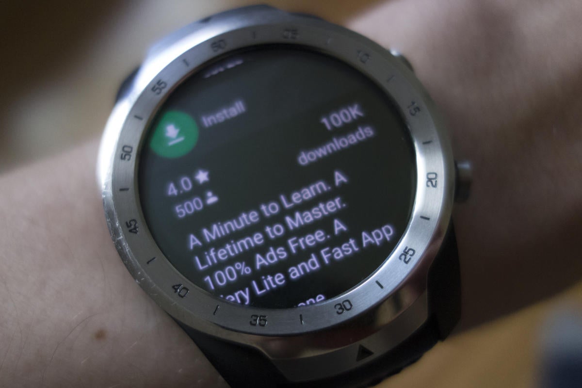 Michael Simon/IDG
The Google Play Store on Wear OS shows too much inforamtion for each app.
The App Store needs to lean heavily on Siri. Much like Apple Music, you should be able to ask Siri to download PCalc or search for popular games just by raising your wrist. When you launch the App Store, Siri Suggestions could show apps that you use often on your phone or display apps related to something you’re using a lot.
Most importantly, the interface needs to be super simple. I don’t want to scroll through a dozen categories or tap a tiny magnifying glass to find what I’m looking for. App pages should be limited to a single screen, flipping through options should require little more than a swipe, and it should learn what you like as you search and use you phone.
Problem: Updates slow down performance
Solution: Schedule them overnight or when charging
App updates are never ideal, but on Wear OS watches, they regularly slow down performance for a minute or so while an app or three update. No matter how fast the S5 chip on the Apple Watch Series 5 is, we don’t need background app updates slowing things down. They should be delayed until the Apple Watch is sitting on the charger.
Problem: The home screen gets crowded
Solution: Dump the honeycomb view and introduce a new method of organization
There’s no real organization for apps on the Apple Watch, and if we’re going to be downloading apps on the fly, things are going to get crowded fast, especially if Apple insists on the random honeycomb pattern. If apps are going to take on a more prominent role on the Apple Watch, we need a better way to keep track of them. On Wear OS, Google provides a list of apps that were recently downloaded or updated, but you have to know where to find it. Apple can do better.
The list view introduced with watchOS 4 is a good start, but even that can get tedious when you need to scroll through a lengthy list to get to Uber. So Apple should give us a new way of sorting. Short of organizing apps into folders—which won’t be fun on a two-inch screen—something akin to a “smart” list would be incredibly useful. Newly downloaded apps would always rise to the top, followed by the apps we use the most. It might not look as cool as the honeycomb patters, but let’s face it, that’s never been a great way to find anything.
Author: Michael Simon, Executive Editor

Michael Simon has been covering Apple since the iPod was the iWalk. His obsession with technology goes back to his first PC—the IBM Thinkpad with the lift-up keyboard for swapping out the drive. He's still waiting for that to come back in style tbh.