
Folks who use Visual Studio Code, Microsoft's free cross-platform IDE announced back in 2015, should start seeing a new set of icons for both Insider and Stable builds.
As those who've used the IDE may know, this is not the first time Code has received an icon overhaul, with version 1.17 from September of 2017 bringing the first refreshed icon set. The Stable version's colour was changed to orange - prompting comparisons to Sublime -, while Insiders got a slightly lighter shade of green. The change wasn't met in a very positively received, so the colour of the Stable build icons was changed back to blue. You can see a selection of past, current, and future icons below:
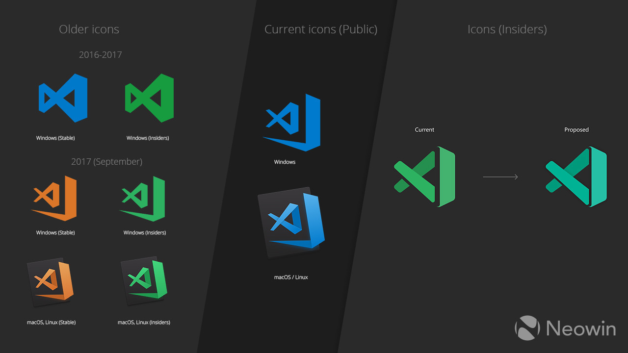
After the introduction of the new Visual Studio 2019 icon and the IDE's subsequent release, as well as the newly redesigned Office icons, Code's icon was due for another redesign. Following the first round of proposed refreshes, there were complaints that the Insider icon wasn't distinguishable enough from regular Visual Studio or indeed the Stable variant. Furthermore, the previous Insider icon drew comparisons to Excel, in no small part due to its similar shade of green and spacing from the rightmost element.

With all of the above addressed, it's worth talking about another variant of Visual Studio Code, which is VS Code Exploration. This is similar to the Insider build in that it's ahead of the public one, though this is focused on implementing newer versions of Electron - the framework on which Code is based. The current Exploration builds retain the same shade of orange debuted by the redesigned icons in September 2017, though the ribbon element on the right employs a zig-zag pattern instead of being filled in, like the other two. This one is also due for an update.

The reworked icons (seen above) will be the same across platforms, eliminating the differentiated look of previous iterations, and should be available to Insiders right now, with Stable builds getting them in early June.
This is the latest in a series of updates that Microsoft has been rolling out in an effort to unify its iconography across services. Your Phone Companion got its new icon last weekend, with the Microsoft Launcher recently unveiling a slightly redesigned logo, and even Access having its icon finally reworked.
Source: VS Code (GitHub) via Thurrott.com


16 Comments - Add comment