Apple's best designs by Jony Ive, according to the AppleInsider staff
 AppleInsider Staff
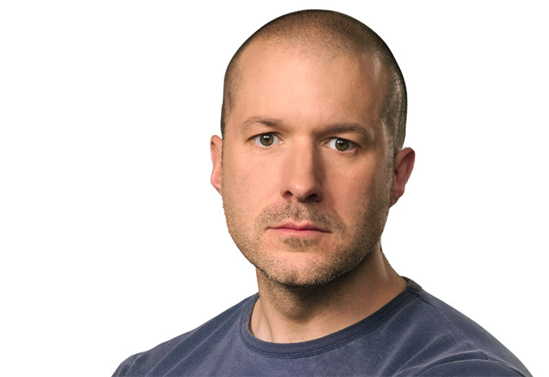
On Thursday, Apple Chief Design Officer Jony Ive announced his intent to leave the company after nearly 30 years on the job, many of which were spent at the side of tech visionary Steve Jobs. In wake of that bombshell, AppleInsider takes a look back at our favorite Ive designs.
Mikey Cambell - iPhone X
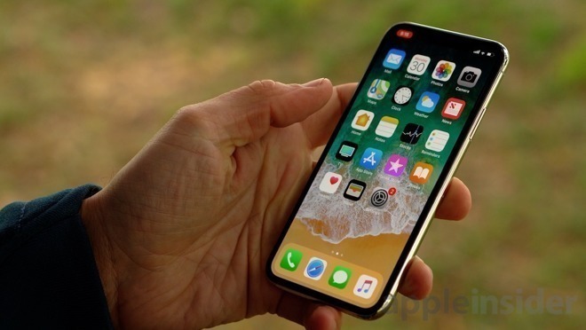
In development for more than two years, iPhone X is perhaps the purest expression of Apple's — and Ive's — vision of how a smartphone should look and feel.
A glass and metal slab reminiscent of the black monolith in Kubrick's "2001: A Space Odyssey" (albeit with gently sloping corners), X blurred the line between utility device and art object more than any iPhone that came before. A sleek rectangular chassis closely follows the form of its dormant OLED panel, which remains inky black thanks to the deletion of all screen-bound manual controls. Without close inspection of the mirrored Apple logo and "iPhone" lettering set under its glass back, X's orientation can only be divined by its camera bump.
Nothing seems wasted on iPhone X. Inside, vital components are neatly laid out on a — dare I say beautiful — logic board, battery cells are custom-fit and the level of fit and finish is peerless. Outside, the screen stretches from corner to rounded corner with a relatively thin bezel and the steel chassis feels almost sumptuous in the hand. The TrueDepth notch is, of course, a niggle, but an acceptable trade off for Face ID.
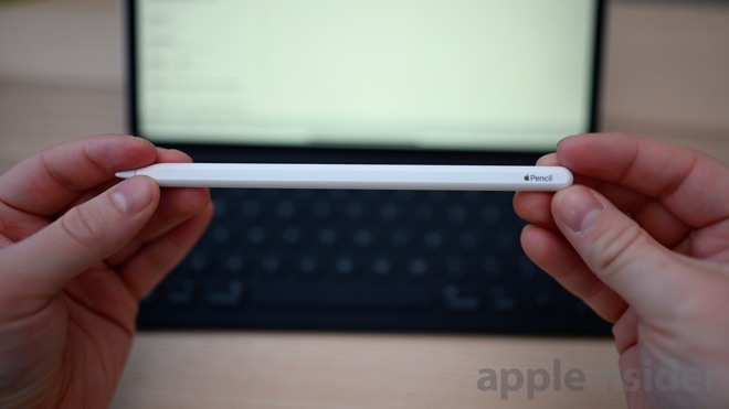
Ridiculous Lightning connector swapped for inductive charging. A flat edge for mating with iPad Pro that also serves as a nice ergonomic grip (and stop Pencil from rolling off the table). Tap gestures. Velvety low-slip matte finish. This is what the first Apple Pencil should have been.
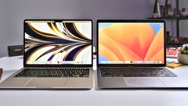
Amber Neely - The current MacBook Air
I still remember the original MacBook Air commercial from the original launch event, where it slid out of a manila envelope with a button-and-string enclosure. As an owner of an incredibly thick PC laptop, I was immediately enamored. The concept of even an entry-level notebook being that thin was wild to me.
Fast-forward to today. The MacBook Air has so far eluded me, but I do appreciate the quality and thought behind the design. In fact, I probably appreciate it more these days. It's the one Apple product that gets my head turning every single time I see one.
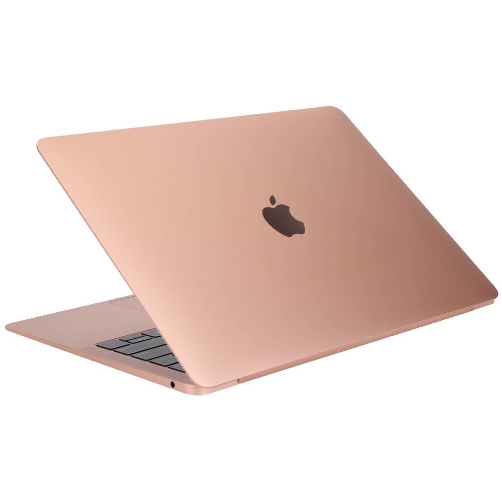
Just look the current generation MacBook Air. It's thin, it's light, and aesthetically, it's got a gorgeous design. The gentle taper from the front to the back gives it a luxe profile, an effect that is only increased when you realize that Apple had the foresight to start offering the Air in gold. I've owned computers with some decent looking cases, but I've definitely never owned something that looked as good as a gold MacBook Air.
Aesthetically, it's hard to imagine how Apple could improve upon the Air. To this day, I still find myself swooning over every gold Air I see in the wild.
William Gallagher - The door on the Power Mac 9600 and iOS 7
Design is not about how something looks, it's about how it does what it does — and how people can use it to do what they need. And that's only rarely as visually striking as, for instance, a gorgeous iPhone. So my favorite Jony Ive design is what he did with door panels.
We know that the forthcoming Mac Pro features extremely easy access to its insides and we remember that the famous Mac Pro, the first cheese grater, had that panel that could open up very simply. What's less known is that this was because of Ive.
He thought of it and he fought for it. Ive had to convince Apple hardware engineers that it was worth doing and that it could be cost-effective.
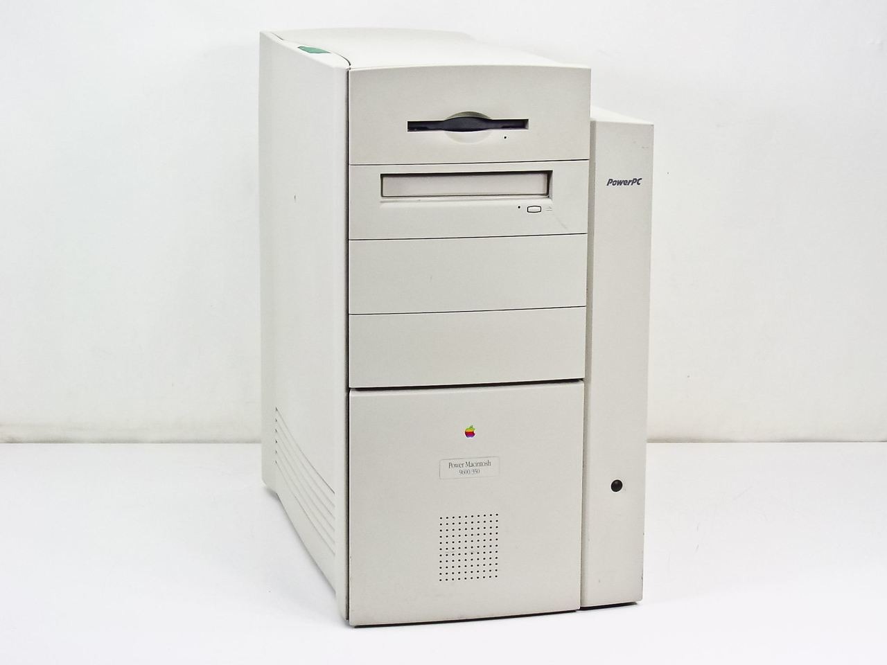
And he won. The 1997 Power Mac 9600 was the first Apple tower computer where you could easily open the side to add or remove components. The same basic design was used for the beige PowerMac G3 tower, and the design lineage carried through the Blue and White G3 and G4 towers was clear.
But, iOS 7 is just as great. When Scott Forstall was forced out of Apple and Jony Ive took over the running of software as well as hardware, the result was iOS 7.
Actually, the result was iOS 7 and then whatever the next version of Android was. The result was that smartphones changed overnight and you can see iOS 7's flattened aesthetic in graphic design used across the world.

What Ive did with software was what he always did with hardware. It's easy to say that he made things simpler, but he also came at it from the focus of how people would use it.
The previous skeuomorphic approach was meant to help people grasp how to use, say, a calendar on their phone. Now we knew, now we were more familiar with the phone version than we were with actual calendars. Ive could step away from this hand-holding tutorial kind of interface, and make a tool that worked better for us all.
We've now had the Ive-inspired flat design of iOS for six years, which is as long as the original lasted. But there's no sign of it changing again because there is no need for it to.
Malcolm Owen - Mac mini
As someone with a background in PC gaming and a habit of spending way too much time on PCPartpicker than should be deemed healthy, I have an interest in how a computer is assembled. This is particularly true for machines that are put together to take up as little space as possible, as aside from being a design headache to create and keep them usable, they also must be serviceable.
Given my disassembly of my own personal Mac mini earlier this year to replace the hard drive, I have to attest that the design of that pint-sized computing powerhouse is phenomenal. A rigid metal casing with so much crammed in there, including cooling, that somehow takes up less physical space than most non-Apple notebooks, is mind-boggling to begin with.
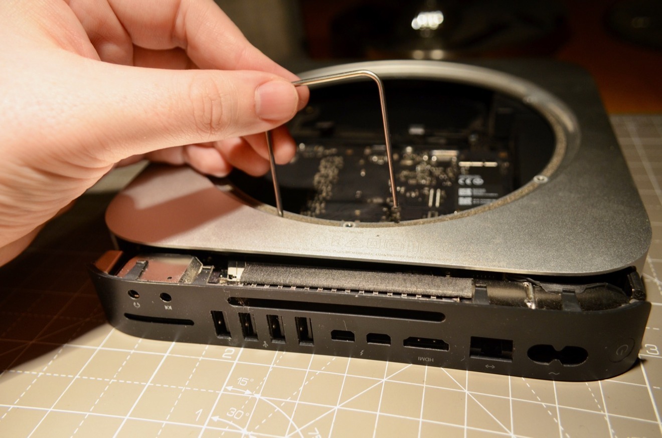
Then there's the disassembly, which is surprisingly straightforward despite the seemingly daunting task of extracting so much stuff from inside that tiny frame, with so many genius design choices to make it relatively painless. Even the use of the power socket as a form of "lock" to hold the rest of the power supply in place is an inspired piece of design.
As much as it still amazes that Apple has put a powerful computer into a slimline and barely noticeable case barely bigger than a few DVD boxes, seeing what Apple did to fit everything in and the process of disassembly and reassembly is probably more breathtaking.
Andrew O'Hara - Leica camera and iPod mini
As a photographer and videographer, it isn't much surprise that one of my favorite Ive designs isn't Apple's. It is the wonderful Leica Digital Rangefinder that was co-designed by Marc Newson, sold at the (RED) Auction back in 2013. The camera itself had a full-format CMOS sensor and shot through a Leica APO-Summicron -M 50mm f/2 lens.
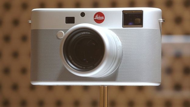
Needless to say, the camera is primarily formed of Ive's material-of-choice — anodized aluminum. It is covered in 21,000 circular perforations that make up the grip around the body and took more than 85 days to manufacture as well as over 550 prototypes. I love how minimalist and functional the camera is, how the design doesn't get in the way of the camera itself. It stays true to Leica but adds a bit of Apple finesse.
If Apple were to release a camera, this could easily be it. The attention to detail is simply unmatched and makes this one of the most lustworthy of Ive's designs that can't even be purchased.
Following the camera is the iPod mini. I absolutely love this device and still have a working model sitting atop my desk, full of my favorite music. The green is bright and fun without being overly loud. The aluminum design still holds up all these years later. The screen is small but with the simple UI controlled by the magical clickwheel, it doesn't feel like it.
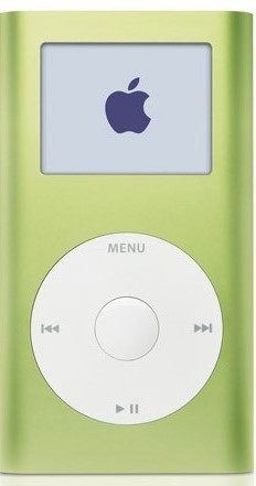
Apple had a pile of accessories to go with the iPod mini, which is a time I very much miss. The quirky iPod Socks, the headphone remote, the simple plastic clip that made it easy to clip onto the side of a backpack, and eventually even the Hi-Fi. All were in my arsenal. I spent a lot of time using the Mini and even though the switch to flash storage caused the device to become usurped by the iPod nano, the Mini still holds a special place in my heart — and my desk.
Victor Marks - Newton MessagePad and the last of the iMac G3 models
The Newton MessagePad is one of Jony Ive's best products, from a time when he had yet to meet Steve Jobs, and was questioning whether or not he even belonged at Apple.
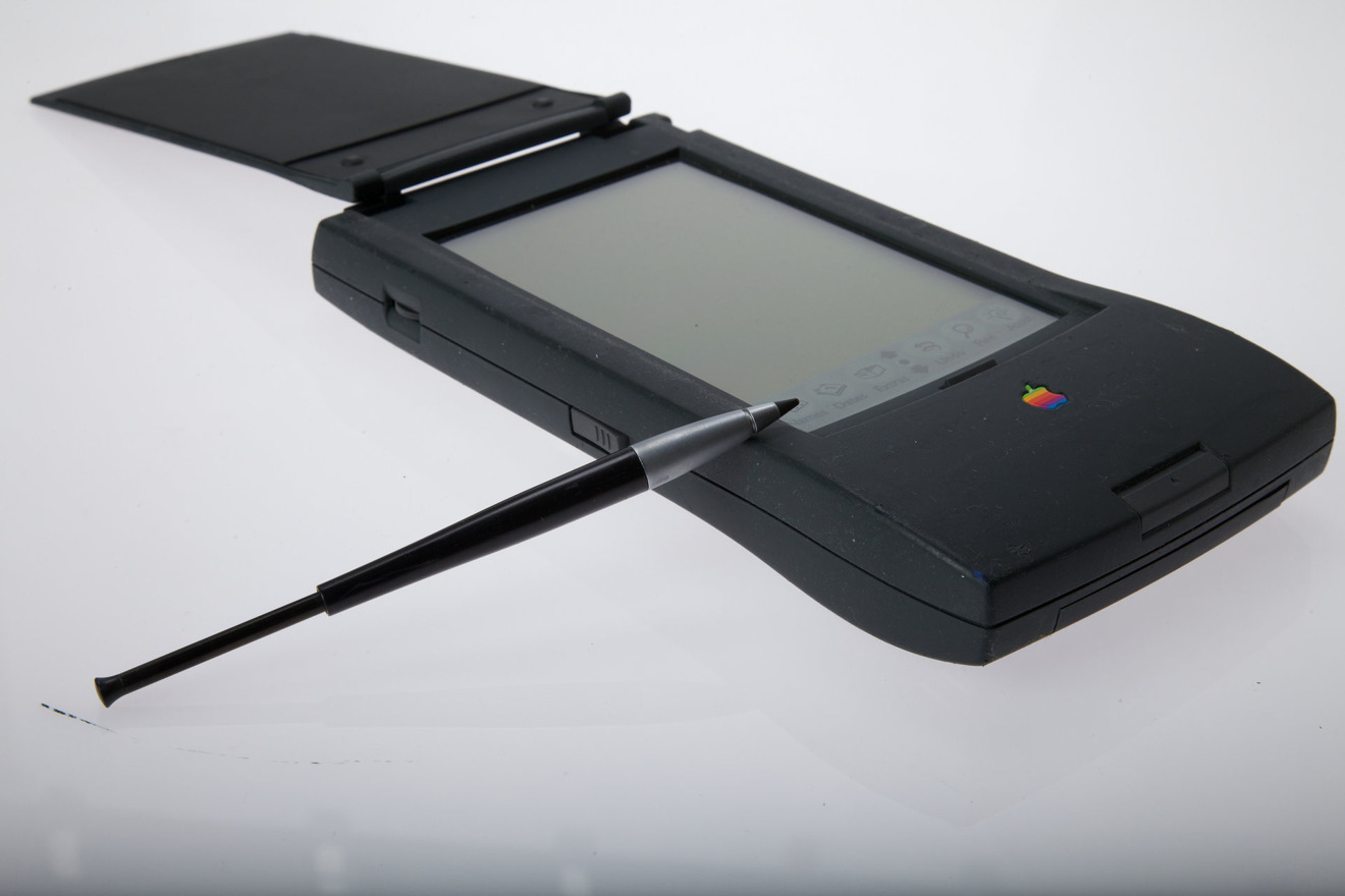
Design takes depth, focus, and caring, Ive used to say. People are frustrated with their environment, and products that surround us should show that they've considered the user in their design. They should show caring on behalf of their makers.
With the MessagePad, the first version shipped without a cover for the display and a wide, flat stylus that felt like a carpenter's pencil, and was uncomfortable to use.
To change the user's relationship with the product, Ive made two notable changes: one, a cover for the screen, and the other, a metal and plastic weighted stylus, with the look and feel of a luxury pen. The cover created the feel of a stenographer's notebook, instantly making the design of the object communicate how you interact with it. The stylus showed care for the user by making the thing they touch and interact with feel like a luxury item.
Newton wasn't long for the world, and was discontinued when Steve Jobs returned to lead Apple, but the humble Newton would influence the Mac and iOS later, with Ink in early Mac OS X, and the obvious Apple Pencil comparisons. The Newton showed that everything is designed, and even the humblest objects should show the care and thoughtfulness behind them.
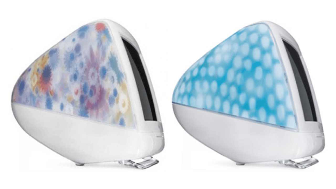
Feb. 22, 2001 marked the introduction of the Flower Power and Blue Dalmation iMac G3. Why did these machines exist for so short a period of time?
I suspect the reason was that the process for decorating the inside of the iMac proved that the process would work for the iPod that was going to be released months later, and allowed Apple to test on an existing product at production scale.
This model was short-lived, replaced by the Snow White, Graphite, and Indigo iMac G3, with only Snow surviving before being replaced by the iMac G4 LCD sunflower model.
Flower Power recalled the 1960s hippies, and Blue Dalmation dogs never existed. We're pretty sure it wasn't a popular color. We're even pretty sure it wasn't one of Ive's favorites. But it shows that design isn't always easy.
Motorola wasn't supplying faster G3 CPUs, and Apple had begun to source them from IBM. iMac G4 was almost a year away. There was pressure to release a new model. It allowed Apple to learn how to make a machine where no two would be the same, and make them reliably. It was looked down on by the press then and now.
But, it definitely broke the bright fruit color pattern that everyone else from kitchen accessories to DIY tools were copying. It paved the way for the iPod, and was the most distinctive computer that showed the industry followed Apple, not the other way around.
Mike Wuerthele - Original iPad
This one took me some thought. There are a load of big-time Ive-led inventions, and picking a favorite took forever. For sheer impact in this house alone, the iPad takes the cake.
For myriad reasons, the vast majority of documents that I had to read and assess through the '00s were provided on PDF. I purchased a heavy and thick Windows tablet with a stylus to do so more conveniently. It was heavier than any single book I had to read, but more compact than all of them combined.
When the iPad was announced in 2010, the game was changed. It wasn't just changed for me, but it gave the internet back to most of the senior citizens across my family.
Furthermore, in 2015, my wife had a stroke. All of a sudden, she went from being on her MacBook Air all the time, to being completely unable to use the keyboard on the machine. The iPad became a crucial part of her recovery and relaxation.
I've said it before, and I'll repeat it here. The iPad is, finally, Apple's computer for the rest of us. And, Apple's design for it made the entire concept possible, usable, and beautiful.


 Wesley Hilliard
 Amber Neely
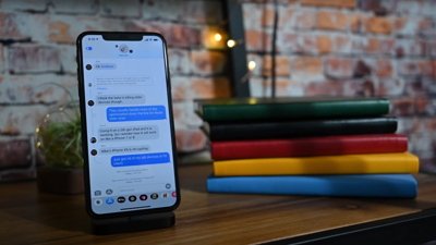
 William Gallagher
 Malcolm Owen