The worst Apple designs by Jony Ive, according to the AppleInsider staff
 William Gallagher
While he's often lauded, not everything Apple has cranked out under Jony Ive's design lead has been spectacular. We've been on the Apple beat nearly as long as Ive has, and we have some thoughts on the flops from Ive's design studio.
Malcolm Owen — Magic Mouse 2
For the most part, the Magic Mouse 2 is a well-designed peripheral. Following on from the original, it retained the same physical appearance while also losing some weight and adding a rechargeable battery, changes that are on the face of it quite useful to end users.
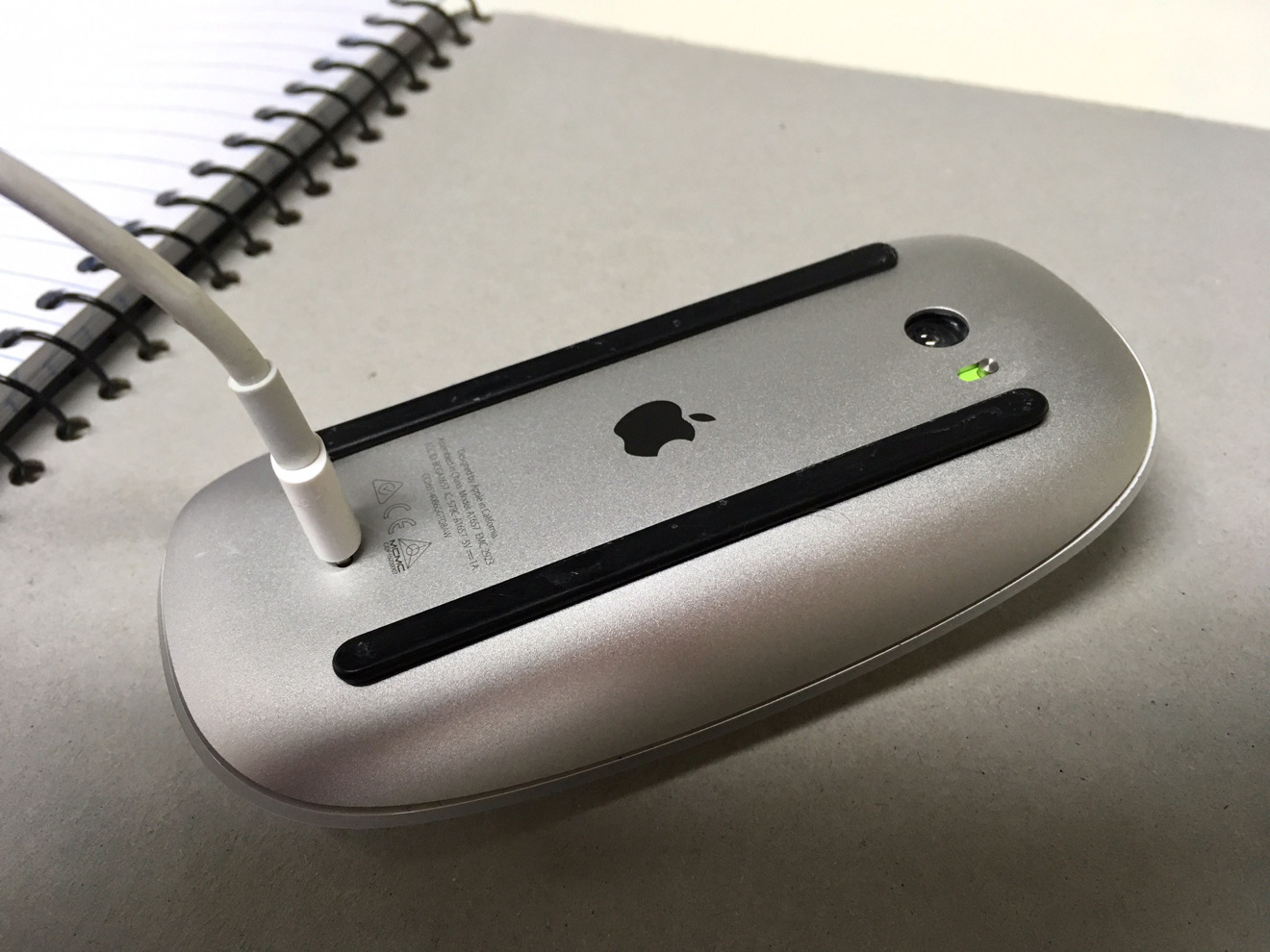
My beef with the Magic Mouse 2 is the lapse of judgement in its design to place the charging point for it on the bottom edge. Rather than sully the outside of the mouse, Apple hid it at the very bottom of the device, where users won't see it unless they need to recharge the thing.
Granted, the idea of hiding it there isn't entirely that bad, but it does mean that the mouse isn't able to be used at times while it's being recharged, as there's a cable and connector in the way. It may only be for less than a minute to get a few hours worth of charge, but it still leaves the user sitting there, twiddling their thumbs waiting for the thing to get enough power to do the thing they actually want to do.
I'd also argue that there isn't anything wrong with placing the charging point at the front point of the Magic Mouse. Some other wireless mouse producers do so, effectively turning it into a "wired" mouse while charging, and it isn't unsightly.
Add in that the front of the mouse isn't usually on view to the person wielding it through normal use, and it makes the base-based port seem even more daft.
William Gallagher — The original iMac
It's heresy to say it when the product is often beloved, and when it unquestionably saved Apple. Yet back in 1998 when it was new and on through today when it's an antique, I've really disliked the design. It looks bulbous and ugly to me, and I understand that this is because there's a whacking great CRT monitor in there — but that doesn't change my mind.
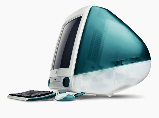
And nor did any of the range of colors it came in.
I liked that the iMac came in many colors, and I have since become an absolute fan of the iMac range. Just not that original version.
Mike Wuerthele — The "hockey puck" mouse
Apple has a long and storied history with pointing devices. The company may have ushered in the dawn of the mouse with the Lisa, and then for everybody else with the Mac, but there have been some missteps along the way.
The AppleDesign mouse that shipped after Apple's original ADB mouse wasn't great, but it wasn't terrible. Its successor, the "hockey puck" mouse that shipped with the iMac, was fully terrible.
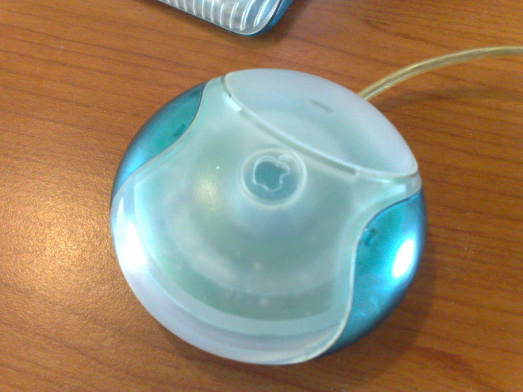
With it being circular, there was no clear "up" without looking at the protruding cable. It was a wreck ergonomically, too, so it was a good thing that there were USB mice from third parties when it shipped.
A bit later, Apple put a divot on the mouse button for a better orientation, similarly to how it has put a raised circle around the Menu button on Apple TV remote. But that didn't help that much.
It was replaced by Apple's optical mouse, which was better, but again, still not great.
Andrew O'Hara — Smart Keyboard Folio
I was a pretty big fan of the original iPad Pro Smart Keyboard. I liked typing on it, liked being able to easily remove it, and liked using it to prop up my iPad when watching TV or movies. There was a fraction of users though who had issues with the presumed complexity of folding the cover around.
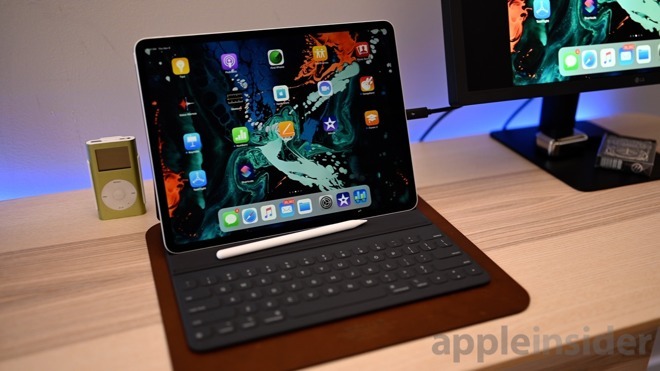
With the second-generation Smart Keyboard Folio, Apple seems to have tried to make up for this and overcorrected. The Smart Keyboard Folio forces back protection onto users instead of making it only an option, as with the first generation. It added cost and bulk to the otherwise extremely slim third-generation Pro. With the case attached, the 2018 Pro is actually thicker than its predecessor.
It also can't be used to prop up a Pro without the keyboard sticking out, taking up a huge footprint on your desk. When not using the keyboard and folding it around the back, there's an awkward experience when users are holding onto the keys — it feels squishy and just odd.
Here's hoping that the Ive-less design team comes up with some improvements for the fourth generation of Apple's pro tablets.
Amber — The third generation iPod shuffle
For the most part, the iPod shuffle wasn't really on my radar. In fact I didn't routinely own iPods or really any Apple products until the introduction of the sixth-generation iPod nano. I was aware of the Shuffle however. After all, nearly half of everyone I knew owned a second-gen model at some point.
Who wouldn't want a tiny, wearable MP3 player? It was certainly a lot more gym-friendly than most.
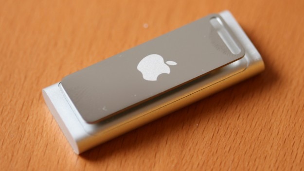
As before, the third generation was a thumb drive-sized stick that you plugged headphones into. It had one control on the device itself that dictated whether you listened to your music in order or shuffled — leaving additional control to the earbuds' in-line remote.
The product was a confusing choice for Apple to make. From a design standpoint, it was a big step backward. The second generation was a small, squat rectangle with a clickwheel that clipped onto your pocket, and allowed you to easily change songs and volume without much thought.
Functionally, the third-gen Shuffle was a total miss. If a user had a favorite pair of existing headphones that didn't feature that inline, three-button remote, they wouldn't be able to control their music. If they did, they'd still have to learn a series of non-intuitive clicking patterns just to navigate a series of invisible menus.
The third-gen was clearly not the hit that Apple had been expecting, because the fourth-gen Shuffle was released a little over a year later and was a slightly stumpier version of the second-gen. Not only was the clickwheel back, it also included an expanded color range, making it the most iconic in the product line.


 Malcolm Owen
 Amber Neely


 Sponsored Content