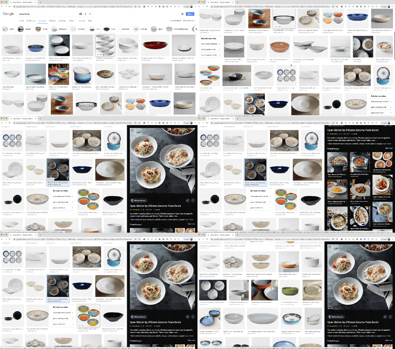
If you’re browsing Google Image search results today, you might notice a new interface element: A sticky side panel that displays any images you click on, providing a closer look at the specific image you want to see, including related images, additional info like ratings, price and in-stock status, ingredients and cooking times, depending on whether you’re searching for products, recipes or something else.
The new sidebar replaces a full-width, in-column interface element, with the advantage that the new interface allows you to continue to browse the image result thumbnails returned on the left. Clicking on any other images will replace the one in the sidebar, but you can easily navigate back and forth with your browser’s built-in navigation features, or you can page through the results in sequence using the right and left arrow keys.
These work already for a lot of existing results and products, but developers who want to ensure their product image results likewise provide this info in a way that means Google’s search engine will pick them up can reference this developer documentation to find out how.
[gallery ids="1865212,1865213,1865214"]
Overall, even though this is not a massive change from what came before, it feels directionally like a big deal: Google has been iterating in a very Pinterest-like direction with image search in general, but this feels functionally like a mature product aimed squarely at comparison shopping, hobbyist cooks, decorators and designers. It’s a very different product from what Images used to be, and that probably affords Google a lot more opportunity in terms of how it monetizes image search in the future.
