Project Catalyst is Apple’s attempt to make it easier for developers to port their iOS apps across to the Mac. It’s a way for Apple to help developers bring mobile apps over to the Mac, without needing to resource an entire team to keep it up to date.
That’s good news for developers, but is it good news for everyone else? Back when we tested out the MacOS Catalina beta, we weren’t at all convinced — Apple’s own Catalyst apps, like Apple Music and Apple TV, were muddled and felt half finished. Not exactly confidence-inspiring. But now that MacOS Catalina has been officially released, other developers are getting in on the act, with over 30 cross-platform apps now out on the Mac.
We wanted to know whether these third-party developers were able to do a better job than Apple when it came to Project Catalyst. To find out, we’ve examined five apps in detail across a range of genres. Do they signify a bright future for Project Catalyst, or is it in dire straits already? I dug through some of the first examples to see how things have kicked off.
The good

We’re off to a great start with PDF Viewer. Where some Project Catalyst apps are a jumbled mess of misplaced design decisions, PDF Viewer is clear, clever and well-made. Not only has its developer taken the time to make its PDF editor app feel at home on the Mac, but its even taken a leaf out of Apple’s design book with some sensible choices that mean it fits right in.
It draws favorable comparisons to Apple’s own Preview app, with a row of similar buttons placed at the top of the app. But PDF Viewer’s developer has gone further with its layout choices for these buttons: Zoom, sidebar and sharing buttons are on the left, while editing controls are on the right, just like in Preview. Since PDF Viewer and Preview can perform similar functions, you may find yourself frequently using both apps. In cases like that, you’ll really appreciate the familiar feels of PDF Viewer. It’s a perfect example of why design consistency matters.
Elsewhere, text sizes and styles are appropriate for the platform, while there are plenty of useful options in the menu bar. The only slight misstep is the inclusion of iOS-style sliders instead of checkboxes in the settings, but this can be excused in lieu of everything else PDF Viewer does right. It’s an exemplary Project Catalyst app.

Next up, MoneyCoach — a saving and personal finance app — is a mixed bag. It looks like a mashup between Apple’s brand-new TV and Reminders apps, with occasional stumbles thrown in for good measure.
At the top are four tabs: Overview, Budgets, Transactions and Reports. This layout has much in common with the TV app, which we had some serious misgivings about when we first tested it. Still, MoneyCoach’s approach works better because it actually feels like some thought went into the design.
The Overview tab, for example, is well-stocked with Reminders-style rounded rectangles, each containing a different section of content. Color is used judiciously to highlight key areas and catch your eye, without looking like a rainbow explosion. The Reports tab, meanwhile, is well organized, if a little overwhelming.
It’s not perfect, though. The process for adding a new budget is very reminiscent of iOS: the pop-up window has Cancel and Save in the top-left and top-right, respectively, where MacOS style is to use the traditional traffic light buttons. The Settings window is lifted almost verbatim from iOS’s Settings app, while iOS sliders abound.
It feels like MoneyCoach’s developers almost nailed it, but then ran out of time and ported the rest of the app wholesale from the mobile version. Throw in a weird glitch where the text in some (but not all) boxes changes size when you resize the app and you have an app that just falls short of full marks.
The bad
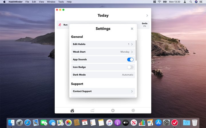
HabitMinder is, as its name suggests, an app designed to help you start and maintain good habits. Eat more veg, do more exercise, learn something new, that sort of thing. You can choose a habit from a long list of options, sorted into five different categories: Body, Mind, Healthy Habits, Appreciate and Commit. Choose a habit, decide how often you want to do it, then click Save.
However, there’s one inescapable problem that rears its head almost immediately. Design. HabitMinder looks and feels like an iOS app that got lost and wandered onto the Mac when looking for the cereal aisle. The Home tab, for example, is a vast empty zone where your chosen habits are dwarfed by the cavernous white space; presumably this would look acceptable on iOS, where the smaller screens make the empty space less obvious, but it’s painfully obvious on MacOS.
The problems extend to the settings, where iOS-style sliders take the place of the checkboxes that are used on MacOS. Text is massive and bold, in stark contrast to the subtler styles more commonly seen on the Mac. And, bizarrely, you can only resize the app’s width by (literally) 5-10 pixels in either direction.
You may argue that all this is inconsequential, and that we’re just being overly fussy. But Apple has always prided itself on its design consistency. Part of the reason people love MacOS is the developer community that’s built around it. Mac apps have their own design rules. Even if you’ve never used an app before, you know roughly how it works because other Mac apps work in the same way. So when you start seeing iOS buttons and the like, it feels ill-suited.
HabitMinder’s mistakes are not directly Apple’s fault, but the company has opened the floodgates to this sort of thing by introducing Project Catalyst, then following it up with its own half-baked apps in the Catalina beta.

Twitter is a great example of what Mac Catalyst aims to do. Twitter removed its native app from the Mac back in early 2018, claiming it was too difficult to keep up to date given its amount of users.
But Mac Catalyst has allowed Twitter to easily port over its popular mobile app. Given it’s probably the biggest name among the Project Catalyst apps thus far, I had high hopes it would be an example of all that’s good about Apple’s cross-platform experiment.
In hindsight, I probably shouldn’t have expected much, seeing as using Twitter in a Mac web browser feels like you’re on iOS anyway. Twitter’s Catalyst app is perfectly serviceable — it’s essentially a Twitter web app packaged up as a native app. The layout is familiar, with sections for hashtags, notifications, messages and more on the left, your feed in the middle, then a search box and trends on the right. So far, so ordinary.
About the only thing that distinguishes Twitter on the web from the iOS app is its settings, where you get traditional Mac checkboxes on the Mac and sliders in the iOS app. Ironically, the Catalyst app uses sliders, even though these have never had a place on the Mac. It’s about the only thing that differentiates it from the normal Twitter experience on a Mac.
The overall impression we get from the Twitter app is one of minimal effort. Sure, it works fine, but it’s so similar to the iOS Twitter app that it’s hard to tell the difference. There are no considerations for the Mac here, just a ported app that’s been churned out in however long it takes to tick the Project Catalyst checkbox. If this is going to become a trend for Catalyst apps, it doesn’t fill us with confidence.
The ugly

Rosetta Stone may help you learn a new tongue, but unfortunately it’s not yet fluent in Apple’s design language. Some of its mistakes appear to be due to a lack of effort, while others are strange visual glitches and other oddities. In the latter category, for example, is what happens when you resize the app. Instead of rearranging the on-screen elements to fill the space when you widen the app, everything just gets bigger. It means the space is used just as poorly as when the app was narrower.
But it’s the former category where the more egregious missteps are found. Right from the sign-up page, things seem off. You are presented with a box to enter your name, a comically large Next button, and a vast swathe of empty white space. Click Next and you get another box to enter your email, again surrounded by emptiness. Why couldn’t these have been on the same page? The larger screen of a Mac provides ample space for this, but inexplicably the developers ignored this possibility. It tells us that very little consideration was given to how the app would function on the Mac.
Once you’re into the main body of the app, it’s more of the same. The layout is extremely basic, comprising solely of tiled boxes for each language module. There are no sidebars, no tools, and only a squalid selection of menu bar options. Although some of these elements make an appearance as you go deeper into the app, the initial impression is extremely poor.
The Mac is a powerful machine, and its apps don’t need to be constrained in this way. Project Catalyst is an opportunity for developers to take their existing iOS apps and expand and customize them for the Mac experience. Give users more options, let them do things that they can’t on iOS — that’s what Project Catalyst is for. Instead, too often we get apps like Rosetta Stone. It’s the worst kind of lazy, opportunistic app development, and Mac users deserve better.
Editors' Recommendations
- Does your Mac need antivirus software in 2024? We asked the experts
- Don’t download the latest macOS Ventura update just yet
- I was wrong about using Stage Manager on Mac
- Why you should buy a MacBook Pro instead of a MacBook Air
- Apple just announced the dates for WWDC 2024