TipBITS: Google Drive Sorting Can Hide New Documents
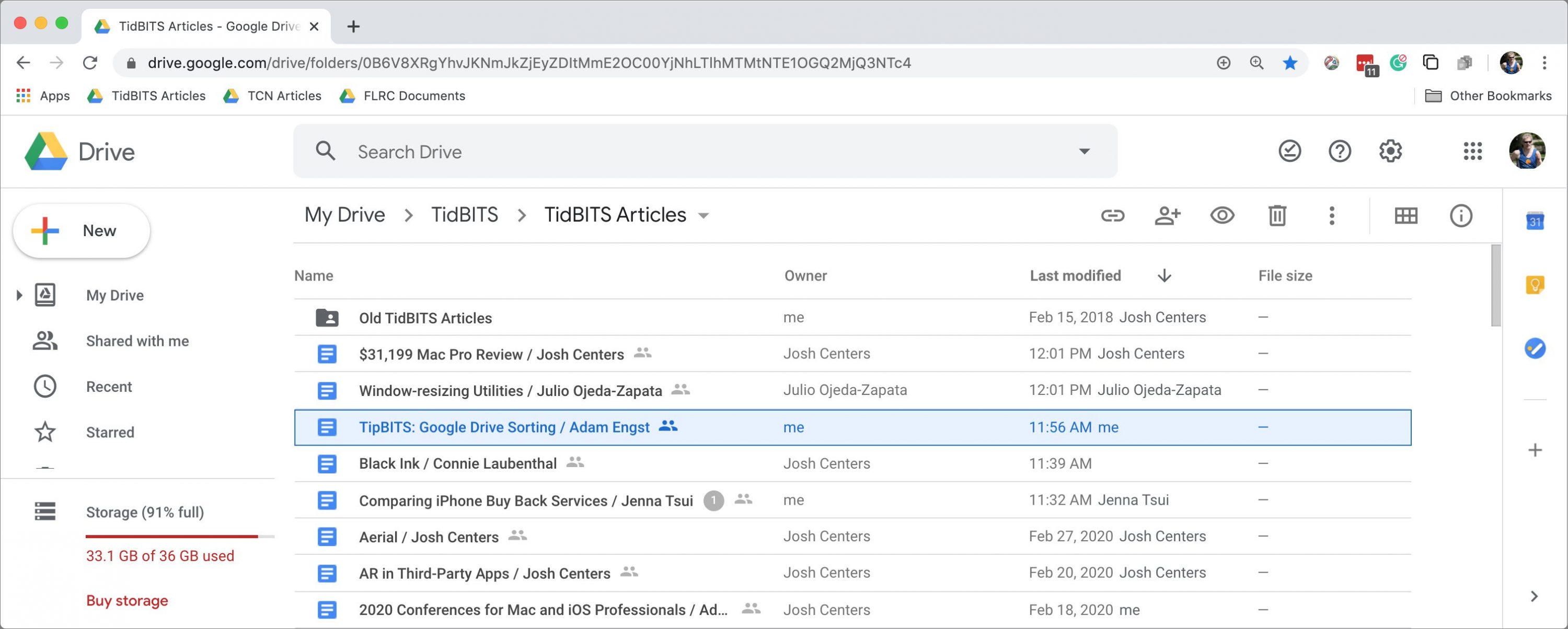
Here at TidBITS, we rely on Google Docs for all our collaborative writing and editing. We have a TidBITS Articles folder in Google Drive that we share with our regular contributors, and whenever we work with a new author, we share an article template file with them manually. As a result, that TidBITS Articles folder has become the central location where Josh and I look to find the articles we need to edit—new files and those that were most recently edited bubble to the top by default.
So you can imagine my frustration when, for about a week, Josh would tell me that a new article was ready for editing, but it didn’t show up at the top of the TidBITS Articles folder. I could find the article by searching for a word I thought was in it, but since I hadn’t read the article yet, finding it was sometimes just dumb luck. Once I had found the article and taken my edit pass, it appeared at the top of the folder as it should. Maddening! Josh wasn’t having the problem, so it was clearly somehow related to my system.
I tried different browsers, multiple Macs, and logging out and back into Google Drive, but nothing helped—new articles didn’t appear. Then one day, randomly, I scrolled to the bottom of the TidBITS Articles folder and all suddenly became clear.
Google Drive lets you sort by name or last modified date in either ascending or descending order. In a slight twist from what we’re used to on the Mac, there are three options under the Last Modified menu. You might not have even realized Last Modified was a menu since the downward arrow indicating that doesn’t appear until your pointer moves over it (one demerit for poor discoverability, Google).

The options are:
- Last Modified: The default option makes the most sense for most people, most of the time, since it merely looks at the last-modified date for every file—whoever made the change—and sorts accordingly.
- Last Modified By Me: This option is more subtle and can be useful when you share a folder with other people but want to focus on the documents you edit.
- Last Opened By Me: The final option is essentially the same as the previous one but considers a file as “touched” if you merely open it, even if you don’t make any changes.
My problem stemmed from the fact that my sort order had somehow changed from Last Modified, which is what I want, to Last Modified By Me. That change caused my confusion because, with either Last Modified By Me or Last Opened By Me, all the files that you haven’t yet edited or opened sort to the very bottom of the file listing when the sort order is set to ascending, as mine was. Out of sight, out of mind.
Such a sort order is sensible, of course, because if you haven’t yet edited or opened a file, it has no “last” date to sort by. But if, like me, you’re accustomed to everything showing up at the top of a Google Drive folder, particularly one that might have quite a few files in it, you’re unlikely to think to scroll down.
I hope you can learn from my week of frustration caused by a not-so-obvious sorting error.
It’s even less discoverable on a touchscreen device with no pointer to move over the menu. You just have to guess to touch it.
What is it with interface designers these days. This type of thing just infuriates users for absolutely no reason.
It feels these days like there’s a lot more stuff that’s hidden from first glance. I suspect for one it’s because our software is just more complex and is increasingly expected to contain yet more features/functionality/fluff, but also because a lot more of it is designed either for touch (making it under-dense on “real” computers), or not keeping touch in mind (alt tags with mouse over come to mind) making it user unfriendly on iOS.
Those are the good reasons for hiding things. I also think there’s a trend toward lazy UI work, particularly on small screens, because of “social discovery”—a friend will tell you about it. The pull-down-to-search convention in iOS is like that—who in their right mind would think to pull down at the top of a screen to see more? Once you know about it, however, you’re fine (until you forget).
That’s interesting, Adam. I never thought about that ‘social discovery’ being intentional. But now that you put it that way, I can imagine how Schiller and his folks would be drooling over it during meetings. Every tweet about such a discovery, another victory.
Is there any answer to how users can keep abreast of such things though? Without constantly tapping and toying around every app.
I’d guess not, though there is this book series called “Take Control Of…” that I’ve heard good things about. Oh wait…
Alas, no, since companies are constantly fiddling with the user interfaces of their apps, and with Web and mobile apps, you don’t get much of a choice about updating. They might call out major changes, but my experience is that small things get moved around all the time with no notice.
If I was President of the World, release notes would be better.
UI/UX/Ix designers come from a broad range of backgrounds. In fact, it’s probably one of the disciplines that’s most welcoming to people who don’t have a formal User Experience Design education. That’s a gift, but also a curse.
Because you can make more money if you “do” UX than graphics design, a lot of designers who have no clue about interaction design — the part that is focused on how humans communicate with technical artifacts — work in the field of UX, and don’t even realize the damage they’re doing.
That said, the backgrounds of the people I worked with, range from graphics design via cognitive science to web coder, and lots of other skillsets mixed in. And all(!) of them really grok UX, and their work and their focus on making stuff user-friendly is proof of that.
Unfortunately, few people who are hiring designers have rock-solid understanding what makes good user interfaces, so they lack the insights to differentiate between applicants who get it, and those who should focus on “beautifying” graphics, instead.
Add to that a massive lack of true talent as well as the constant perceived(!) urge to keep working on user interfaces, even they’re just fine as-is, and you get into a situation where user interfaces are “fixed” even though they’re not broken at all.
What you’re describing nicely sums up why it’s key to usability to optimize user interfaces for the intended client environment.
If you don’t have a pointing device, hovering over a control is likely impossible, so hiding things makes discovering those features a lot more difficult than if you’re working on a laptop or desktop machine.
Conversely, there is a lot more room on the typical computer than on a mobile device, so there is actually no need to hide as many controls.
A competent designer knows exactly how to optimize a UI for the constraints of a particular target device. But not every designer has an equally competent product management peer who cares as much about usability as the designer does. Or who at least trusts the designer to do the right thing instead of interfering with the designer’s decisions.
Ha, never heard that term before, Adam.
I feel that’s a great concept for nifty, easter-egg-like power user features. Just today I found one of those in Sketch.app (the arrow keyboard shortcuts for nudging and resizing symbols/layers also work for the selection when cropping an image, which makes me irrationally happy… ).
).
That approach should never be used for core functionality that is meaningful to the majority of users, however!
E.g., it’s neat that I can delete list items in most iOS apps by swiping them to the left. As long as that is offered in addition to an easily discoverable Edit mode, that’s a nice short-cut. But if that’s the only method for deleting list items, the design has failed, because it’s nearly impossible to discover this interaction.
Undo via shaking the phone or three-finger swipe, anyone?
Ya mean you’re not?!?! Adam for Prez.l,l,l