So the new iPad has been released (I ordered two of the top models), along with an updated AppleTV to take advantage of its retina display.
I will not at all be surprised when the tech pundits today boohoo the new iPad, from its failure to cure cancer through to its ungainly name, which I predicted would be the case in a previous blog entry, just because Apple can. And indeed likely enjoys playing the punditry for fools, while it laughs all the way to the bank.
Before I get to the main points of this blog entry, a couple of non-appearances are worth noting.
1. Where was Scott Forstall? I can’t recall an Apple keynote where the iPad and iOS were featured and he was not given a place on stage. Given he reports direct to Tim Cook, was this Tim’s way of further asserting his new CEO status? Or hopefully, a much more simple explanation.
2. Where was the much anticipated Microsoft Office for iPad which had the tech punditry all atwitter in recent weeks, once today’s keynote invitations had been sent out?
Instead, what we did see but not demonstrated were beefed up iWork apps, which like iPhoto for the iPad allowed Phil Schiller to drive home the message that “don’t let anyone tell you you can’t create on an iPad”. (You can see him refer to this at 1h:15m:20s, after you download the keynote podcast from the iTunes store ).
Indeed, Schiller emphasised the parity that now exists between iPad and Mac OS X devices like the iMac and Macbook since the Apple creative applications – iLife and iWork – now exist on both platforms with an extremely similar feature set.
I downloaded the Keynote update, now in V1.6, with the most important and obvious additions being the near match between builds and transitions. It’s not quite 100%, and of course the iPad font set is still limited, so error messages may crop up after importing desktop Keynote file with esoteric fonts.
In a previous blog post I had predicted that an updated desktop Keynote would not be released into the wild until there was much greater feature parity between the two versions, and this would require an improved iPad with respect to CPU and graphics. The hint Apple gave us that this was on the cards can be seen with the placement of the Keynote app icon in the tray for the keynote invitation illustration. I don’t know anyone who leaves Keynote there, myself included.
Which leaves desktop Keynote users to ask: : “Whither Keynote? You’ve not been updated for more than three years, so what gives?”
Clearly, much of the iWork team’s efforts have been directed to the iPad versions plus iBooksAuthor which also received an update today (V1.1) to account for the new iPad’s retina display.
There are clues however, and in today’s keynote I believe we saw hints that a new version – or at least some feature additions to the current version – are present.
Let’s go to the video replay…
In recent keynotes, Apple has been overenthusiastic about its use of the Anvil build, something which was last added to Keynote in a point update, as well as some new text builds. It’s been used when keynote speakers wanted to drop a bomb on us, so as to demonstrate “incredible” numbers of apps sold, or stores opened, or some other fact where expectations were crushed.
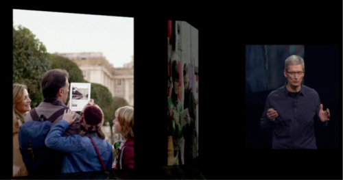
In the March 7 keynote, we didn’t see it at all. Perhaps it was a favourite of Steve Jobs, and here is Tim Cook asserting his status once more. If there was one build we saw quite often in today’s keynote, it was a variation of the “move” build, but this time two elements came in almost simultaneously, while pushing other elements no longer up for discussion, out.
If you have the podcast, go to 20m:14s, and here are some screenshots of what I noticed:
 Here Tim is discussing how iPad users rate the device for various activities, such as reading books. He’s now going to discuss it as a favourite for playing games, so in the next click of his remote, the iPad image and text slide to the left, but not quite synchronously:

And now the new image and text slides in from the right, the text in the lead before the previous image has left the building:
And the rest now slides into place, the text once more leading the way:
And now the image aligns centred above the text:
Now, each of these could be performed with “move” builds – in and out – but some of these slides would require four of these, two each for text in and out, and two each of image in and out.
Because this effect was used several times in the keynote, I’m going to assert that it represents a new transition, similar to Magic Move, where you create each slide with its picture and text, and the transition does the work for you, such that you can control the delay and speed. Who wants to guess what Apple calls this new transition?
I suspect, however, this is was not the only transition. For some time now, I’ve been watching my AppleTV when it goes into screensaver mode. As with iPhoto, there are several very interesting ways that new photos can be brought in, including Origami. If you have an AppleTV, check in Settings for your screensaver options:
(Brian Burgess, at Groovypost.com has a nice set of screenshots and elaboration upon AppleTV screen saver options here).
When I noticed these in action, it caused me to wonder how nice they would be as additions to the Keynote transition set, especially as more people are using full size pictures, as well as multiple illustrations in Keynote.
I think I saw one new addition in the March 7 keynote, at 18m:22s:
It starts at the time Tim Cook has said Apple sold more iPads in the last quarter of 2011 than any PC maker sold all their PC products, and says iPads are “showing up everywhere in the daily lives of people”:
Now it’s quite possible to do all this with the current Keynote, but why would you? It’s not Apple’s way to make itself, and the user, work so hard, when it can create transitions to do it for you, with you merely selecting the images (or presumably, text).
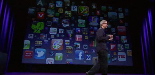
I suspect there is one more new build or transition but the camera work was too poor to pick it up. It occurs about 20m:40s and here is the images I can grab but they are certainly uninformative:
I suspect this popping of apps as a build in was in fact similar to what was shown at the Education keynote to introduce iBooksAuthor January 19th, and used the Object Zoom transition.
It’s a very underutilised effect, bit I did manage to use it myself at Macworld in January. See below.
If you think you saw some new Keynote effects, please add your thoughts in the comments section below.


Scott Forestall is in charge of IOS. Nothing of IOS
was highlighted except to mention 5.1 and Japanese Siri.
Microsoft is not going to show Office when it is not even out
in Beta and they have to show something for their tablet.
They didn’t even show at Win 8 unveiling.
Didn’t I say Mac version won’t be updated until Mountain Lion
and Retina Display Macs.
You may be on to something, Les, but I’m pretty confident that the first transition you mention is the Object Push slide transition. The only variation being, as you mentioned, the text appears to precede the media, whereas it currently is vice versa.
But, goodness, we sure are due for an iWork update…
When i use an Object Push, the behavior is exactly like in Tim Cook’s presentation.
Found it. By using the layers function (moving objects to the front or back), you change the behavior. The objects at the back start the transition first. Actually, the online help gave the answer.
I for one would welcome an upgrade to iWork (well over due) and I HOPE that it will allow for a more tightly integrated experience for docs moving between max and advices. All too klugey at the moment – but now they are closing the iwork.com beta – i wonder if iWork will come out with a proper interface to icloud that idevices and macs can both easily access – a la dropbox say 🙂 This IMHO would be an absolute MUST.
Hi guys,
I am new here and am loving the enthusiasm and knowledge of all of you here.
We have developed a very simple yet clever way of creating powerful videos using Keynote (or PowerPoint if you must!) as a base and need excellent people like yourselves to help us. An example of this can be found at the link below, and the style can change depending on client need:
We would be very interested in talking to you if you feel you have the ability to create these videos in their entirety (we can provide the illustrations and voiceover). Please email dan.h@performanceconsultants.co.uk to have a chat.
Thanks for all of the informative comments here – they are most useful.
Kind regards,
Dan
Pingback: Iwork For Ipad | computer laptop reviews, desktop computers, notebook reviews