Just about the most asinine, presumptuous, hubris-filled thing a designer can say is that someone else’s design is “wrong”. That word is reserved for judgments of absolute truth or ethical guidance; for flawed mathematical proofs and crimes. And yet, allow me to declare the following: Jony Ive’s icon grid in iOS 7 is wrong.
Or perhaps I should say, it’s being used wrong. Let me give a specific example, and then I’ll explain.
Jony Ive’s new “icon grid” is a guide meant to ensure that different apps’ icons look harmonious on the home screen. That’s a lofty goal. The issue of whether a grid can really accomplish that is complex; most designers think that non-block-based designs (so, not paragraphs of text, not photos, not headings) require a lot of “optical adjustment”. This is fancy talk for “tweak it so it looks right.”
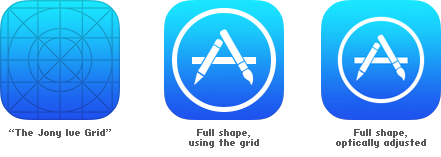
But whether we accept the idea of a grid or not, here’s the bigger point: no icon designer I’ve asked thinks Ive’s grid is helpful. In that sense, it’s wrong. The large circle is too big. Many apps in iOS 7 use it: all the Store apps, Safari, Messages, Photos… In all these icons, the big shape in the center is simply too big. Every icon designer I’ve asked would instead draw something like the icon on the right. To our eyes—and we get paid to have good ones, we’re told—this is more correct.
Now, it’s possible that Ive’s grid is simply being misinterpreted by the actual designers who put pixels to screen to make these icons. (I doubt that Ive himself fired up Photoshop and cranked these out.) His grid is a good guide of bounding boxes. That large circle represents the outside edge beyond which your icon’s shape should never extend.
Here’s an illustration of this concept:
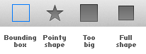
The blue, hollow box is the maximum area the icon can fill in this toolbar. If your icon is a “full shape” (one that fills space very efficiently) it would be a mistake to simply make it the size of this bounding box. It would look too big. Instead, it should be inset slightly. That way, “pointy shapes” (with a lot of “inefficient”, protruding parts) can extend to the edge of that bounding box, and the two kinds of shapes will look good next to each other.
(It’s also worth noting that you should absolutely mix up “full” and “pointy” shapes. This kind of visual rhythm makes icons recognizable, and gosh darn it, it’s what makes all art look good.)
So, in this sense, the new app icons in iOS 7 are wrong.