
The Good, the Bad, and the Downright Ugly of Parallax Web Design
You might not know what it's called, but you, reader of the Internet, have most likely encountered parallax scrolling — the latest trend in Web design — at some point in the last six months to a year. If you were one of 3.5 million, or so, people who read The New York Times much talked about multimedia Pulitzer Prize-winning piece "Snow Fall," you saw it. Or if you happened to visit the Brookings Institute recently to read this essay on gun violence you experienced it, too. And if you're a regular visitor to The Verge, Pitchfork, or ESPN, then you've probably seen it on some of their long-form articles to come out in the last year, too. These multimedia experiences all feel similar because of the very specific design element called parallax scrolling.
RELATED: So What if Tons of People Read That 'Snow Fall' Story on the Times Website?
Parallax is the web design technique of using CSS to make different layers on the web page move at different rates. So, when scrolling down the page, instead of having all the text, photos, videos, and other elements move screen altogether, it feels more like a visual page turn, with a new layer of beautiful imagery or video or a pull quote gliding up to replace the just read "page." "It makes you feel, as a user, that you're sort of interacting with the page," Pitchfork's creative director Michael Renaud told The Atlantic Wire.
RELATED: New York Times Designs 'Snow Fall' 2.0 (Almost)
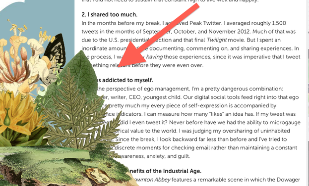
Certainly, the first time you encounter it, it feels cool because it's different. But, since "Snow Fall", it has started to turn up everywhere — in ways that don't always feel so useful. Take last month's Fast Company story about Baratunde Thurston quitting the Internet for 25 days. Toward the bottom of the page, the designers used parallax to make leaves and flowers bloom onto the page. Unless you're browser window is extremely wide, the details ended up covering the text, however, making it difficult to read the story:
RELATED: The New York Times Site Redesign Looks Like a Really Nice Blog
Maybe that was a subtle point by the designers? The piece was, after all, about the benefits of getting away from the very Internet you were using to view the story.
Elsewhere, it just feels a little forced or unnecessary. Pando Daily used parallax for a feature on Quantum Computing, which a lot of people thought looked nice but attracted some critics, too, who thought the layout "hurts" and an "unreadable ... spectacular waste of time." Did that Brooking's Institute essay really need its design? (Some would say no.)
"It's getting a little overused everywhere," Trei Brundrett, the chief product officer for Vox Media, which owns SB Nation, The Verge, and Polygon, told us. The makers of "Snow Fall" and the other parallax pioneers who have used it made it the defining feature of thoughtful web design. "It's a signifier of quality. It has become a trope," added Pitchfork's technical director Matt Dennewitz. That's partly because it's easy to slap on some parallax on say: Look at this fancy thing I did for a big long piece. Both the Pitchfork and Verge guys say it's not very hard to code. "You can add CSS and do a parallax and it's not a big deal," said Brundrett.
The low barrier to entry means, a lot of the times the effect doesn't add much to the story. "I think it's cool if used appropriately or in moderation," said Brundrett. A good use, he says, would be to "cleverly position" photography next to supporting copy, like in this Pitchfork story about the punk band The Savages, where it draws more attention to the pull-quote.
The most compelling designs go beyond parallax. "Snow Fall", for example, had a lot of other impressive design elements. They brought in a physicist to recreate the avalanche; they collected elevation data for the fly-over cascades. "The parallax were the least exciting of that experiment," said Brundrett.
As pointed out by many critics, to implement a project like that takes a lot of resources that most media properties don't have—or perhaps put another way, the business of web publishing can't currently support. Coding in a little parallax scrolling on its on its own, however, is do-able even for smaller operations. Unfortunately, that means it has gotten very tired, very fast. The Pitchfork team sees the whole trend winding down in the next year or two. "I think people will start to use it a lot more and possibly tire of it," said Renaud.
Despite the beginning of the end for parallax, its existence has led to a renaissance in the way people — designers and readers — think about web design. "It's definitely been a gateway drug to thinking about design," said Dennewitz. This now-tired element has opened up a whole new way of thinking for web designers. "Designers are excited that there is a lot of energy and curiosity around more thoughtful design and breaking out of our optimized content world," added Brundrett.
As for readers, it's what the Pitchfork guys call a "Trojan horse." The more people are exposed to and understand different formats, like parallax, the more their teams can experiment with other things. The hope is that parallax just part of the larger trend to creating more interesting ways to read long-form things on the Internet.
So if Parallax is out, then, what's next? Better animation, maybe. Or, better ways of incorporating stories within stories. Neither the Pitchfork or Vox media guys really knew. But they seemed confident that web design would continue to evolve, for the better.
Top image by Todd Neal via Flickr
