
iOS 7 has been hailed by many iOS users as the biggest overhaul of Apple’s operating system since iOS was unveiled in 2007 with the first iPhone. However, it seems to me (at least) that Apple did not unveil a new operating system for the sake of doing so. Apple wanted to provide a new user experience that would make using the iPhone as easy (if not easier) than it was before.
As I sit here taking in my iOS 7 desktop view, I am first taken away by the array of colors of the various icons that, at first glance, appears to be a child’s coloring project gone wrong – but, when combined with the transparency look of the notification window and the Control Center, looks absolutely riveting.
There are a few things about the iOS 7 desktop and individual applications that will strike you at first glance. I’ll cover a few of them here, although time and space constraints will not allow me to do justice to them all.
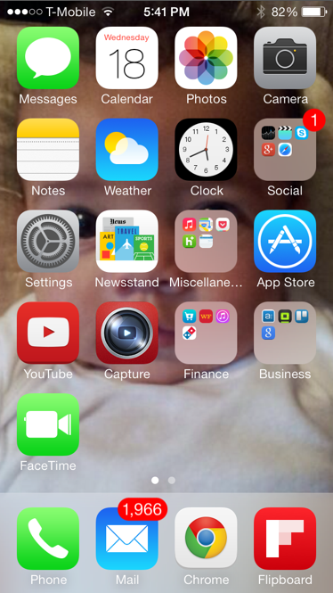
iOS 7 Sight #1: Signal Bars and Battery Icon
Contents
It’s been said long enough that it sounds almost trite to repeat, but it’s true: there is a contemporary elegance to iOS 7 that is as refined as iOS 6 – but, in its own way. First, the old reception bars at the top left of your desktop screen in iOS 6 have been replaced by dots.
It’s a small difference, but one that aids the contemporary look. While many tech enthusiasts believed that Apple would replace the skeuomorphism of Scott Forstall and iOS 6, they may not have expected the signal bars to also undergo some small transformation.
To the right of the top of your desktop remains the battery icon that characterized the health of your iPhone in iOS 6. It, too, has more of a shape and verisimilitude than I expected with Jony Ive’s new contemporary style. When you charge your iPhone, it has more of a “ring” sound than before. The sound seems to have a lighter sound than that of the usual charging noise we’ve come to expect from iOS 6.
iOS 7 Sight #2: The Clock
This sight mentioned here is something that, if you don’t look hard enough, you may miss altogether. The clock in iOS 7 matches real time, a nice change to the clock application that did not exist in iOS 6. The clock on my iPad 3 (which I’ve yet to update to iOS 7) shows a time of 10:15, which, of course, is more of a representation of time itself than of actual time.
This is an interesting addition to iOS 7, seeing that it would seem, on the surface, to be a part of the skeuomorphism of Steve Jobs and Scott Forstall. The fact that Ive and his team could add real time to the clock application shows that a modern, contemporary look does not deny some element of realism.
iOS 7 Sight #3: FaceTime Has an Icon on the iPhone
![]()
Privacy is a huge deal to many of us, but some of us prefer more privacy than others. When it comes to me, however, I do not resent the idea of Apple discovering my interests – what I like and what I don’t.
While Apple has likely spent the last year tracking my interests, the company’s discovered that I, like many other iOS users, rarely use FaceTime. After all, without a FaceTime icon on my main desktop, and Skype as the video chat and text application of choice, what other application would I choose for life’s personal moments?
This is fixed in iOS 7, seeing that Apple has now provided a FaceTime app (which mirrors the FaceTime app on the iPad and in Mac OS X) that creates a fifth row of icons on my iOS desktop.
iOS 7 Sight #4: iMessage
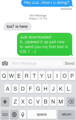
Apple’s iMessage has always been nothing short of refreshing for me. If you’ve ever experimented with Android’s messaging apps (particularly that of Samsung), you will understand what I mean.
Samsung’s messaging apps (on both the GS3 and GS4) come in the traditional black color. You can change them to a white color of some sort, but the application still forces you to live with the black color until you click on a recent message (which can then provide a white background). The black and white colors clash, in my view.
With iOS 7, iMessage has gotten even better. Now, gray has joined the other iMessage colors, adding to the sights of iMessage. In addition, as your texting conversation progresses, earlier comment bubbles turn lighter than before.
The further down the page your comment or that of a relative or friend is, the darker the bubble color. While this may not make a difference to some, it is a slight change that contrasts with the usual green and blue comment bubbles in the iOS 6 iMessage app.
iOS 7 Sight #5: Folder Zooming
One thing you may have noticed when pressing on your folders in iOS 7 is that, contrary to what happened in iOS 6, iOS 7 zooms in to the folder you’ve pressed so that you can see the apps up close that you’ve grouped together. This is a neat feature, since iOS 6 made it easy to open folders and forget the folder you wanted or needed earlier at a later date.
For those of you that wanted Newsstand to finally get in a folder and stay there, you got your wish: newsstand can now be placed in a folder in iOS 7. You can now use the extra space to prioritize another icon in Apple’s app ecosystem.
There are many other impressions, sights, and sounds to notice in iOS 7. We here at Tapscape will be back to bring you more coverage on what you can expect in iOS 7. Stay tuned.