:format(webp)/cdn.vox-cdn.com/uploads/chorus_image/image/71360693/UPDATES.1419979916.0.png)
Apple just released its “biggest change” ever to iOS — and it’s hard to argue with the company’s phrasing. From top to bottom, every corner of the operating system looks different, even if it all still acts pretty much the same.
But there’s one area where iOS 7’s bright and colorful new look will need to catch up: the apps. Right out of the gate, just about every big name seems to updating its apps with gorgeous new designs that fall in line with the iPhone’s latest style. We’re rounding up how all of your favorite apps are going to look the next time you turn on your iOS device.
We've collected all of the biggest apps in our Storystream, but below are a few more that have caught our eye.
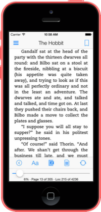
Kindle keeps just about everything in the same place while totally doing over its style in iOS 7 fashion. Think thin fonts, blurred backgrounds, and even folders that look just like what’s on the homescreen.
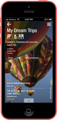
Flipboard has adopted a few iOS 7-isms to help it fit in, but the app as you know it remains the same. The coolest change? Magazine covers have a parallax effect just like the new iOS home screen does.
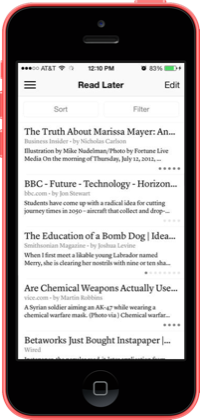
Instapaper’s design is already spartan, but now it’s removing all remnants of gloss in favor of a simple, clean layout. The update also includes a variety of new ways to sort what’s next on your reading list.
Digg never would have looked out of place on iOS, but with all of the necessary tweaks made, it now looks better than ever and can even download new stories in the background.
New York Times
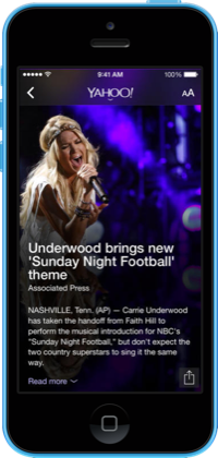
Yahoo

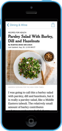
The New York Times’ iOS app has bigger headlines, bigger photos, and an all around tidier layout. Catching up on the Times’ news has never looked so good.
Yahoo is revamping its app with a style that’ll be familiar to fans of its beautiful weather app. It looks right at home on iOS, now includes breaking news alerts, and even supports animated GIFs.
Pocket is introducing a simple update that brings flares of iOS 7’s style into the app’s existing design. Its article view has been cleaned up, and it'll now automatically sync your stories in the background.
CNN looks better than ever after a major overhaul that cleans up its layout, adds tasteful translucencies, and brings in plenty of rich blues and reds across the app. (The update is yet to roll out, but will look like this.)
The Huffington Post is adding translucencies pretty much everywhere in its app to bring out a distinctly iOS 7 feel, even if it might be a little much.

Twitterrific
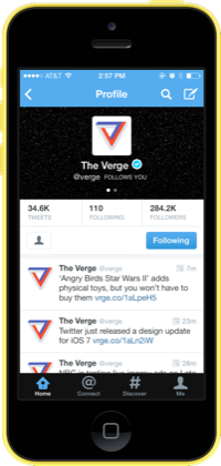
Twitter hasn’t changed much, but it is getting in the spirit of things. Its navigation bars have been flattened and brightened, and its icons are simplified all across the app.
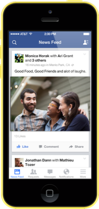
Facebook is jumping straight into the flattened style of iOS 7, and it's using the design update as a chance to completely rework its navigation with a new persistent toolbar at the bottom of the main screen.
Twitterrific retains its own playful style while adding in flares of iOS 7 where they fit. And best of all: it updates your tweets in the background.
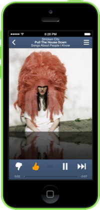
Pandora
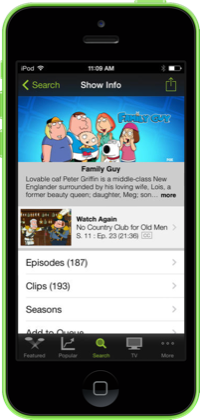
Hulu
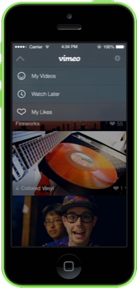
Vimeo
Pandora isn't fully making the jump to iOS 7 yet — it's even still using the old keyboard — but it has shed some clutter from its look: buttons are no longer framed, and superfluous dividers have been cut out.
Hulu's app is still pretty busy, but it does tone down some of the earlier iOS style in favor of simpler toolbars and icons — it even throws a bit of translucency in there.
Vimeo is simplifying its iOS app with a stylish look that feels a lot more like its website. It wraps in iOS 7's penchant for simple icons, thin text, and translucencies too.
Pocket Casts
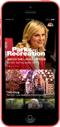
NBC
TED
Pocket Casts has a great new look that does away with its shining buttons and bars and replaces them with a sparse layout freckled with simple icons and podcast cover art.
NBC is completely overhauling its app. The updates removes unnecessary navigation bars, and — more importantly — put a focus on huge images that should make browsing its library of shows all the more enticing.
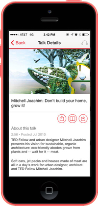
TED's app update cuts down on clutter to put your focus right on its trove of talks. It has plenty of white space, and simple, bright red buttons on each page.
Downcast is shedding its traditional iOS looks for a stark and minimal style filled with black, white, and red. Even better? It'll now download your podcasts in the background.
Simplenote
Evernote
Drafts
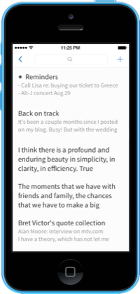
Simplenote hardly looks the same after its iOS 7 refresh. The app drops the blue, bubbly style of early iOS in favor of an open design with big, thin text.
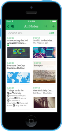
Evernote is getting a complete redesign that does away with its cards metaphor in favor of something cleaner, brighter, and a bit more useable. "We definitely did not want to just do a style update," Jamie Hull, Evernote’s head of iOS product, tells us.
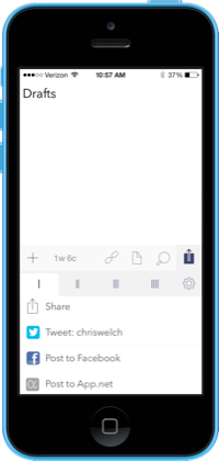
Drafts cleans up its already simple style with cleaner navigation bars and simple, new buttons. From here out, Drafts actually requires iOS 7 for all updates too.
Byword is flattening out where it can — though there wasn't too much gloss to begin with. Its custom keyboard row now fits right in with iOS 7 too.

OpenTable
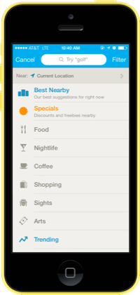
FourSquare

eBay
OpenTable is fully redone in the style of iOS 7. Gone are its heavy icons and headers in favor of bright new buttons and simple layouts.
Foursquare isn’t making many changes for iOS 7, but it now has a fun new icon, a brighter style on its menus, and has replaced its buttons with big, clean typography.
eBay has reworked its existing style in a way that looks great for iOS 7. It has a brighter design, content that goes edge-to-edge, and nice big fonts that are a pleasure to look at.
Foodspotting has totally revamped its design from using dull earth-tones to using white and bright green everywhere.
Mailbox
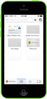
Chrome

Reeder 2
Mailbox flattens its buttons and toolbars for a streamlined look that doesn’t change anything more than it needs to. Enabling snoozes looks better than ever too thanks to a gorgeous, translucent overlay.
Chrome looks nearly identical, but Google has swapped in some iOS 7-friendly icons, as well as some cleaner typography here and there across the app.
Reeder 2 doesn't bother with visual flare, instead presenting a simple layout that'll keep you focused on your feeds. And its iPad version is just as neat and clean.