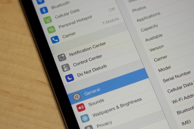
Apple didn't start the conversation about pixel density in display resolution, but as with so many other things through the years, Cupertino made it a major talking point when it came up with the "Retina" branding for the 326 PPI, 960×640 display in the iPhone 4. In the years since, resolution and density have become major talking points, and the Android OEMs in particular take great pride in their ever-denser screens.
In the last year, Apple's displays have in fact been surpassed in density by Android devices—phones like the HTC One (468 PPI) and tablets like the Nexus 10 and 2013 Nexus 7 (300 and 323 PPI) have surpassed the iPhone and iPad in screen sharpness. In the iPad mini's case, the original model's 1024×768 display was behind competing tablets like the original Nexus 7 and the Kindle Fire HD right out of the gate, at least when it came to crispness of text and images.
At 326 PPI, the new iPad mini is no slouch in the display density department, but Android devices a year from now may well have cleared the 500 PPI hurdle. It's worth taking a look at just why Apple doesn't stay in lockstep with the Android OEMs when it comes to screen resolutions and densities, even as it stays very competitive in design and in SoCs.
Between 1024×768 and a hard place
To take advantage of high-density displays, your software has to support some form of scaling—without it, text, pictures, and other UI elements will only get smaller as resolution increases, not sharper. Android and Windows are both built to run on a wider variety of hardware than iOS and OS X, and so each OS is capable of scaling to a few different levels. Windows will offer to scale desktop items to 125 or 150 percent of their normal size, for example, while Android's APIs specify four different scaling levels based on the density of your screen (ldpi, mdpi, hdpi, and xhdpi).


If used properly, these mechanisms ultimately allow for greater hardware diversity. Android can run at 1920×1080 just as well on the 4.7-inch HTC One as it can on the 21.5-inch HP Slate 21. The issue is that third-party developers actually have to keep up with these ever-changing densities, and not all of them have. We've been over the Windows desktop's scaling troubles before, most thoroughly in our review of Toshiba's Kirabook. Microsoft's built-in and first-party programs look pretty good, but the way third-party applications behave when scaling is enabled is all over the map. Popular Android apps tend to behave a little better in this regard, but even on the "midrange" 1280×720 display of a Nexus 4 or Moto X, there are apps that look tiny because they were originally built for phones with lower-density displays.
Apple makes things simpler for its developers. For each type of iOS device (the small-screened iPhones and iPod touches and the large-screened iPad and iPad mini), there are two different scaling options: no scaling and 2x scaling. To support both the first- and second-generation iPad minis with the same app, for example, developers just have to include versions of its assets that look good at 1024×768 and blown-up versions of those same assets that look good at 2048×1536. It works the same way in OS X, even though that operating system supports more diverse screen resolutions—developers need only to include "standard" versions of their assets for non-Retina Macs and scaled up "2x" versions of those assets for Retina Macs. Once a developer has added Retina support to a given app, there's nothing else needed.
Apple's goal here was obviously to make it so that developers could create apps that looked good on all kinds of iOS devices without having to worry about constantly shifting display resolutions and densities. This was a key reason why the iPad mini had a 1024×768 display while many contemporary tablets had moved on to 1280×800 or more—Apple could introduce an all-new tablet without requiring much (if any) work from developers who were already supporting the 1024×768 iPad or iPad 2. The company is willing to change screen aspect ratios and densities when necessary, but only rarely (once every couple of years seems to be the norm) and in the least disruptive way possible. Even when switching from the 960×640 of the iPhone 4 and 4S to the 1136×640 of the iPhone 5 and 5S, Apple only changed the size of the screen in one direction.
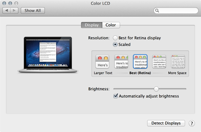
The downside of this approach is that it limits just what hardware Apple can use for its displays. Pretend you’re developing a new 13-inch MacBook Air and you’re thinking about upgrading that 1440×900 display. Because of the way OS X handles scaling, maintaining the same effective resolution would require a 2880×1800 display. If you can’t buy panels like that, or if putting a panel like that in the Air would make it too thick or harm battery life, your options are limited. Going with a more technically feasible in-between option like, say, 1920×1200 would probably be too small for most people to use in non-Retina scaling mode, but that screen would only have an effective resolution of 960×600 in Retina scaling mode. We have no way of knowing for sure, but this scenario (or one like it) is probably what’s keeping a Retina display out of the MacBook Airs.
Now, it would theoretically be possible for a Mac with a 1920×1200 display to use an effective resolution of 1440×900. The Retina MacBook Pros already do this—you can set an effective resolution of 1650×1080 and 1920×1200 on the 15-inch model instead of sticking with its standard effective resolution of 1440×900. The way OS X does this is that it draws all of the UI elements using the "2x" scaled Retina assets (rendering a 3840×2400 image while in 1920×1200 mode) and then downscales them to fit on the laptop's 2880×1800 display. There are good reasons not to use these as default settings for a shipping product, though—for one, image quality degrades slightly compared to using the laptop at its "native" resolution. The CPU and GPU also have to work a bit harder to render everything, which will have a negative impact on battery life and performance. It would be a workable solution, but it would be inelegant, and Apple usually doesn't resort to half-measures.
These problems are further magnified in iOS, which unlike OS X can’t just give you more desktop space if you give it a screen with more pixels—apps are coded to expect specific screen sizes and resolutions, and adding more would increase the size (in megabytes) of apps and require more effort from developers. An iPad app that supports both Retina and non-Retina devices comes with Retina and non-Retina assets regardless of which screen your device has, and adding further resolutions without changing the way iOS handles scaling would require another set of assets; the problem compounds if you add a new kind of screen every time you refresh the hardware.
Not a bad approach, just a different one
The upshot of all of this is that Apple will be slower than its competitors to introduce new screen sizes and resolutions. Most of the time, this won’t be a big deal.
I would liken the jump from non-Retina to Retina screens to the jump from VHS to DVD. The benefits were self-evident and easy to demonstrate, and almost anyone could appreciate the difference. The jump from a 300 PPI screen to a 400 PPI one is more like the jump from DVD to Blu-Ray—the differences are there, but they're not as important, noticeable, or beneficial to as many people.
Apple has ultimately made the right call for the people who matter more to its bottom line—the customers who bought 31.2 million iPhones last quarter and nine million of the latest iPhones in their first week and the developers responsible for Apple’s vibrant third-party application ecosystem. Scaling in Windows and Android works well enough most of the time, but developers need to write software that respects the scaling settings, and users are still going to run into apps that don’t behave properly. Apple prizes simplicity and consistency, and its current system provides both.
Listing image by Andrew Cunningham
reader comments
102