We’re currently in the throes of Apple changing the look and feel of its operating systems.
iOS 8 has just been released, revealing the influence of Apple Senior VP Jony Ive in bringing a flatter look. Yosemite is around the corner and it too will show a quite different feel from the desktop operating systems of the past few years.
When Apple makes these large scale changes, it introduces design memes which are often copied. Witness the original Bondi Blue iMac of 1998, and how it changed not just Apple’s design standards, but that of many other technologies, bringing multicoloured translucency to many non-IT products, for better or worse.
In iOS8, Apple has introduced Healthkit, a series of services combining both apps and hardware which resides on your iOS devices.
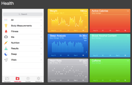
Below is a representation of some of its services:
Here, on the left you can see the Dashboard, with Calories burnt in orange above a Sleep measure, in blue, below. On the right, you can see a variety of health services and measures incorporated into Healthkit.
I now fully expect that these visual representations of data points will become a design meme many will choose to follow, with their crisp sharp images and icons.
(UPDATE: The folks at UI design outfit, Mercury, have offered a graphic of iOS8 elements here. Below is the healthkit range – click to enlarge).
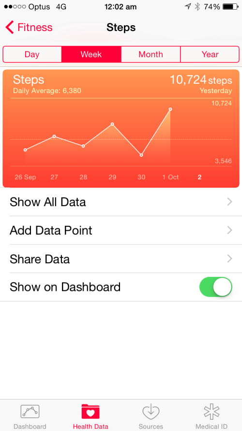
Here’s a screenshot I took of my own iPhone 6 screen showing steps taken these past few days:
I want you to note Apple’s use of dual advanced gradients. One is the entire orange soft edge rectangular shape containing all the relevant data, chart and information, going vertically from an orange to an almost blood red.
But I want you to also note the line chart showing how many steps I took the last few days, from September 26-October 1. Note in particular the area under the series of white lined data points, which too has a gradient from light orange to a darker hue.
I wanted to know if this design meme could be replicated in Keynote unassisted by third party drawing tools. This is one way I hone my Keynote skills, by setting myself challenges to reproduce what may have been constructed in professional design software.
The task then was to create an advanced gradient embedded on an advanced gradient.
In the video below, I walk you through one set of solutions, so that those with rudimentary Keynote skills can learn to apply some of the software’s deeper elements, such as grouping, drawing, outlining, gradients, colour matching, opacity and layering.
Bear in mind, the means I show may not be the only way to do this, and if you have more economical means (i.e., less mouse clicking), let me know in the comments.
Enjoy!


I decided to try to create the shape first, then watch your video to see if we did it the same way. We started identically with the background, even adjusting the corners to match the original, but diverted rapidly from there. I created the chart with a chart. Although I’d never created a gradient for the area under the a graph before, and am still learning this version of Keynote (because it’s Speakers’ notes remain woeful), I pleased with the result.
Here’s a link to the result, let me know if you’d like the slide.
https://www.cubbyusercontent.com/pli/LesPosenGraph.png/_f370be519b0e4efdb8f7aa1ff0567a91
Great learning experience! Thanks for the challenge Les, that was fun. 🙂
good work… a more complex chart or set of data points would have seen me use the built in chart making features too…
Here’s my attempt at the same. There’s a special case that exists when the series is discontinuous. In those instances, a dashed line is used and the gradient is darkened. (long iCloud URL follows)
I intentionally tried something different from what I’d normally do just to see if there’s anything I can learn from the process. In order to have the same angle in each section, I duplicated the original line, made it editable, then added an additional point beyond the end. That became the defenders for the gradient (after I removed the stroke and endpoints) The slide progression shows each phase of the changes. By the last slide, my gradient wasn’t matching, so I manually lightened one end. Download and play around with it.
I just want to note that it has been quite silent, lately, on this site. Did you learn anything new about Keynote from the March 9 event, Les?
Actually, it did it did inspire to write an entry; something should appear in the next day or so.
Thanks for reaching out…. Yep, it’s been a long time.
Looking forward to it!