:format(webp)/cdn.vox-cdn.com/uploads/chorus_asset/file/15773041/nfaces.0.0.1460768256.png)
Google announced this week that it's making a bunch of changes to the emoji in Android: namely, it's finally introducing emoji that look like people, and it's largely doing away with its freaky blobs.
The blobs are still here, but they're better
But there's a bit more to it than replacing blobs with human faces. The blobs are still around, but tweaked. And while the human faces are largely a big improvement, they do come with some downsides.
Emojipedia collected all of the new emoji designs in Android N. Here you can see how Google has tweaked its core set of faces:
Left: new emoji. Right: old emoji.
Like on all other platforms, this first set of emoji are largely formless, outside of their eyes, mouth, and occasional accessory. They're meant to have no specific gender, age, or skin tone — they're just expressing an emotion. So even though Google is adding human emoji, these blobs stay the same.
Or rather, they stay mostly the same. Google has made subtle changes to nearly every single one of these yellow blobs. The main result is that, in Android N, every face has the same shape. It's one consistent yellow gumdrop shape for face after face.
They look more like Apple's emoji, and that's a good thing
That consistency makes the faces all look much more natural and puts emphasis back on what their eyes and mouths are doing. In earlier versions of Android, the blobs would bend, twist, and morph. They were often facing off to the side, too. A lot of that just led to some weird facial expressions, but it made Google's emoji a bit harder to look through as well.
The changes in N also make Google's emoji feel closer to Apple's emoji, which, for whatever reason, have long felt like the standard (they're not — Unicode sets the standard, but Apple interprets them in fairly straightforward ways). They're small changes overall, but they ought to help clarify meaning when you're talking to someone on another platform.
Here you can see how Google's new "confused face" emoji is almost identical to Apple's (both of which are close to, but not quite spot on, Unicode's guidance).
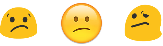
From left to right: Android N, iOS, current Android.
What's interesting here is that (to me, at least), both of these faces look more like they're showing slight disappointment or concern than confusion. Google's old emoji actually did a better job of showing confusion — it's even more in line with Unicode's guideline. But while Google's new face may be less in line with the real standard, it's more in line with what's actually being used. Twitter's version of this emoji looks exactly the same, and Samsung's looks similar, too. Arguably, maintaining that meaning across platforms is far more important than nailing the named emotion.
You can see a similar thing happening here, where Google's "Frowning Face With Open Mouth" moves closer to Apple's.
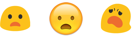
From left to right: Android N, iOS, current Android.
And here, with the crying face. This one is a really small change, but it's interesting how big of a difference it makes. The old Android emoji looks like its head is bowed in shame. The new one, with its eyes open, feels like a much more generic expression of "sad." Unicode's depiction of this emoji includes the closed, U-shaped eyes that Android originally had, but most other platforms display it with open eyes.

From left to right: Android N, iOS, current Android.
Of course, the really big change to emoji in Android N is the inclusion of real human faces, with a skin-tone selector to go along with them. That meant Google had to get rid of its weird gumdrop slugs that were being used to represent things like "boy," "girl," "older woman," and "princess."
I think there will be no disagreement that these:

Look better than these:

They don't make you uncomfortable just to look at, which itself is a big improvement. They're even kind of cute!
For the most part this is all improvement, but there is one big downside. Emoji like "police officer" and "construction worker," which are not meant to be gendered, are now represented as men (so long as we accept that short hair = man, which seems fair given societal stereotypes and the more immediate fact that this is how men are represented in the emoji above). Sure, these are still pretty generic faces, but you can't ignore how these will widely be read. And that's not great! Because male emoji get to be cops and detectives, and female emoji get to be princesses and have their hair cut.
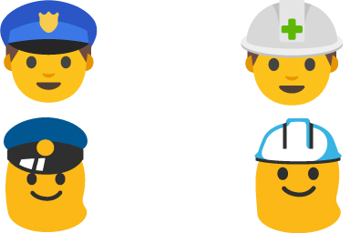
This isn't entirely Google's fault — nearly every other platform does this the same way, and even Unicode's example looks male. But it plays into the narrative of "male as default," with women requiring some additional identifying accessory (if you haven't seen it, Feminist Frequency has a really great video on how this has played out in video games). As terrible as the blobs were, they at least proved that these emoji can be designed without suggesting a specific gender.
In its writeup of the Android N emoji, Emojipedia noted that Unicode is considering implementing a gender selector — much like the skin-tone selector — that would let people choose between neutral, female, and male versions of an emoji. If that goes through, it's possible these problems will be taken care of in the future. For now, Android falls closer in line with other platforms, but not entirely in a good way.
That's more or less all that Google is changing. Because even though it had terrible human emoji, it's actually had really great emoji for almost everything else. And now that all of its emoji are looking pretty good, it's time to revel in just how great some of its existing emoji are.
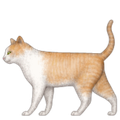
Just look at how cute this cat is!

And this lion!

And this little ram!

And seriously, compare this to what the other platforms are offering.
Apple's cat is unpleasantly realistic:
And Microsoft isn't even trying:

Google's octopus is adorable:

Apple's is pretty good too:

And Microsoft had some kid make this in Paint:

Basically, with Android N, Google has gone from being the biggest troublemaker in the emoji world to proof that other companies need to step up their game. Seriously Microsoft, do something about those animals.
:format(webp)/cdn.vox-cdn.com/uploads/chorus_asset/file/25289658/vic_green_1024x1024.jpg)
:format(webp)/cdn.vox-cdn.com/uploads/chorus_asset/file/25287583/DSC06615.jpg)
:format(webp)/cdn.vox-cdn.com/uploads/chorus_asset/file/25289137/GGZZMDwXsAAUfIc.jpg)
:format(webp)/cdn.vox-cdn.com/uploads/chorus_asset/file/25287814/HT012_Google_Keep.png)