When Apple introduced iOS 7 in the summer of 2013, the software came with the biggest visual overhaul in the mobile OS's history. Alongside flat design icons and a more modern and Jony Ive-inspired approach was one of iOS's much-needed features: Control Center. It was a slide-up tool drawer — enjoyed in similar form by Android users for quite some time — to turn on and off Wi-Fi and Bluetooth, access useful stock functions like the flashlight and camera, and quickly change screen brightness. It was also a giant, complicated mess.
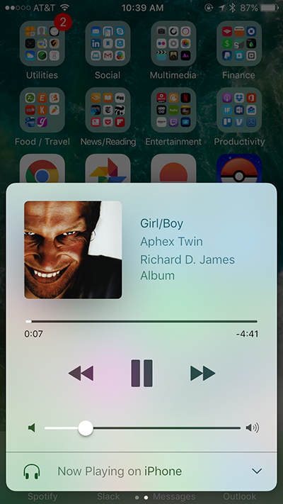
Three years later, Apple has finally come around to redesigning Control Center to help it feel like the uncluttered, powerful toolset it was meant to be. Instead of cramming a music row smack dab in the middle, your music controls are now in a separate panel off to the right. In its place is Apple's new Night Shift option, which uses different color tones to better help your eyes adjust at to darkness. If you swipe left, you'll now get access to HomeKit-connected accessories. In my albeit short time with the iOS 10 beta, it is a huge improvement over its previous forms.
The new Control Center is another example of Apple's new philosophy on software, which is more focused on fixing failed launches than it is on clutching to bad ideas. Just as the company plans to remedy many of the longstanding issues with the Apple Watch when watchOS 3 arrives this fall, iOS 10's new Control Center takes out clunky UI missteps and kicks them to the curb. It's an admission of fault and, at the same time, a moment of celebration. The company known for dead simple software can still hit the mark, even it if takes a little while and a few swerves along the way.
Apple can still hit the mark, even if it takes a little while
Of course, the old Control Center wasn't an abomination of modern software by any means. You can see that by how much of its predecessor remains within the iOS 10 version. We still have our standard five buttons — airplane mode, Wi-Fi, Bluetooth, "Do Not Disturb," and screen lock. Those buttons now have colors to indicate the status, such as blue for Bluetooth and red for screen lock. But the placement remains the same, as do the buttons for the flashlight, timer, calculator, and camera.

But it's those subtle changes, like a simple color choice and more breathing room, that make the difference. It's not hard to imagine less experienced iPhone users accidentally swiping up on the home screen of iOS 9 only to get smacked in the face by buttons of all different shapes and perplexing sliders. The Control Center of the last three years was unfriendly and difficult to master. With iOS 10, it's just the essentials. If you want more, you can start swiping.
The new Control Center isn't perfect. As some of my colleagues at The Verge have pointed out, it could use a few tweaks. The brightness slider is a bit hard to hit, which now results in swiping you over to the music panel a little too easily if you're not precise. There's no 3D Touch implementation on buttons for Wi-Fi and Bluetooth either. That could be a super obvious way to let users jump in and out of those respective settings panels. (Strangely, you can use 3D Touch on HomeKit accessories and the bottom row of the main Control Center panel, but not elsewhere.)
The iOS 10 Control Center is not perfect
Apple is also making a generous assumption about the popularity of the smart home, handing one third of its panel space over to the Home app when it could make it customizable instead. Not everyone has Philips Hue lights. Being able to open up iCloud, Siri, or wallpaper settings seems more immediately useful, especially if the panel were customizable for those who still really do want to keep the accessories option intact.
Still, Apple's less cluttered Control Center is a big improvement. Beyond the small tweaks many users may not necessarily notice every day, the cleanup shows a stronger clarity of vision for iOS 10. It may not be a big leap forward, but it's Apple admitting it was wrong and doing what it can to improve.