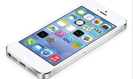
Are you ready to join the future? That seems to be the subtext of every tech presentation of the 21st century, but for Apple, acknowledged leaders in the field, there has been a nagging feeling that its users were already there, waiting for it to catch up. At its Worldwide Developers Conference presentation of its new iOS7 user interface on Tuesday, Apple finally cottoned on, by cutting ties with the design principle that has so often held it back: skeuomorphism.
Loosely speaking, skeuomorphism means "making stuff look as if it is made of something else". In this context, it is the logic that dictates that Apple's iBooks app resembles a cheap pine bookshelf, for example, and its Notes app resembles a yellow legal pad with lines and a margin – of the type last seen in about 1978.
Look closely, and skeuomorphism is all over Apple and other user interfaces – the little shadows cast by windows, the highlights on virtual buttons designed to make them look shiny, like real buttons. Originally this was to help us neanderthals make sense of the dazzling new technology before us, as in: "Oh, I get it. That looks like a button, so I'm meant to push it." But Apple got skeuomorphism-drunk, plastering the screens of its futuristically minimal devices with incongruous faux wood, leather and green baize. It got ugly.
Steve Jobs was allegedly a fan of skeuomorphism, as was iOS creator Scott Forstall; Apple's design chief Jony Ive wasn't, and legions of fans sided with him in what became an intense "skeuomorphic v flat" debate. Following Forstall's departure last year, the flatties seem to have won the day. Instead of faux textures, iOS7, which is to be released in the autumn, boasts clean, simple, graphic, unashamedly two-dimensional interfaces that bring to mind a Swiss railway station, say, or a Microsoft Windows phone. The Swissness is accentuated by a new ultra-skinny hipster-friendly Helvetica Neue Ultra Light typeface (one graphic designer I tested it on immediately said, "hairdressers"). But rather than old-school flatness, iOS7 gives you layers of flatness that float on top of one another. Some are translucent, so you can see a blur of what's underneath. There is also a fancy quasi-holographic effect when you turn on the device, suggesting your screen icons are hovering above the wallpaper.
So at last, skeuomorphism is dead, and human evolution has reached the stage where we recognise buttons on phones, even if they don't look like buttons. But iOS7 also points to a future where information is routinely presented three-dimensionally. One day, the idea of interacting with stuff on a flat screen will seem hopelessly antiquated, when we are all able to surf information telepathically thanks to Apple's new, intelligent hair gel – which will come in a bottle resembling an iPhone.

Comments (…)
Sign in or create your Guardian account to join the discussion